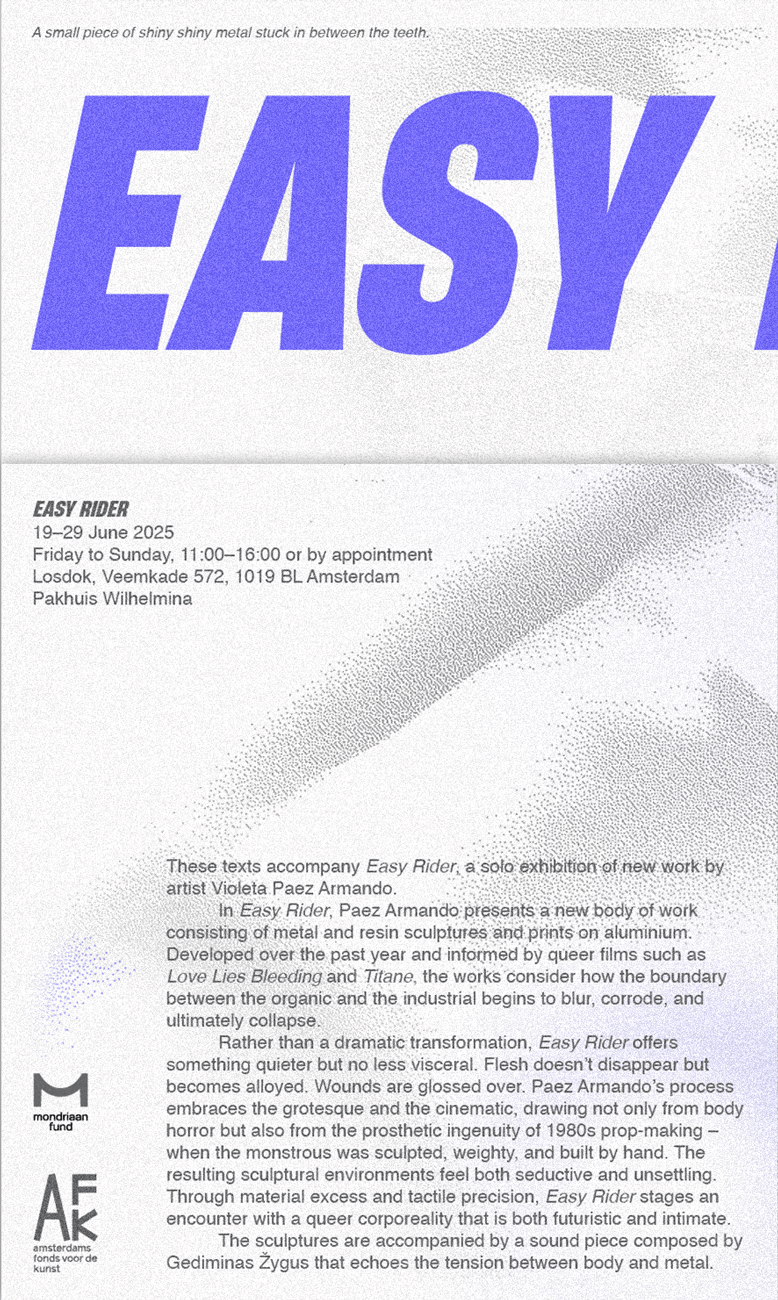
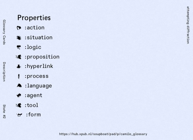
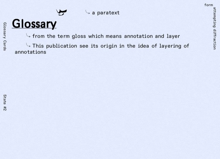
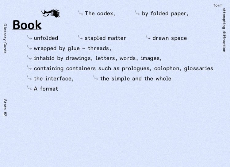
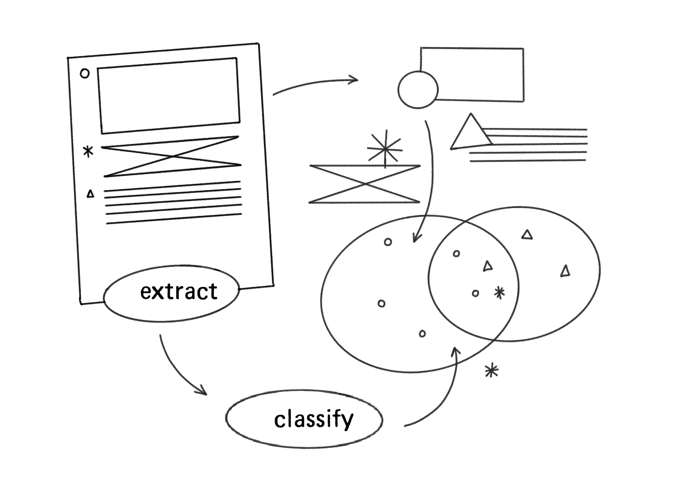
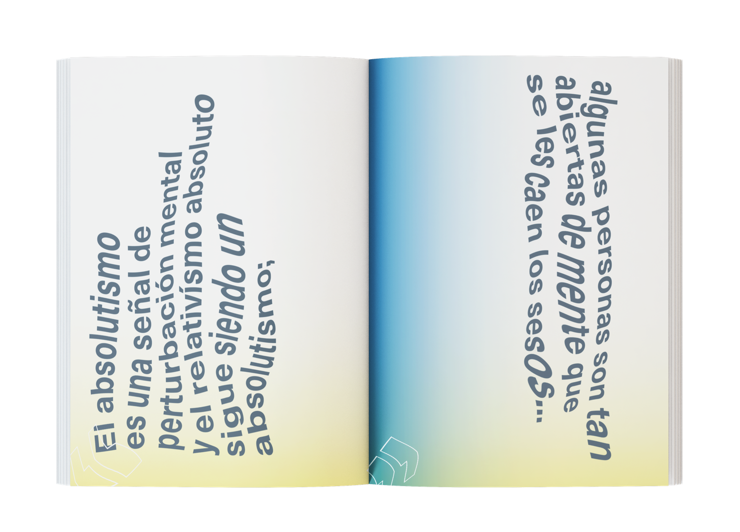
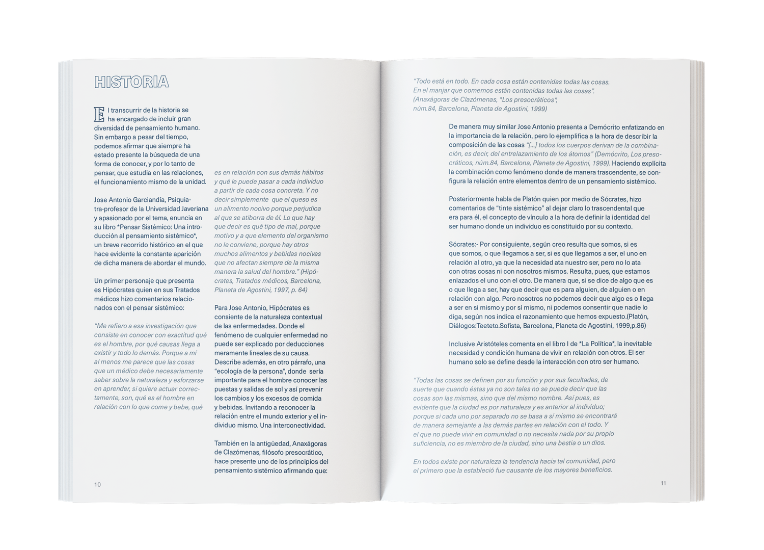
Operate
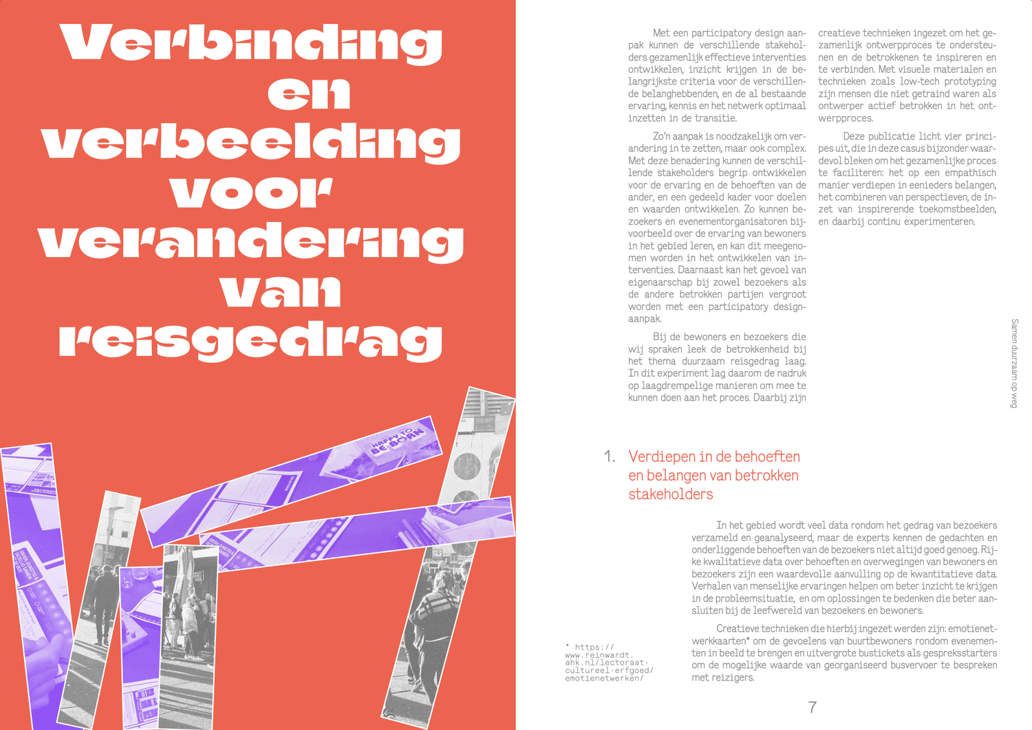
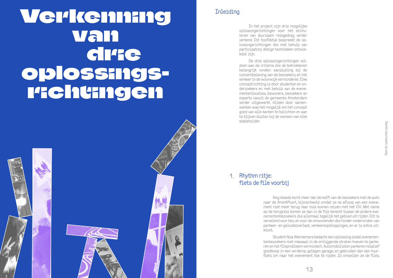
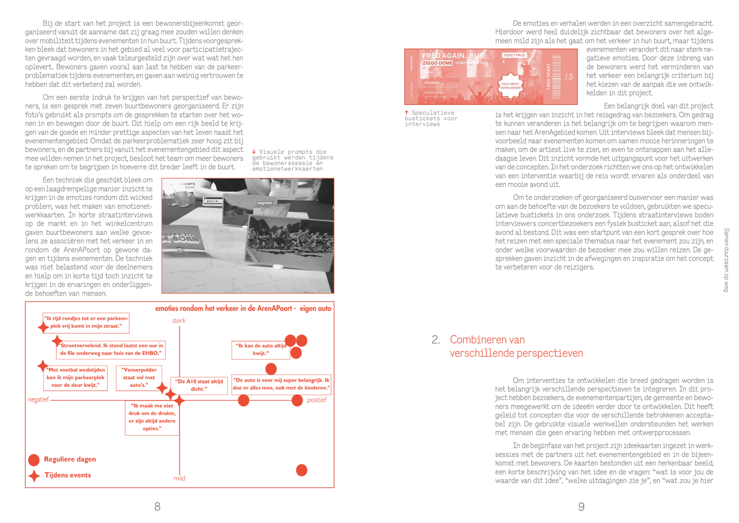
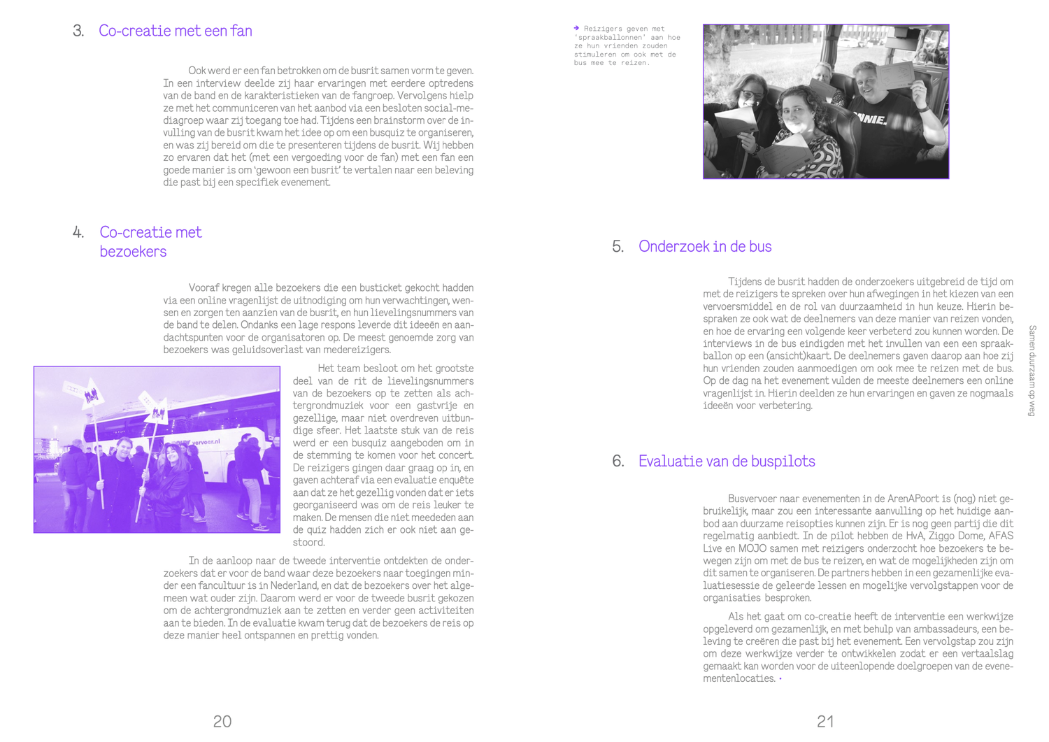
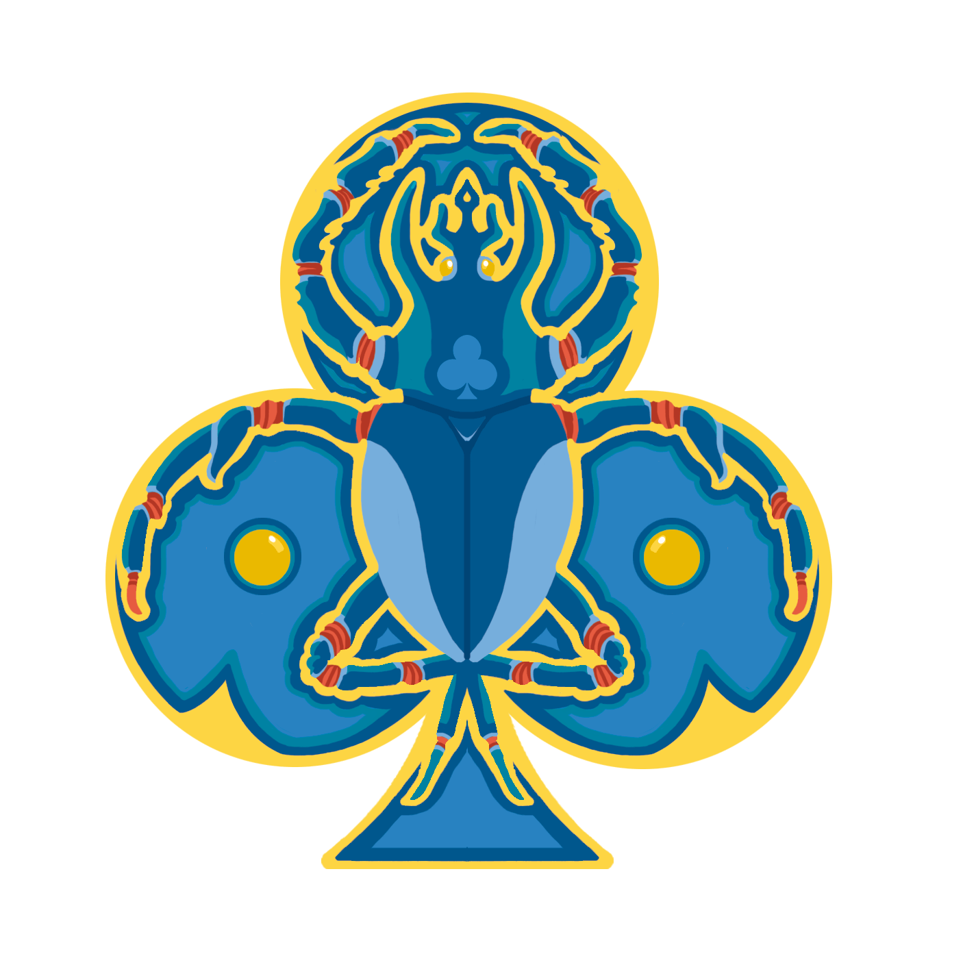
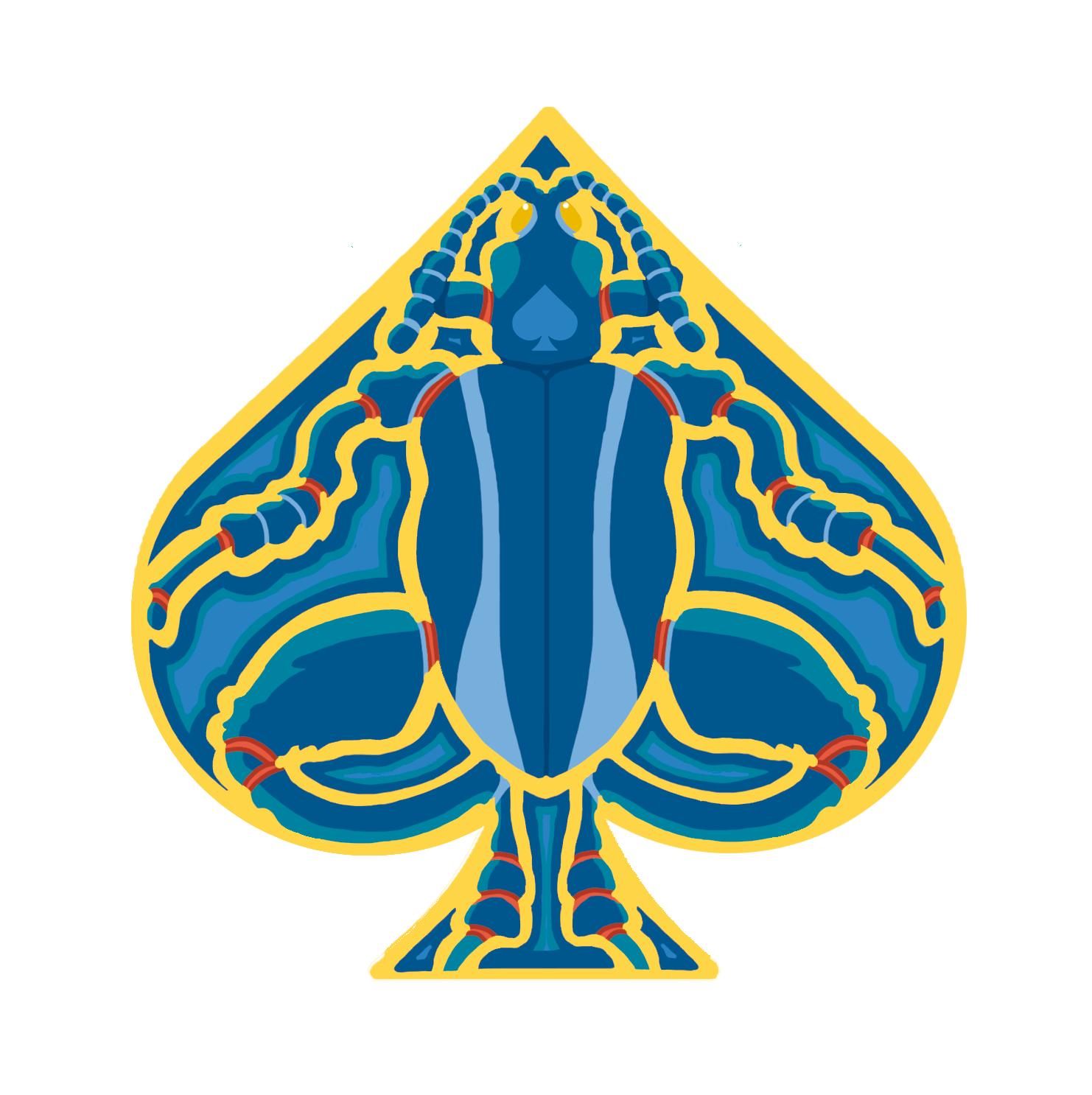
Symbol
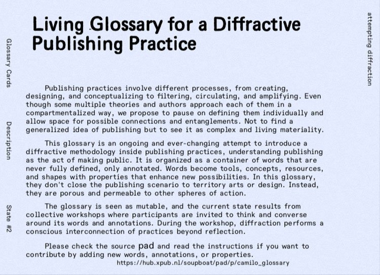
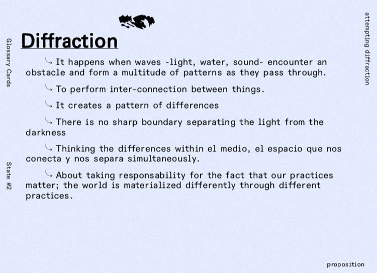
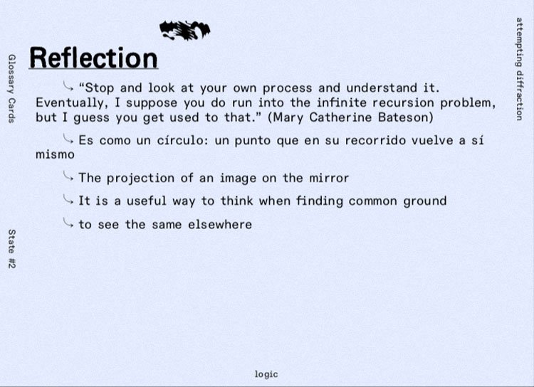
, Diagram
Description
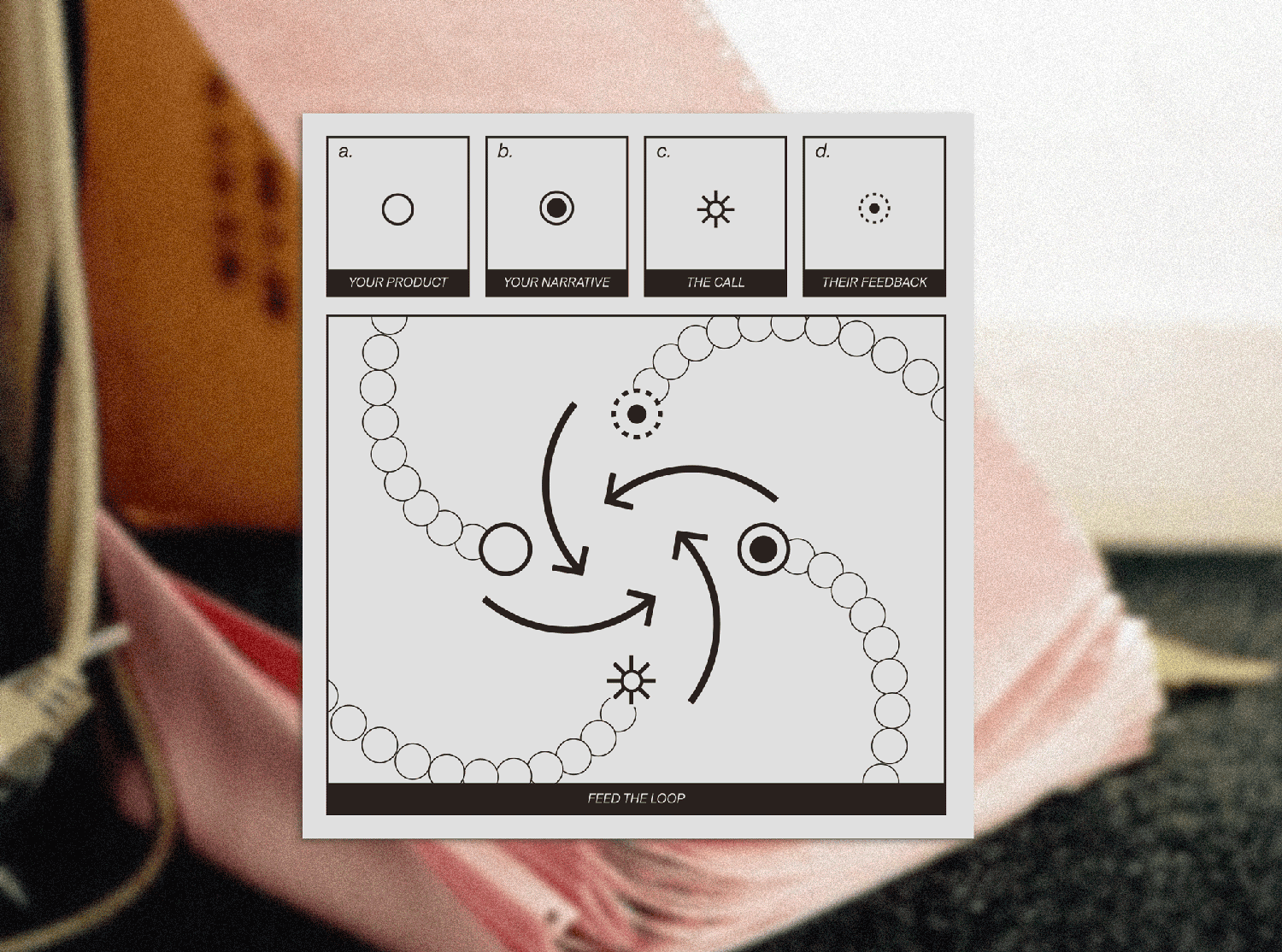
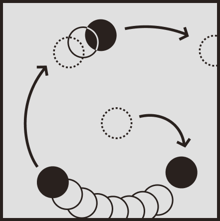
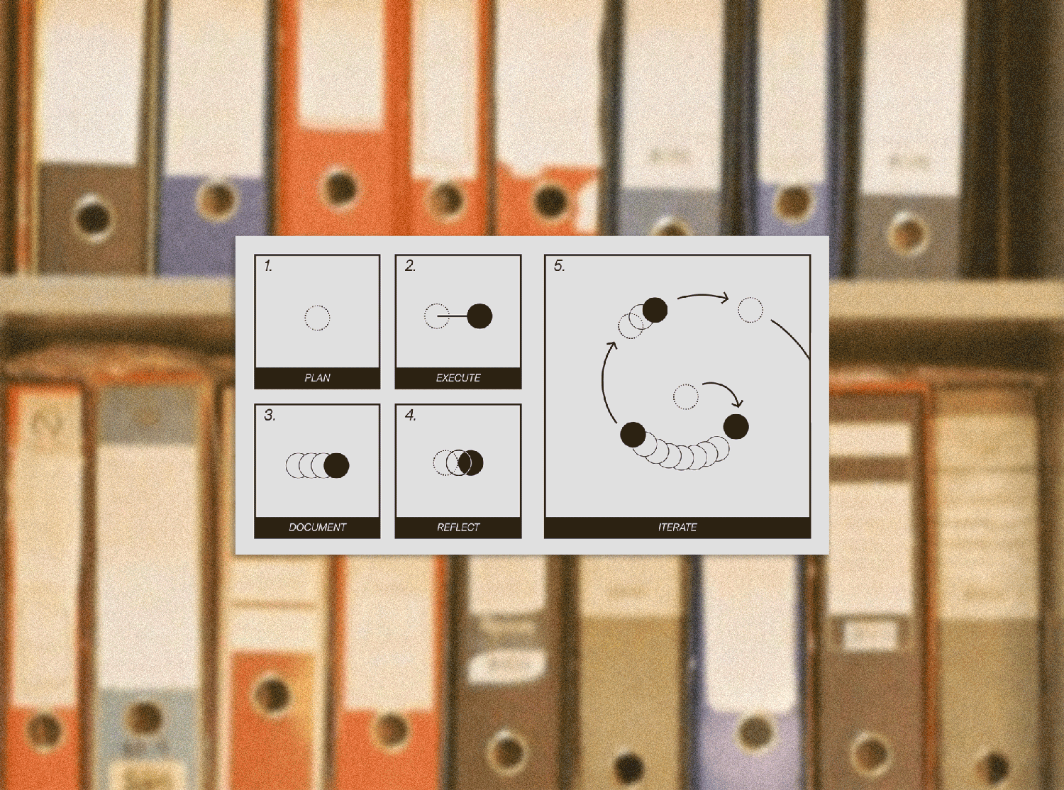
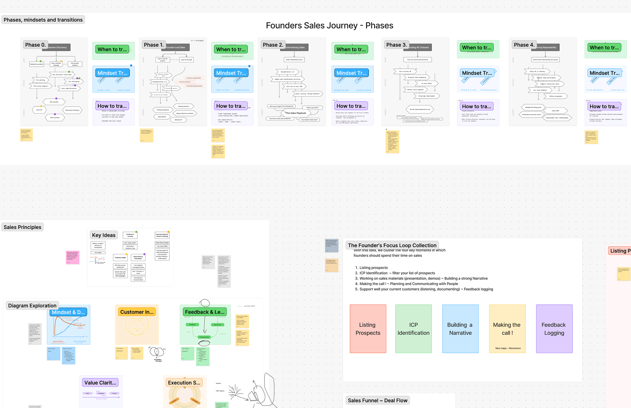
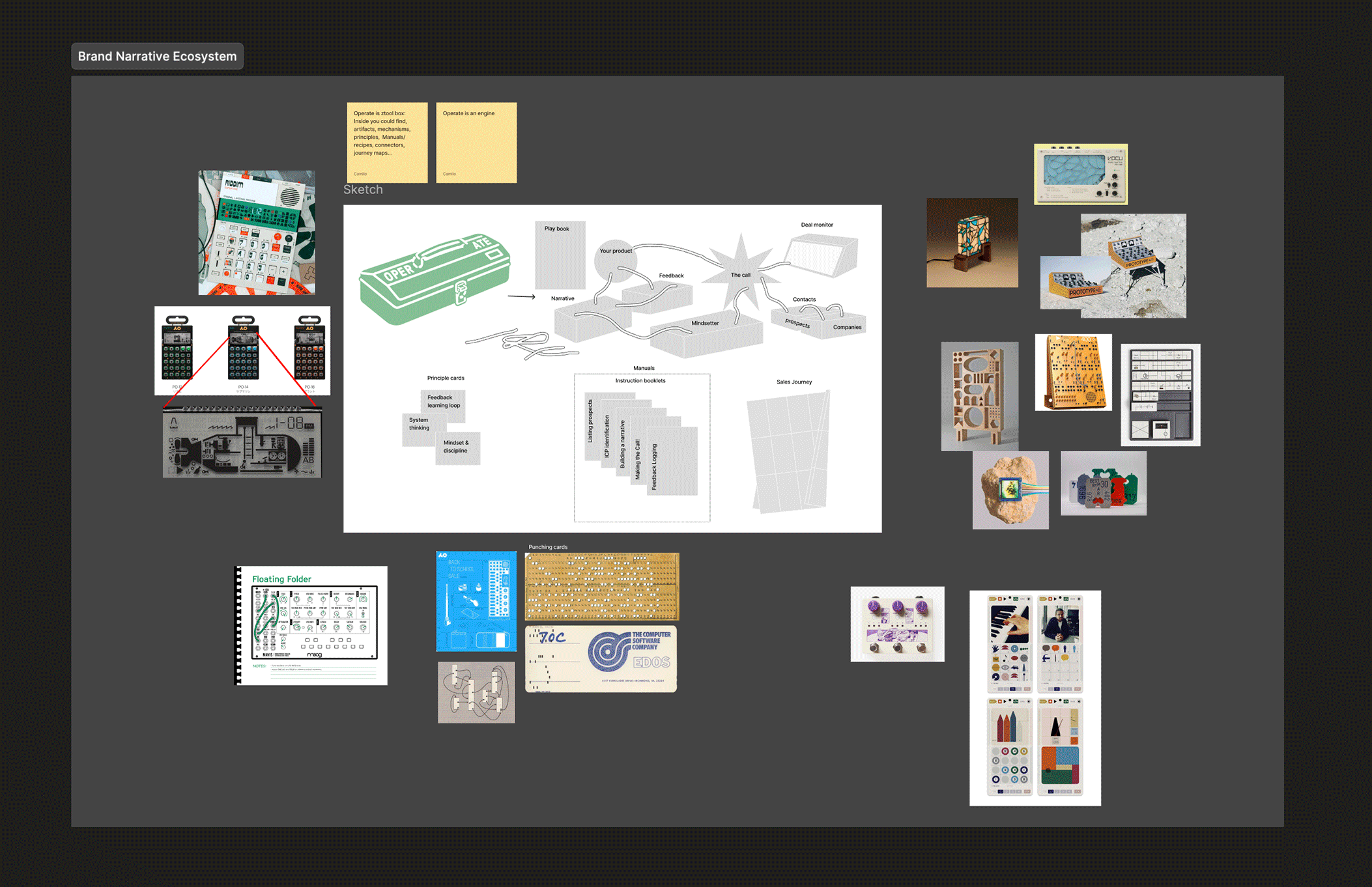
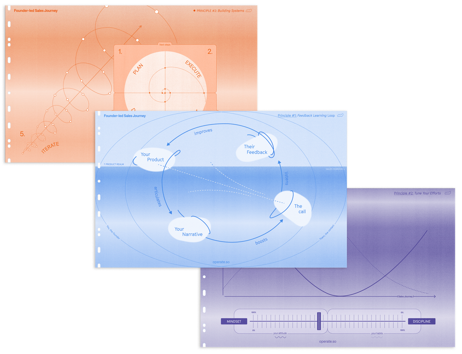
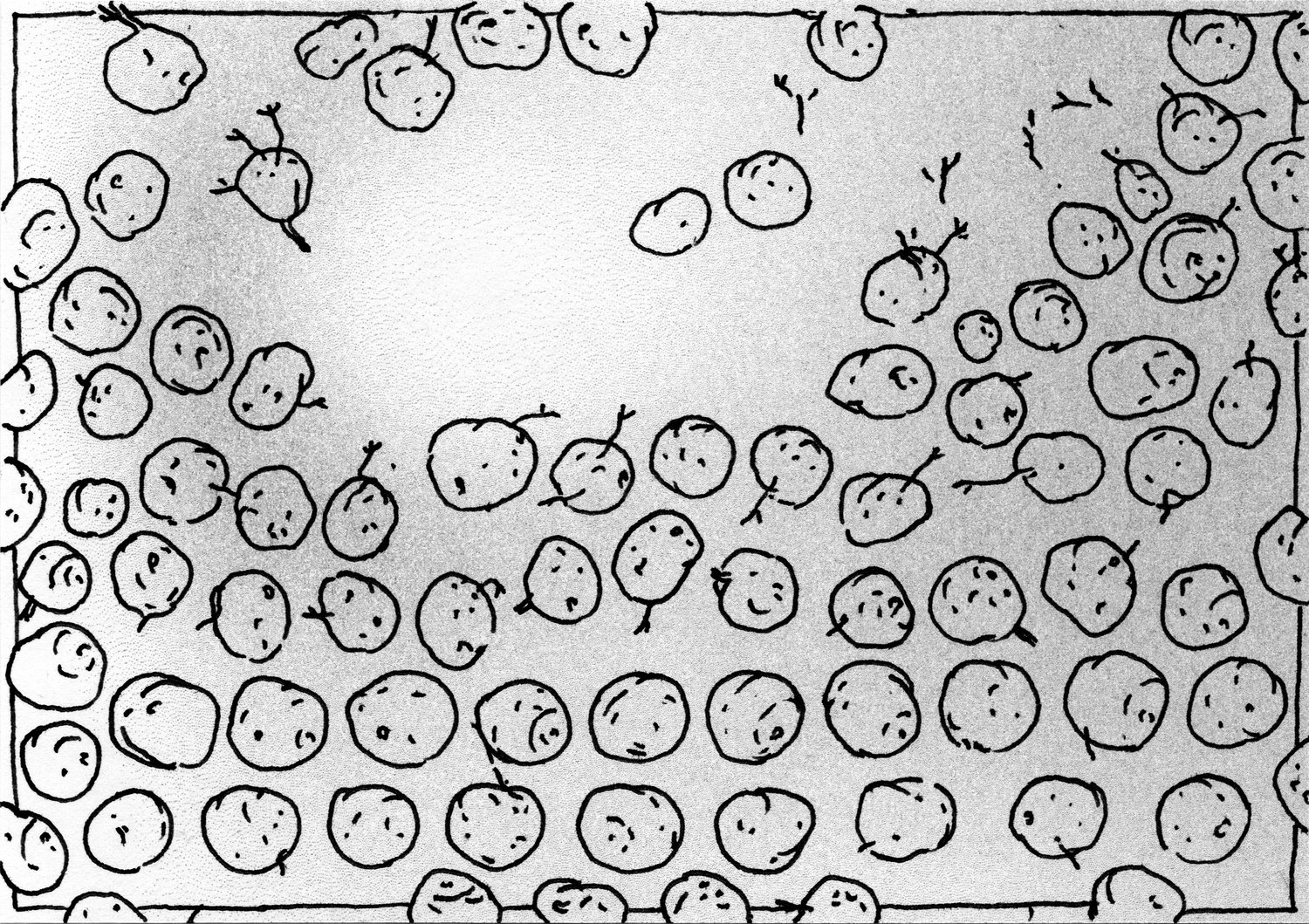
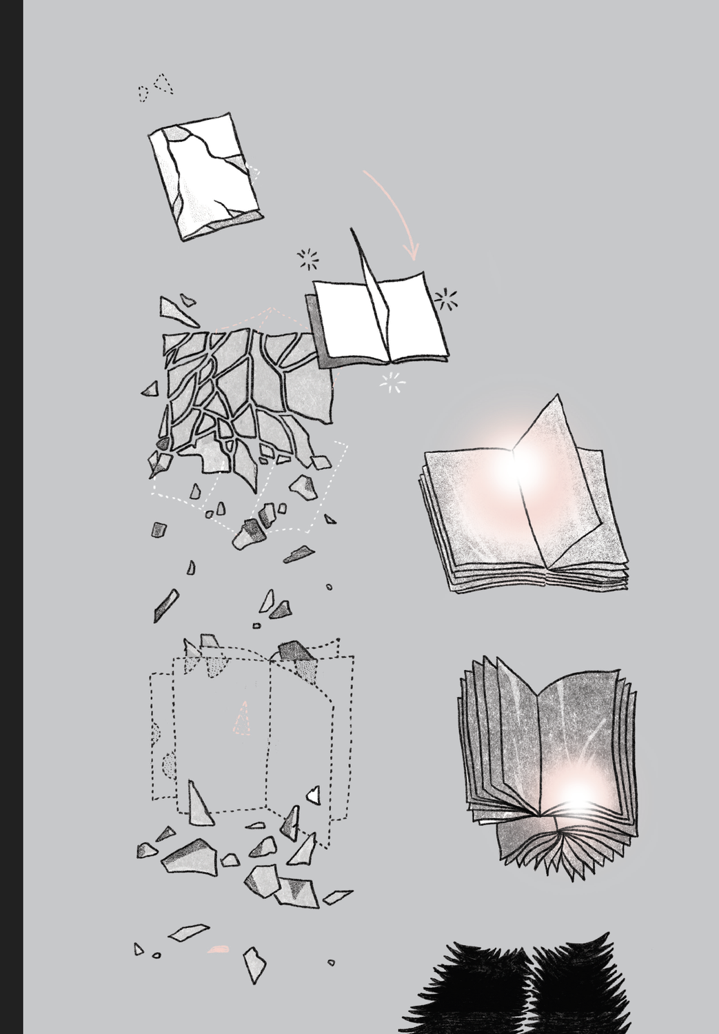
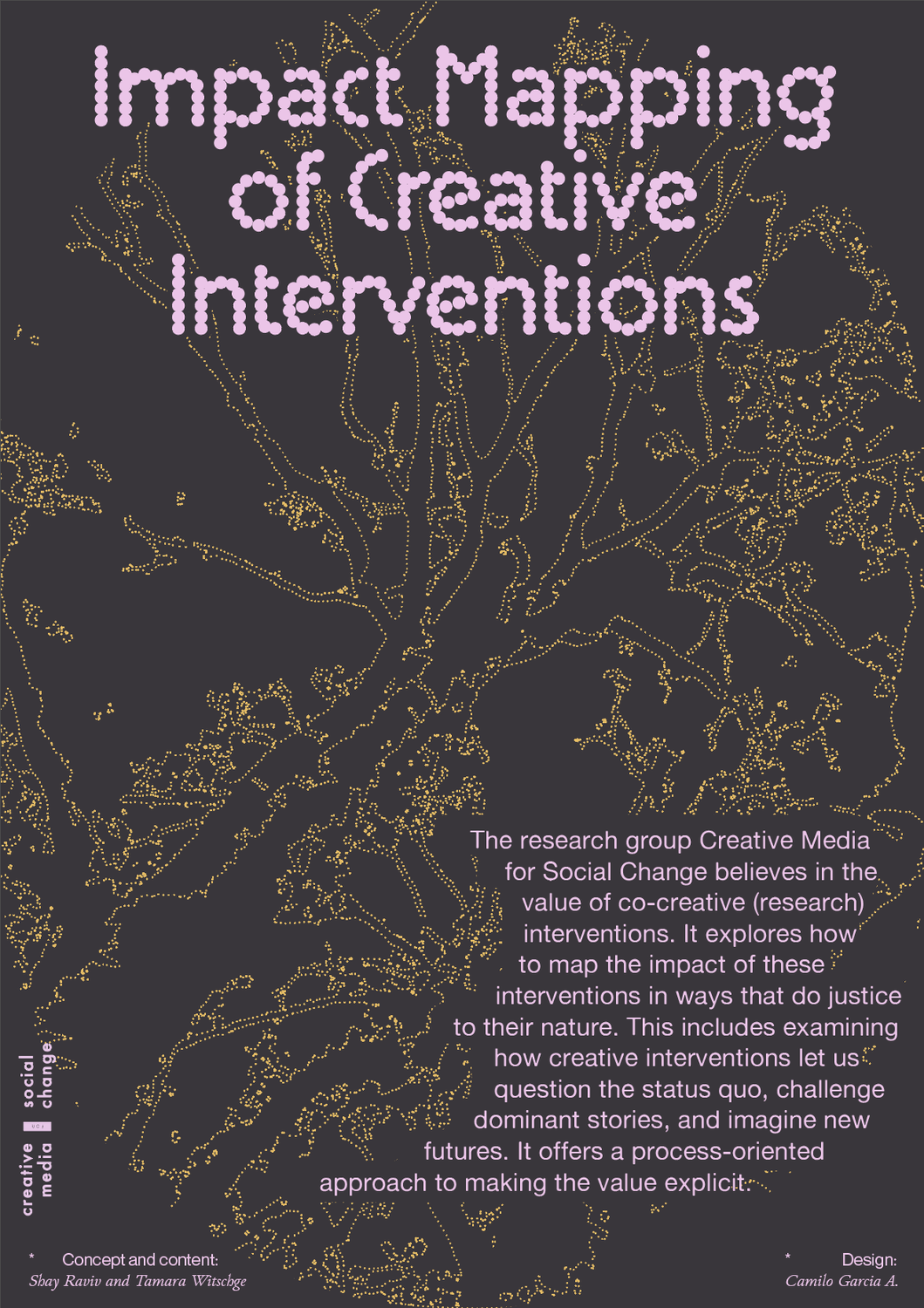
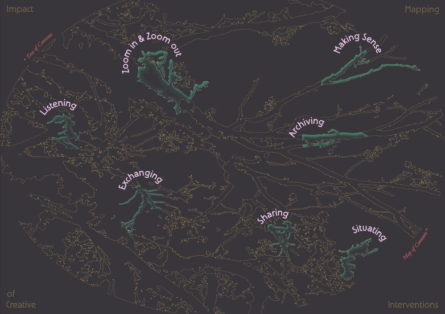
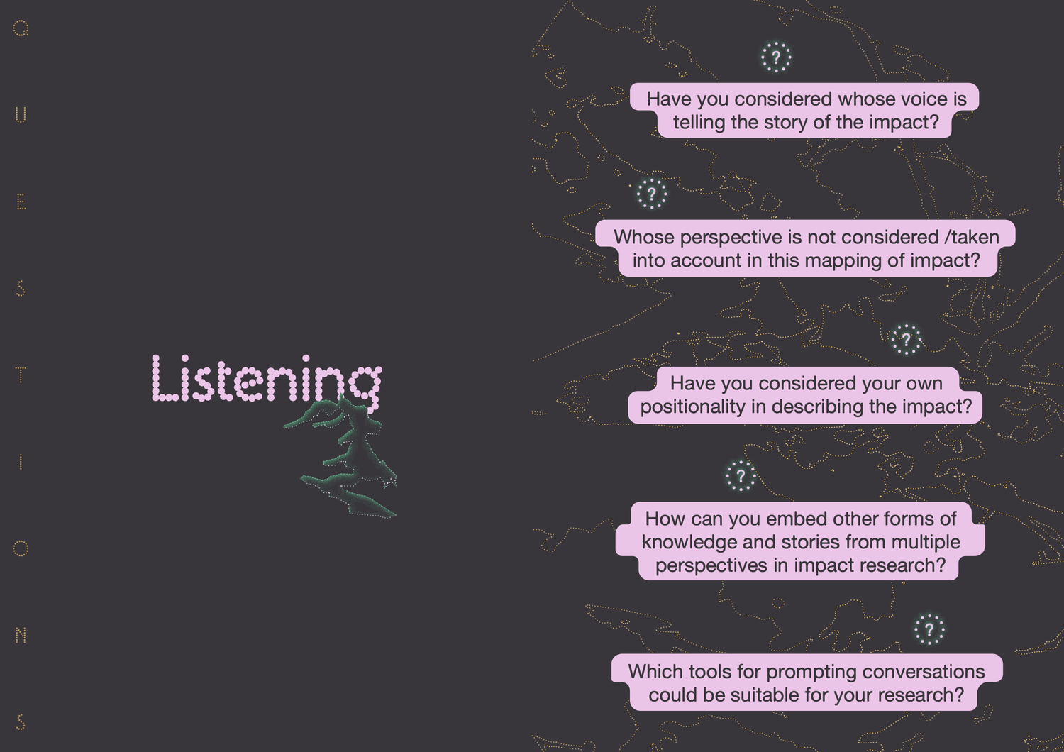
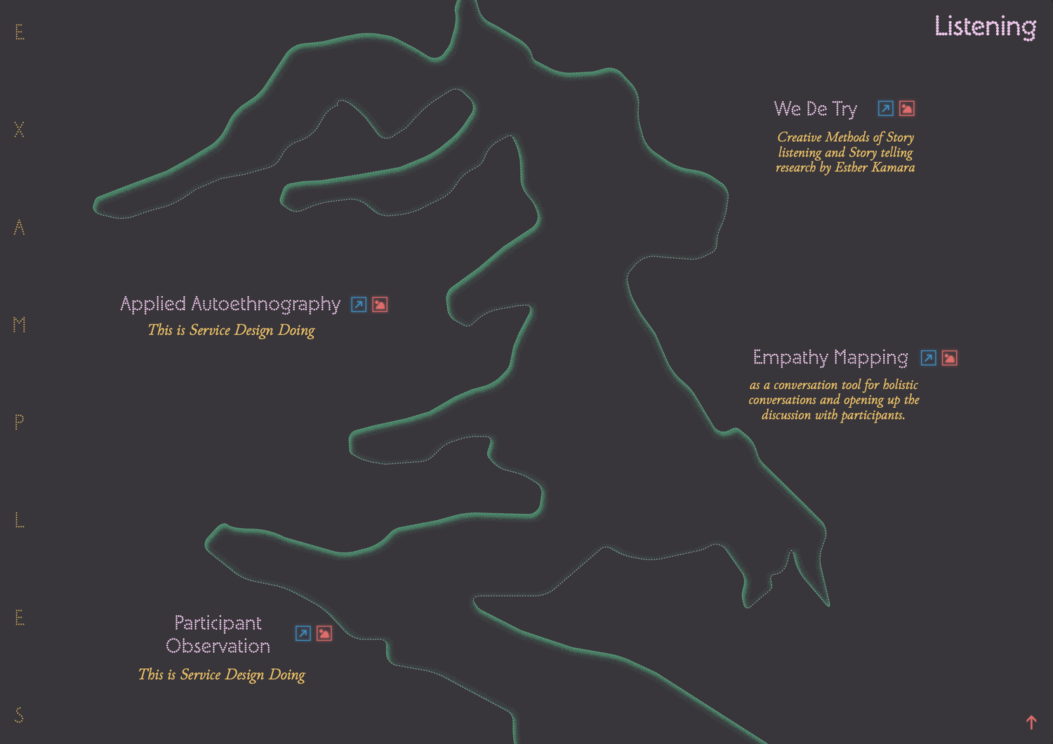
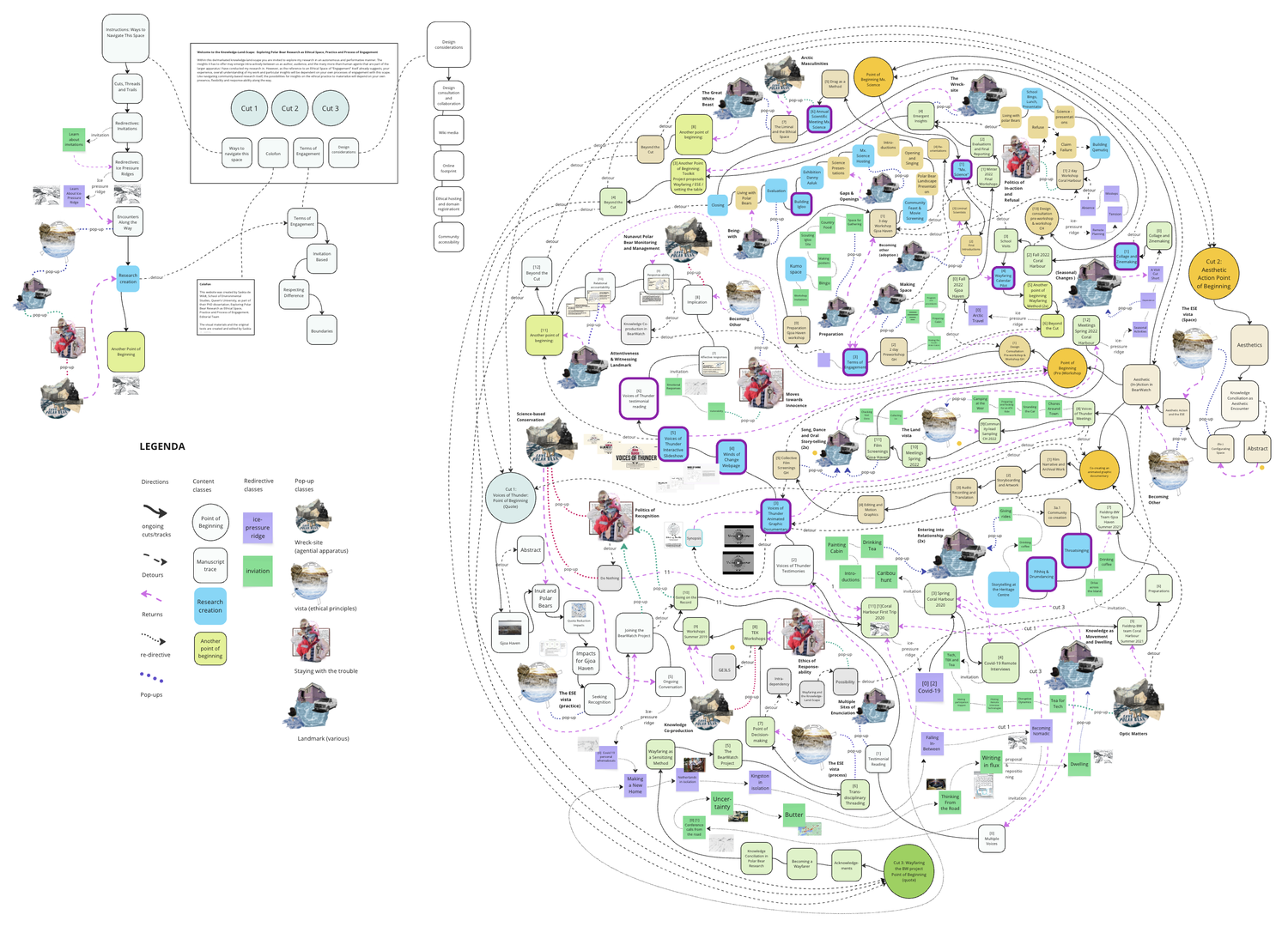
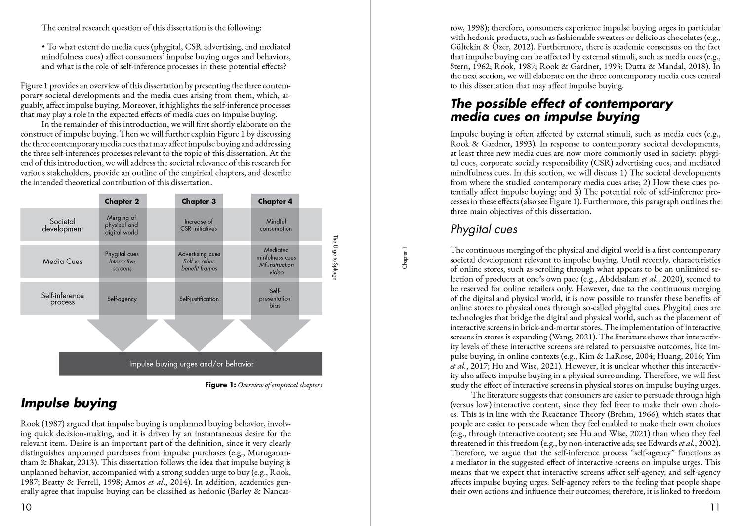
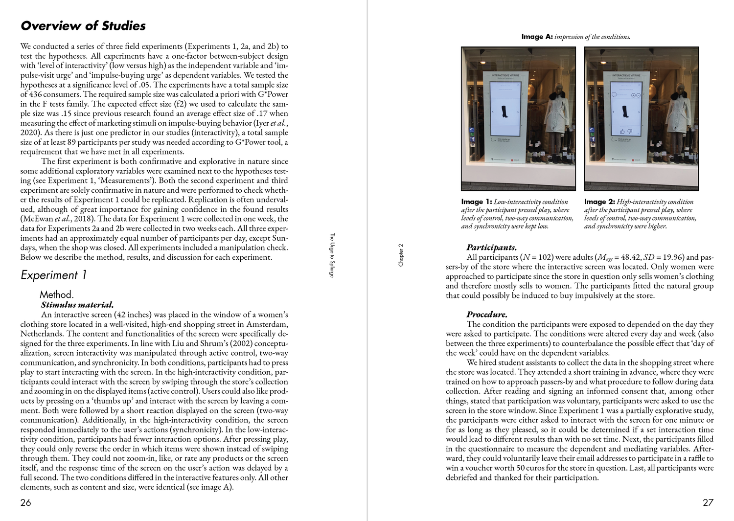
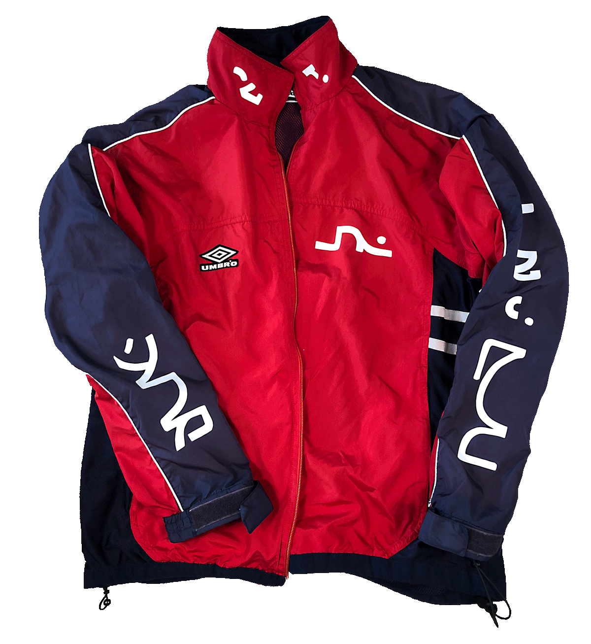
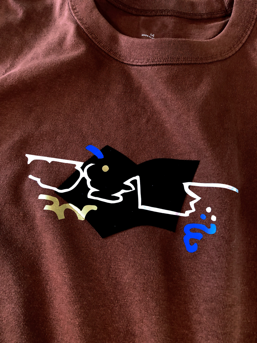
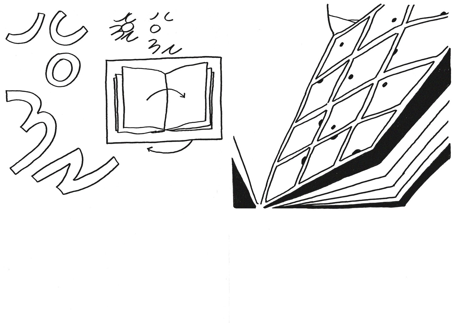
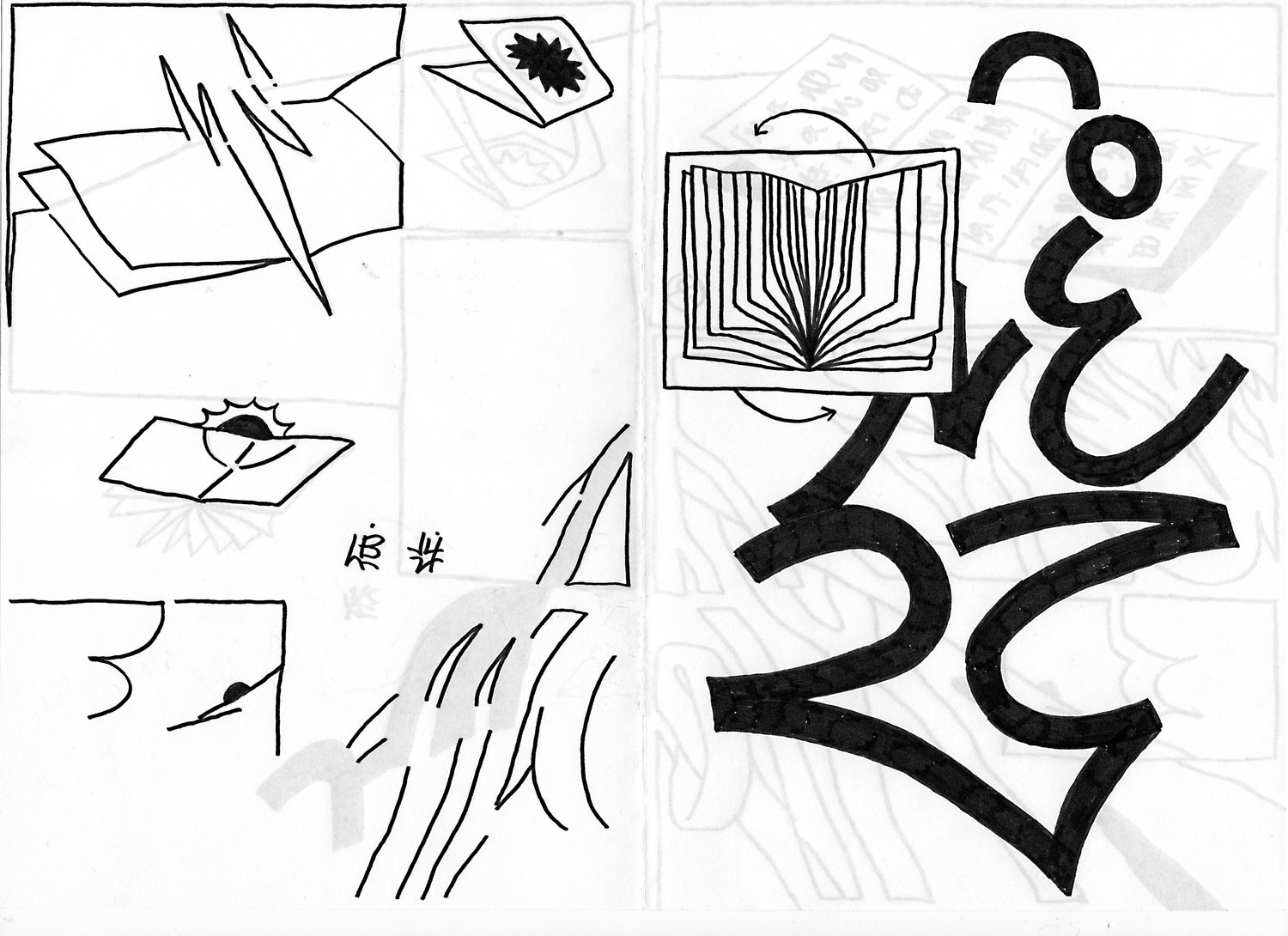
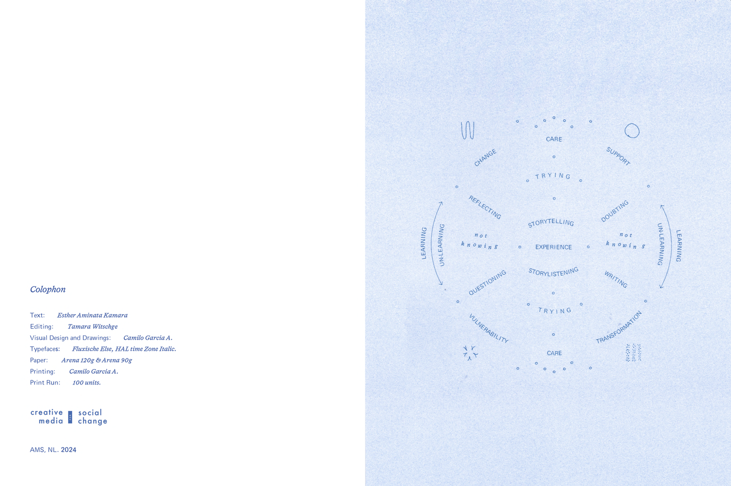
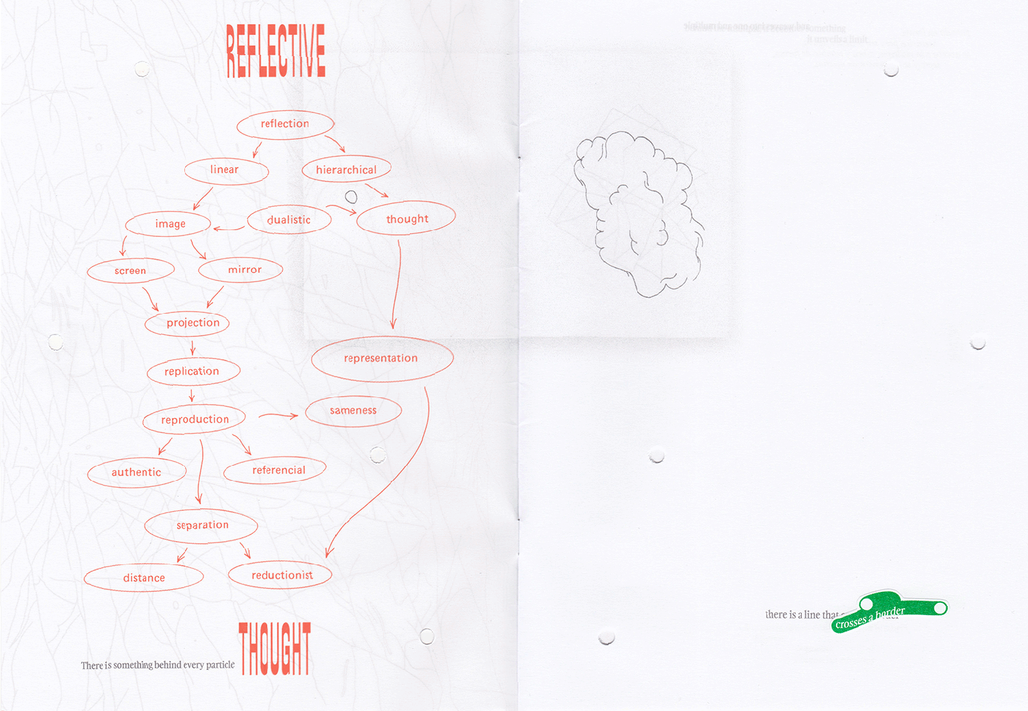
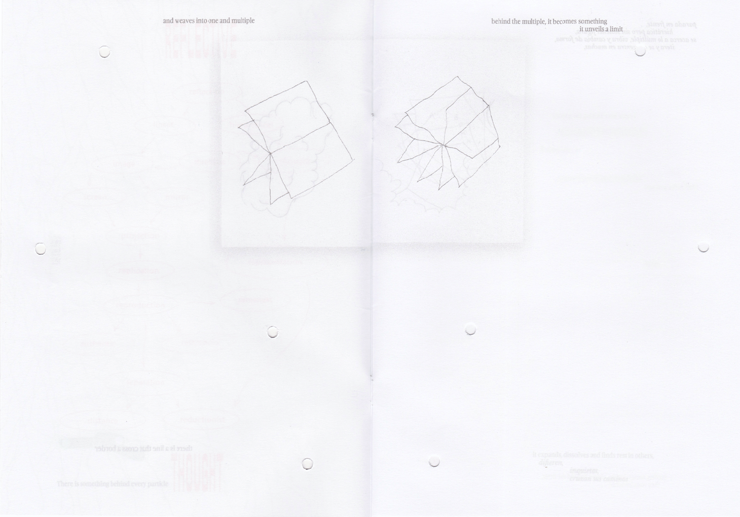
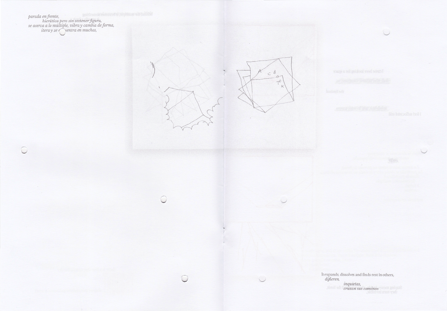
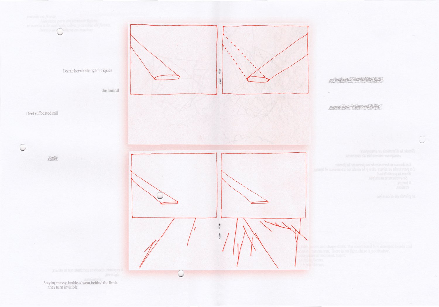
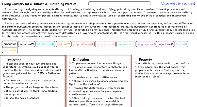
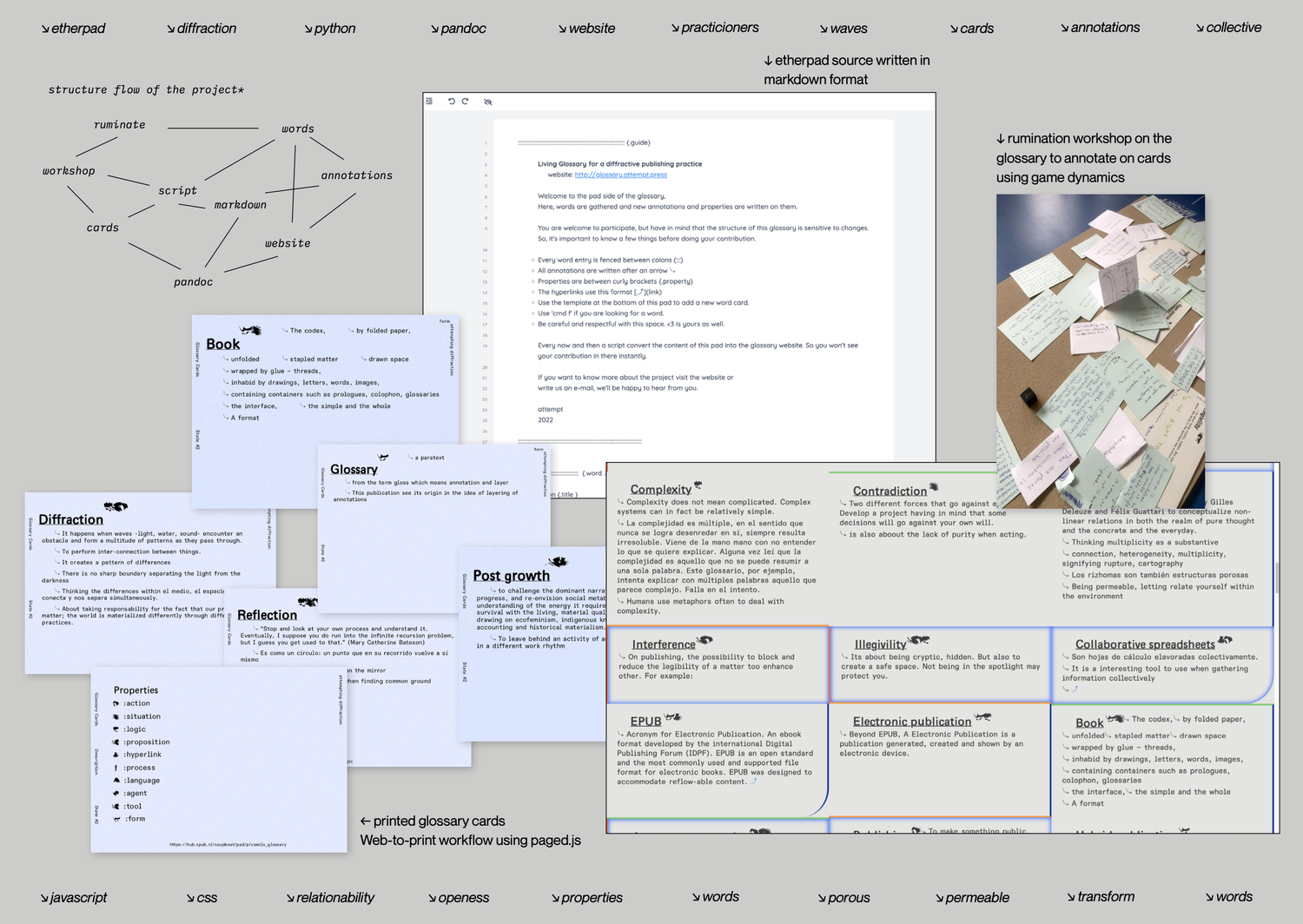
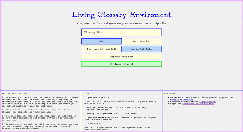
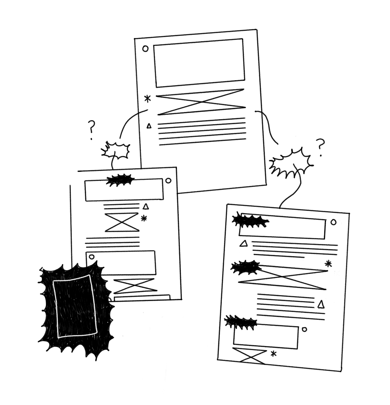
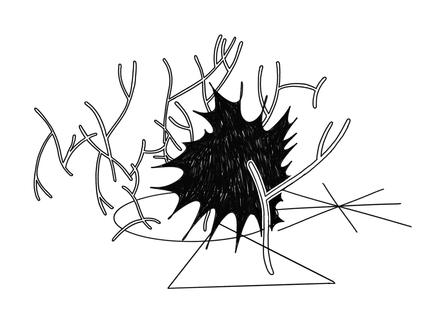
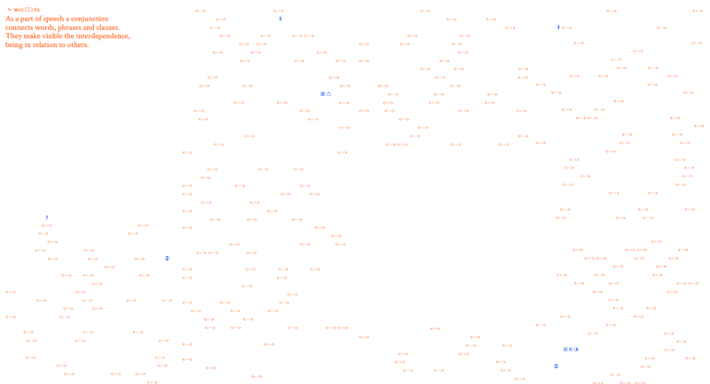
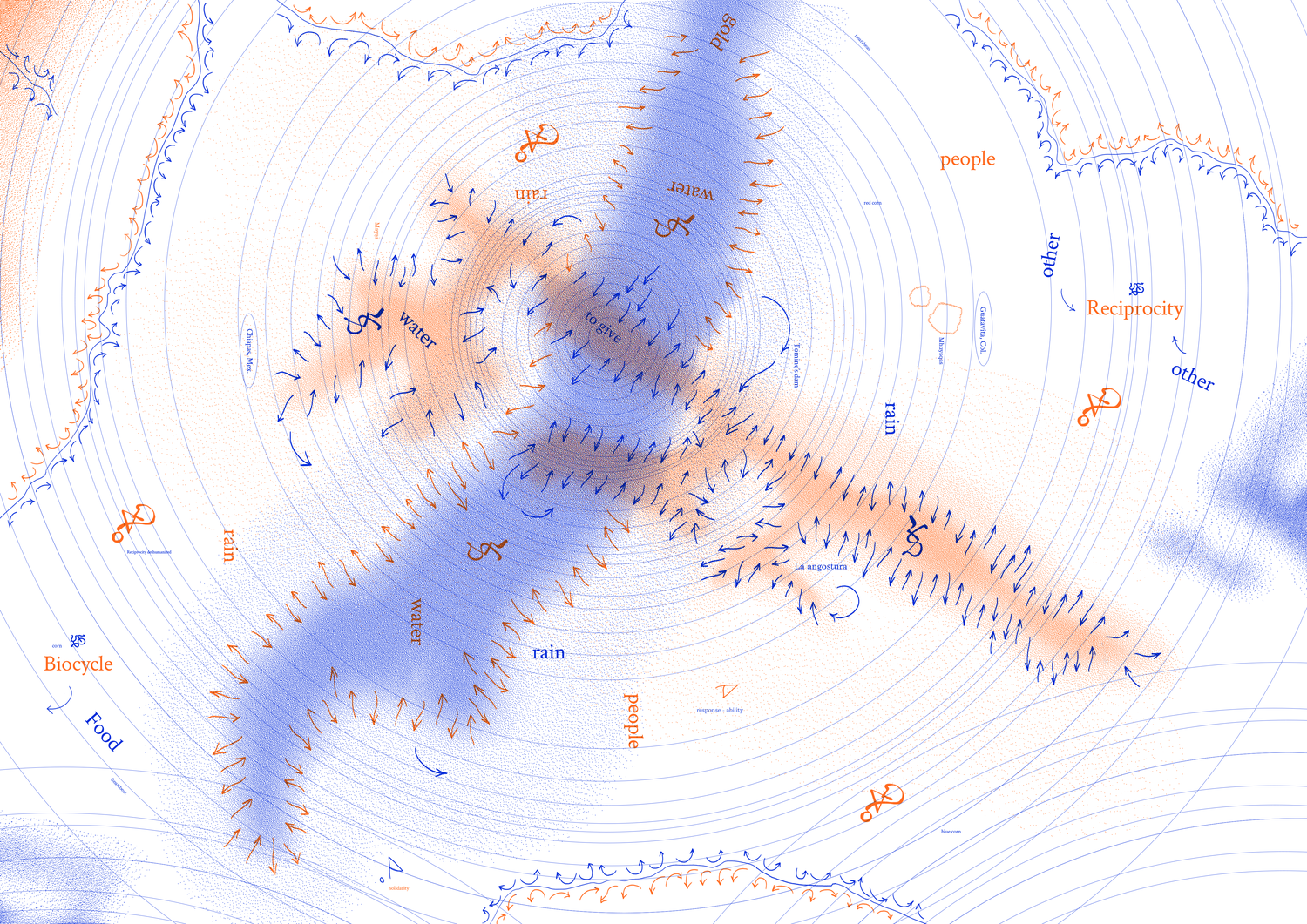
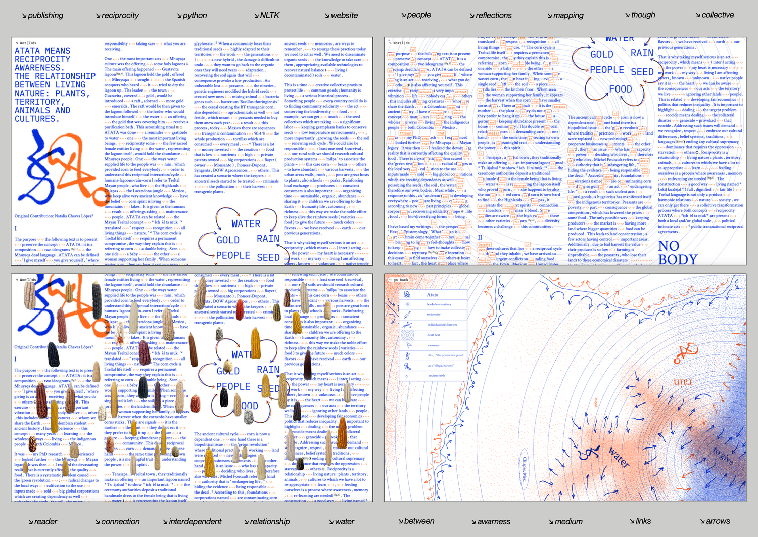
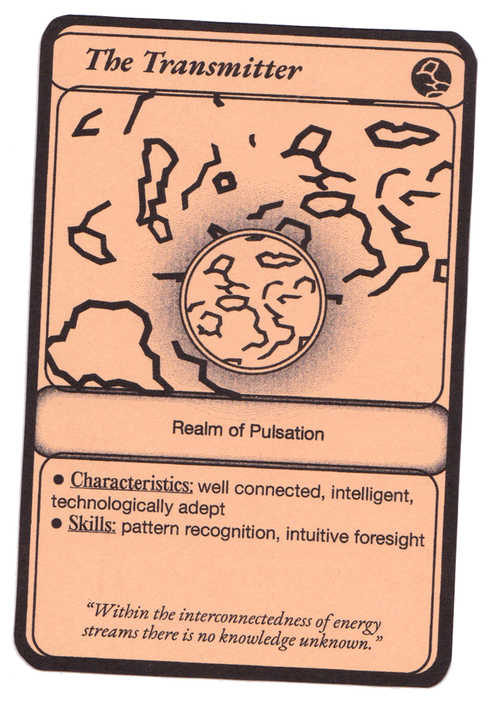
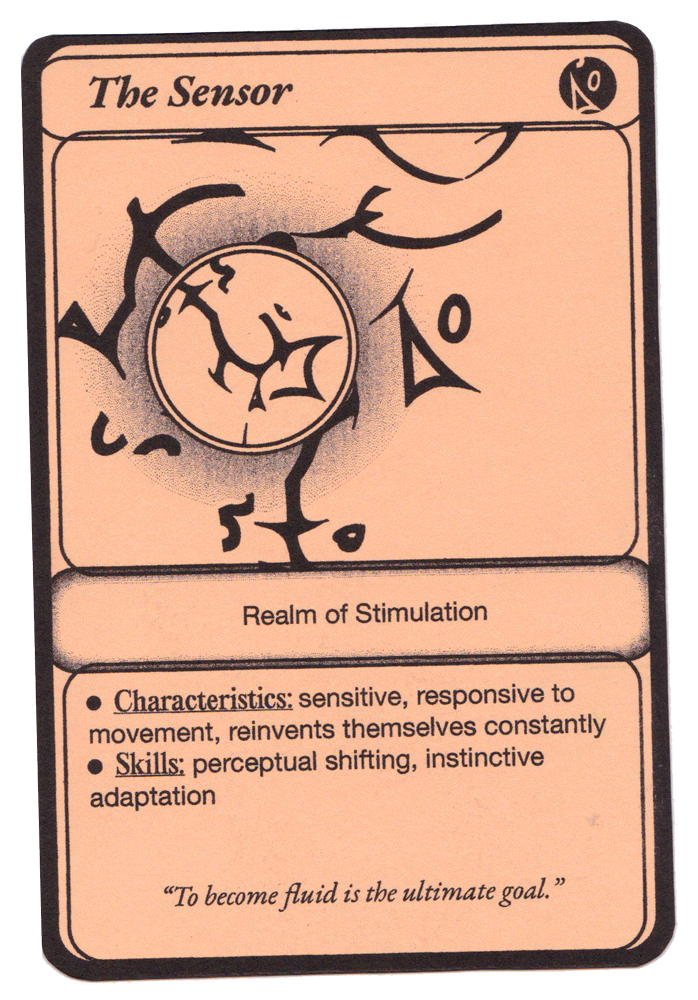
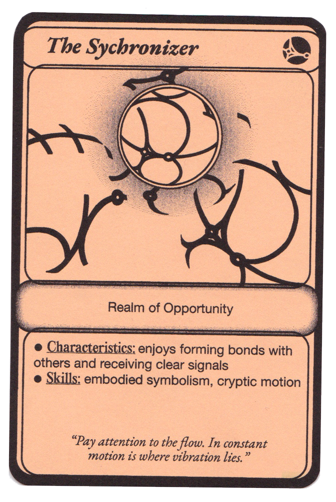
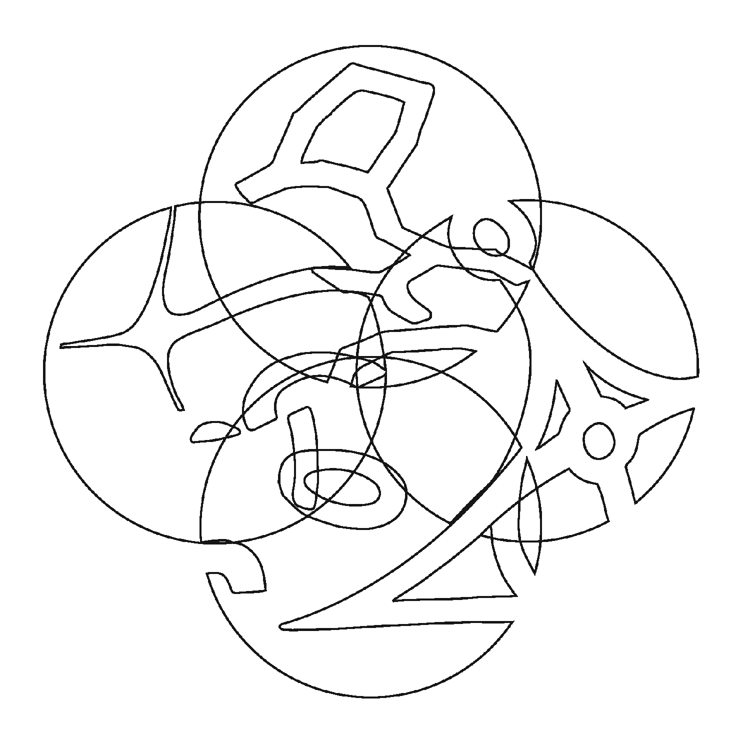
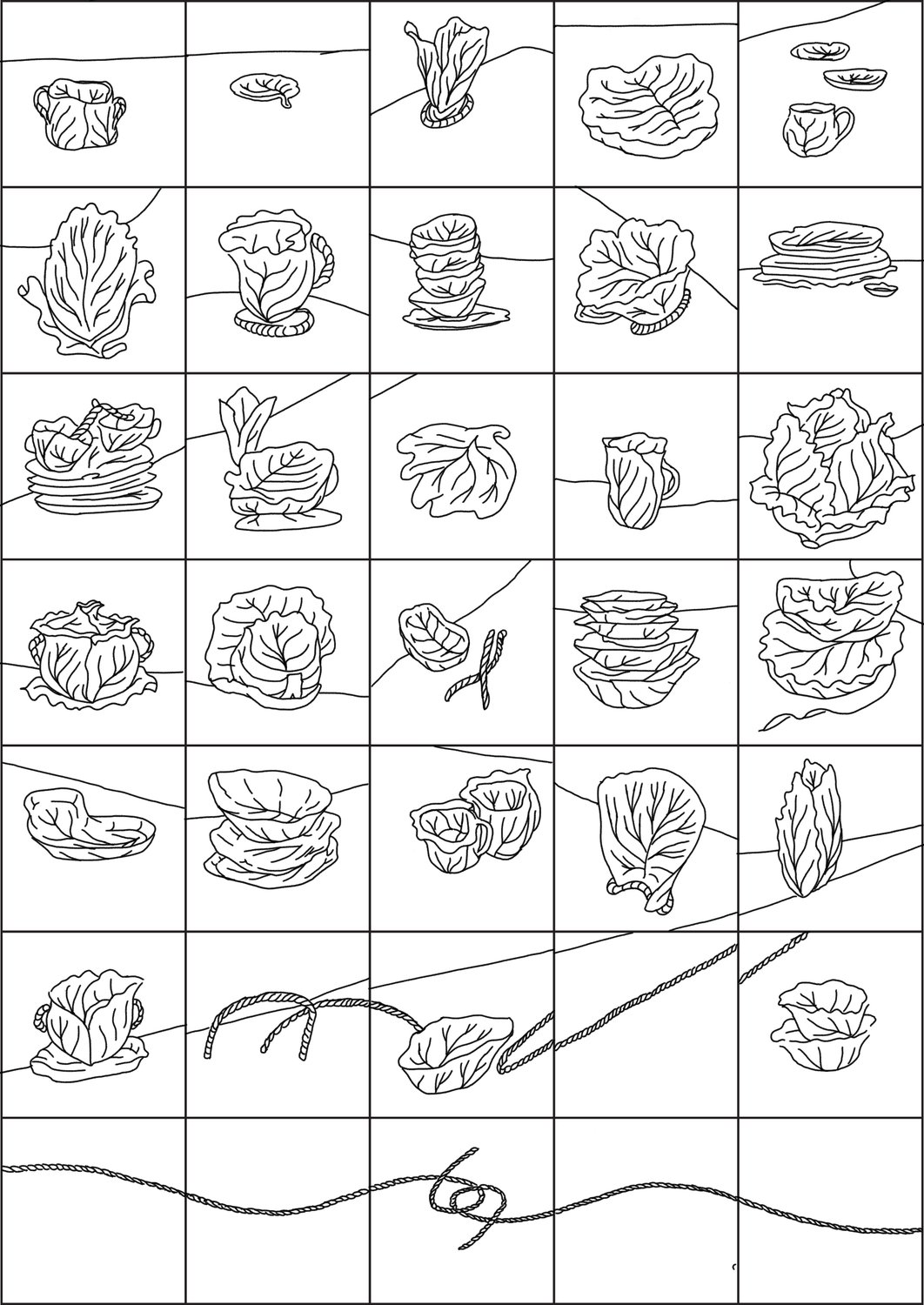
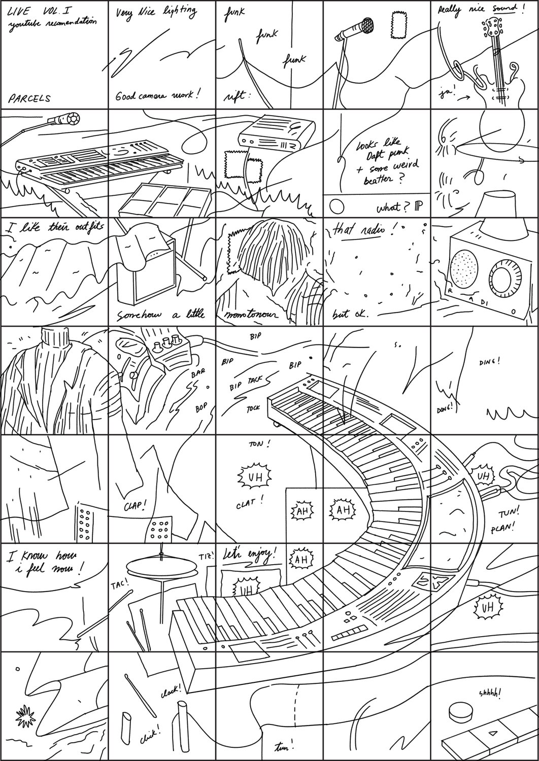
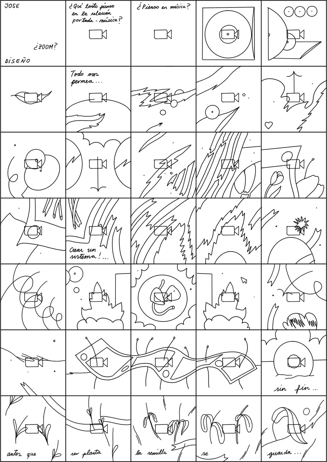
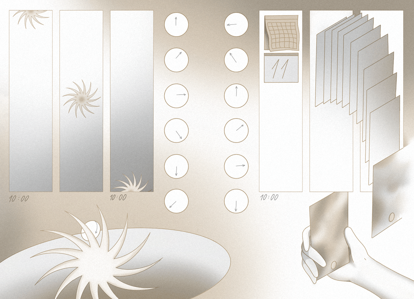
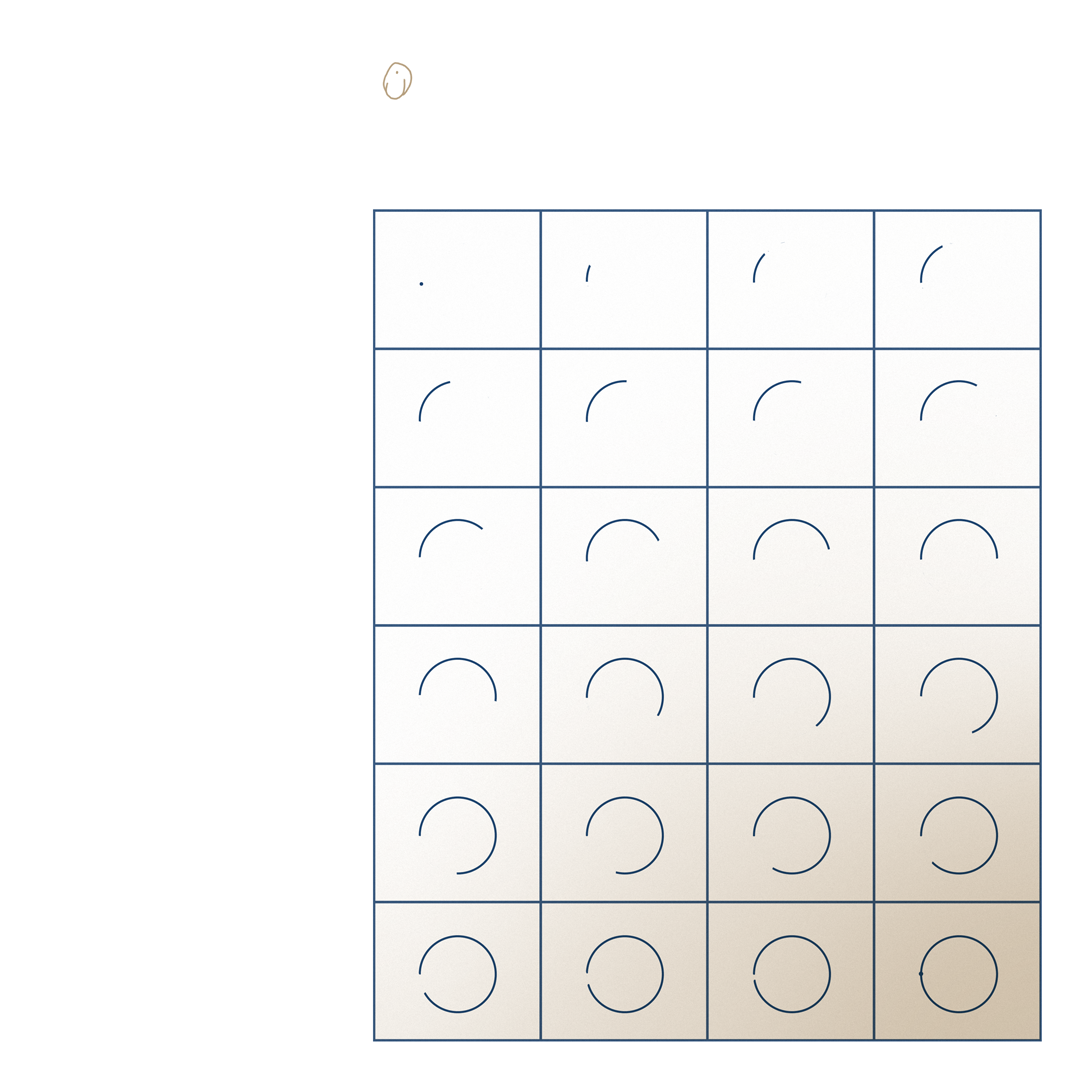
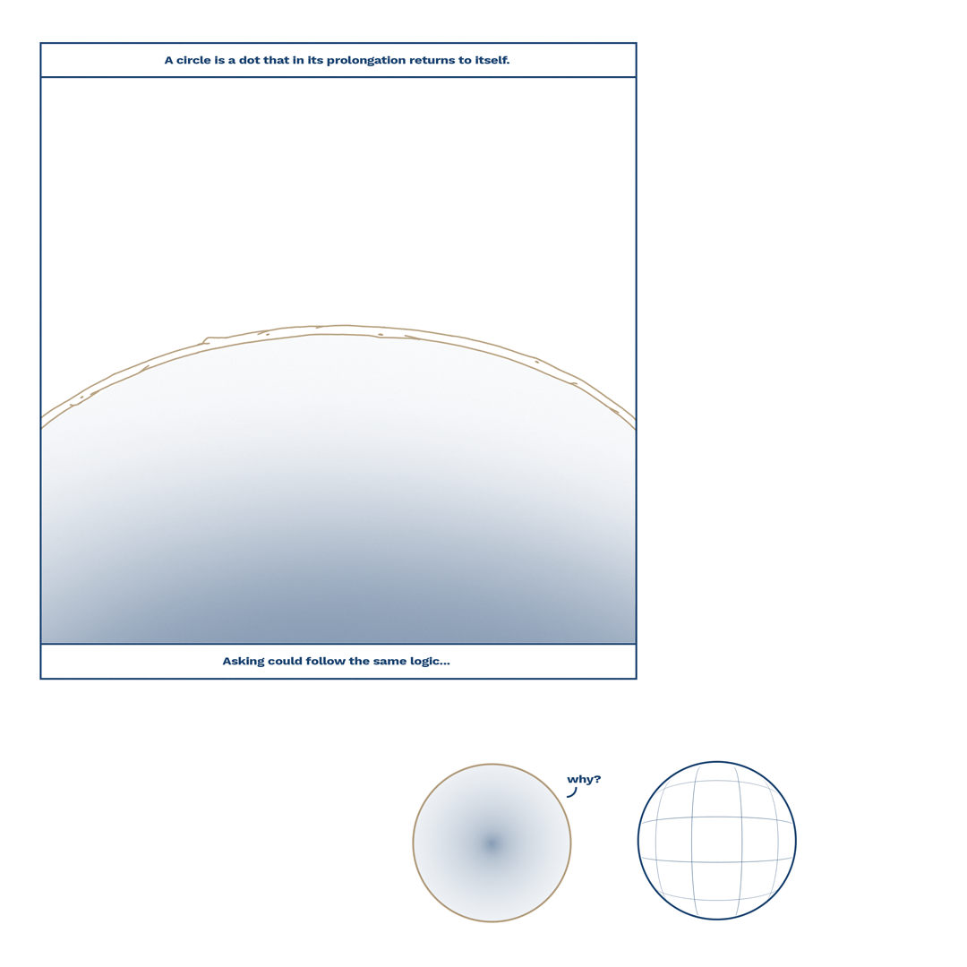
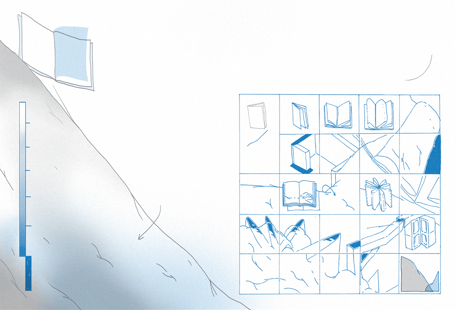
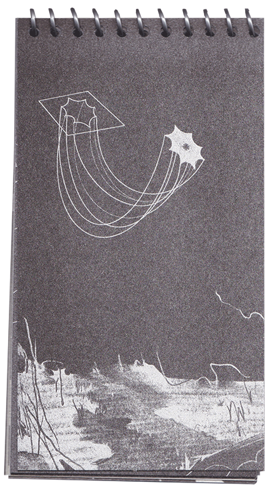
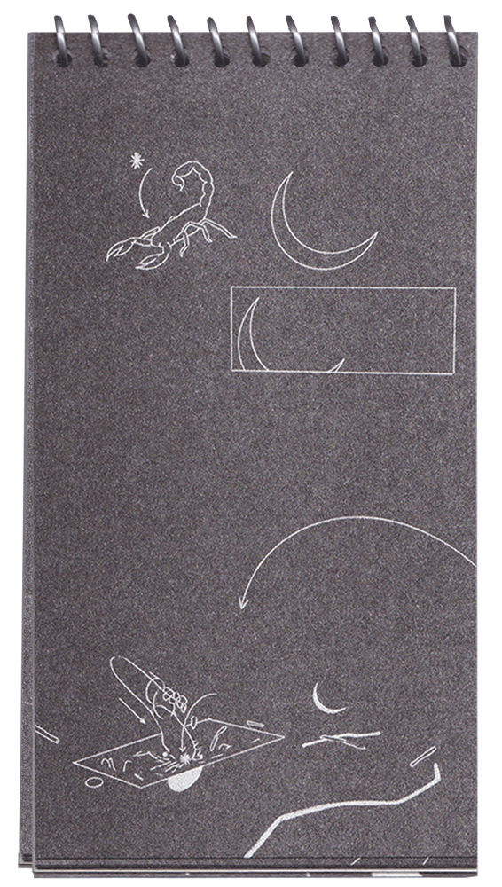
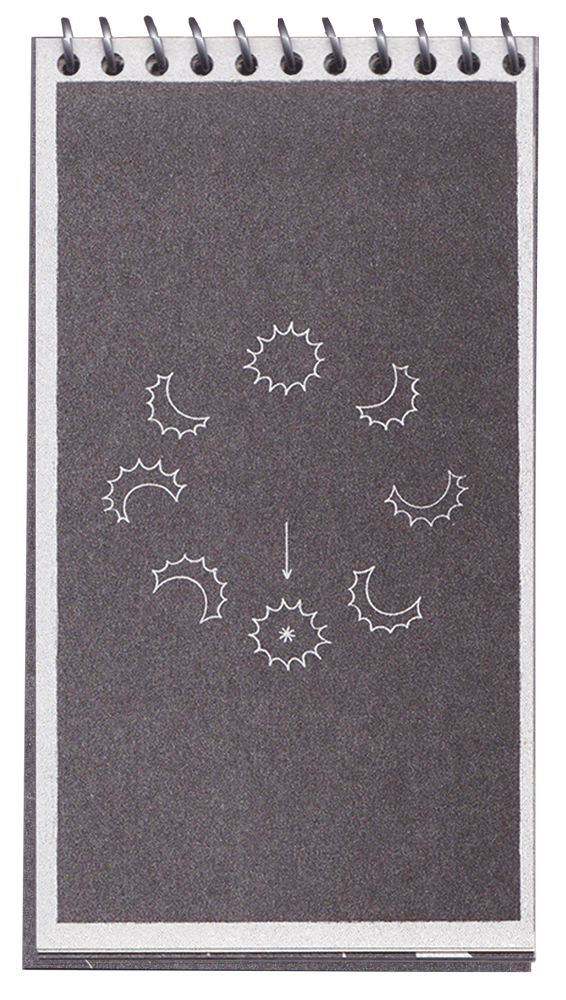
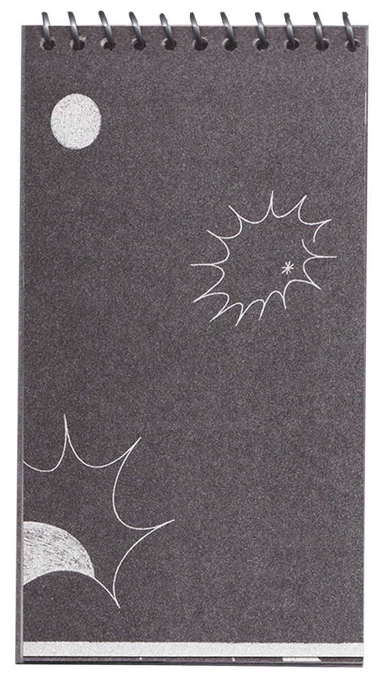
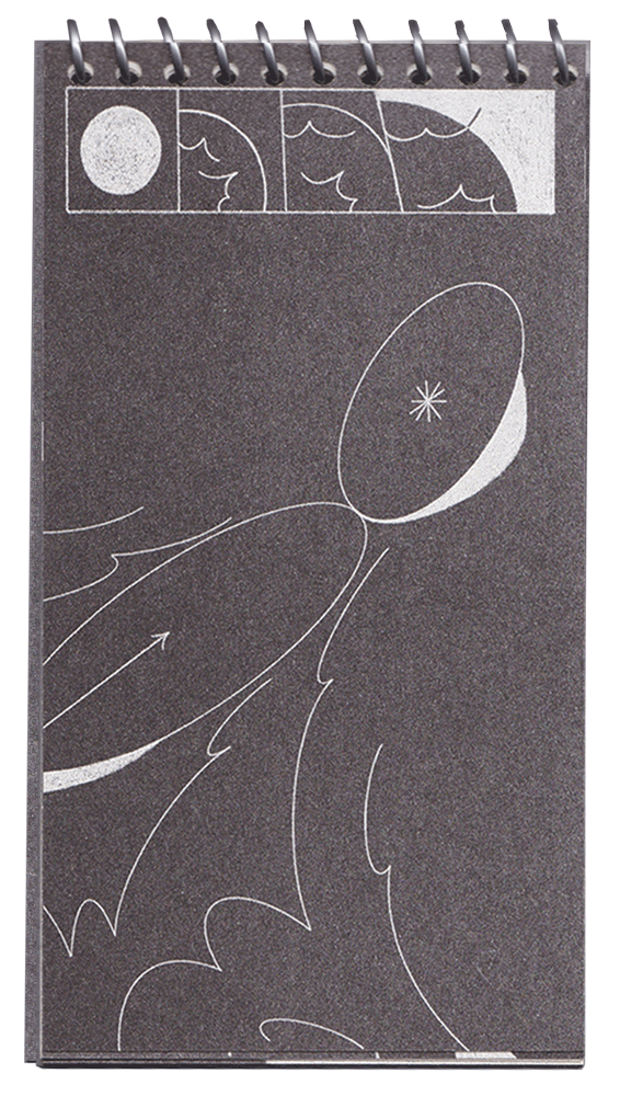
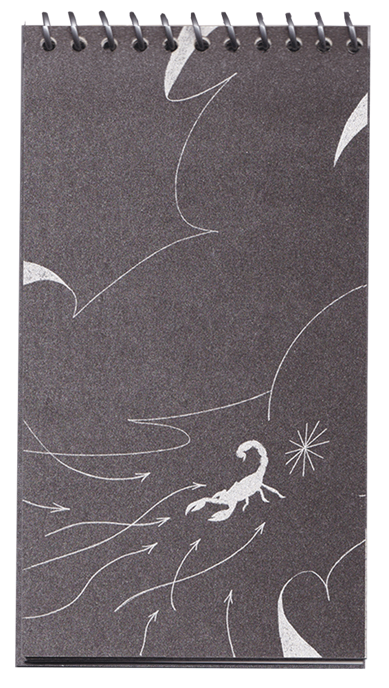
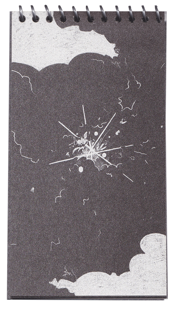
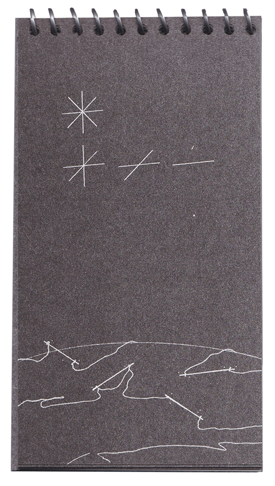
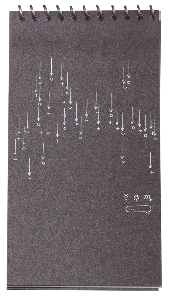
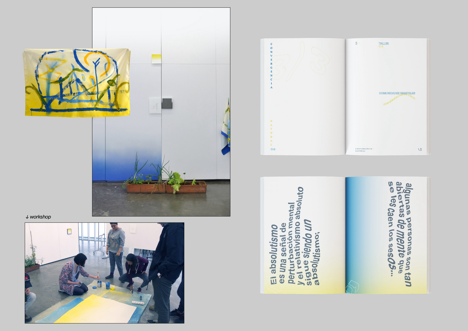
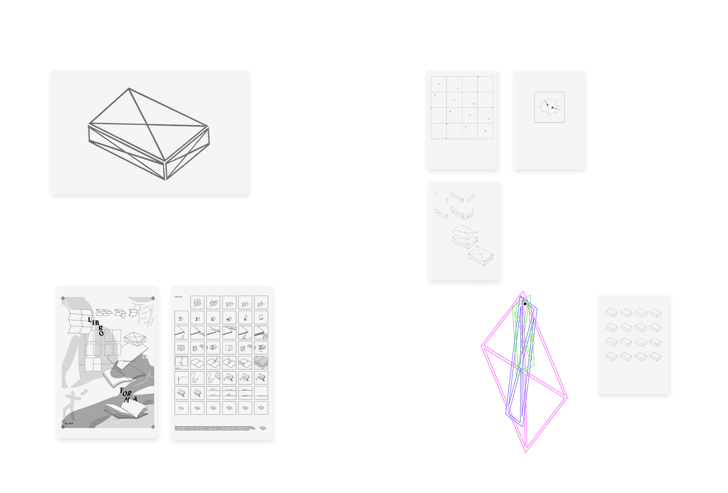
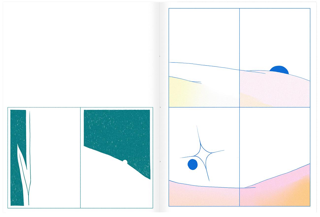
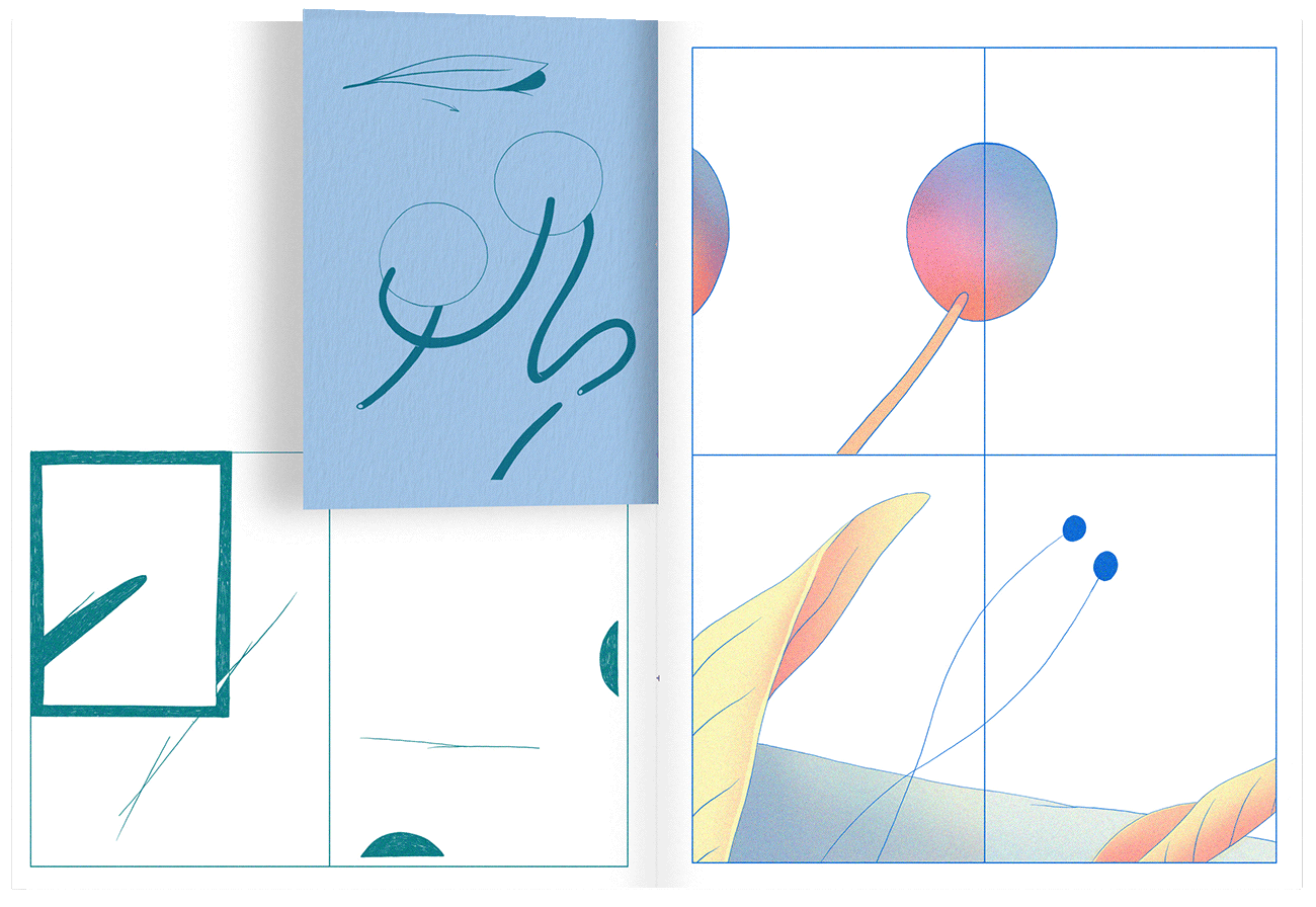
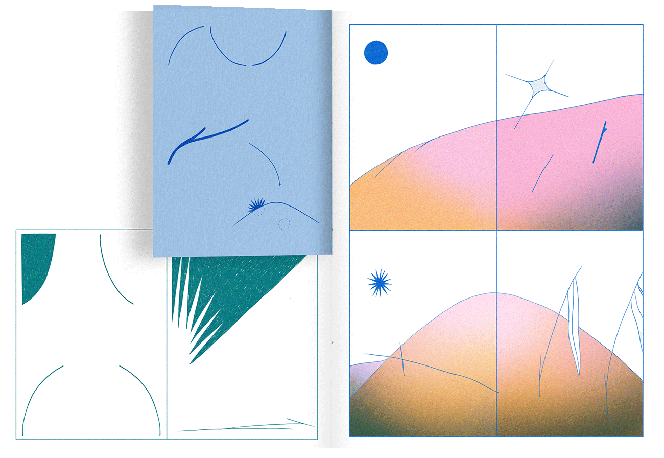
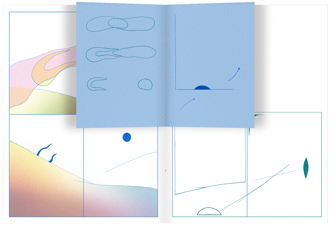
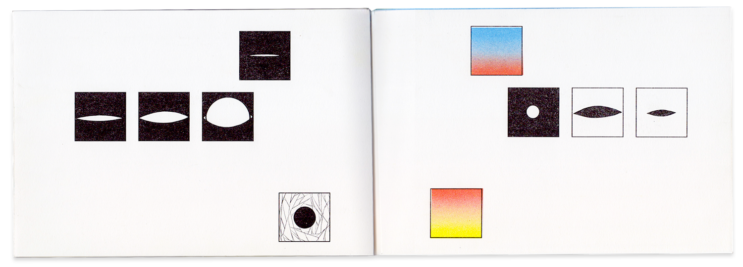
I collaborated with Operate on a conceptual design exploration focused on how complex processes can be represented clearly through visual systems. The project involved publication research, diagram structures, and symbol design, with the goal of proposing a visual language for representing stages, feedback loops, and execution flows in Sales.
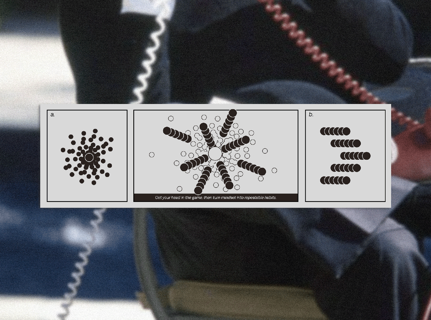
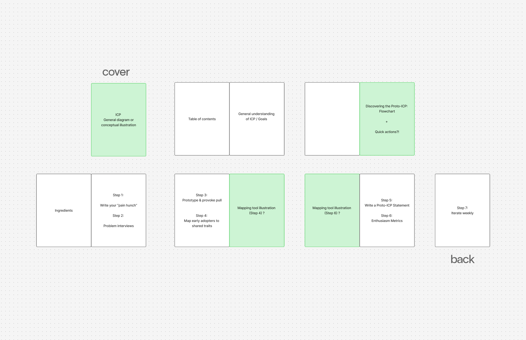
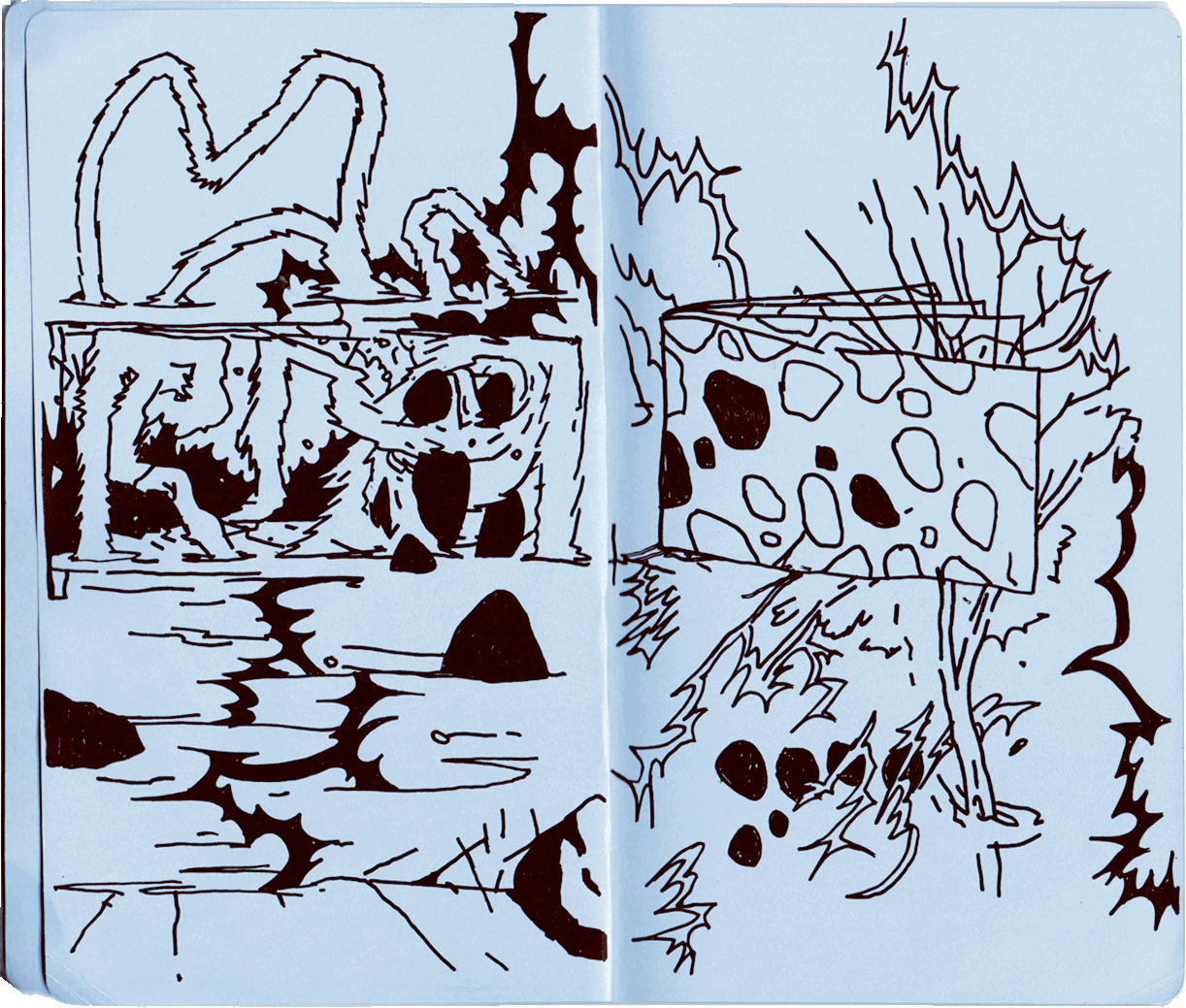
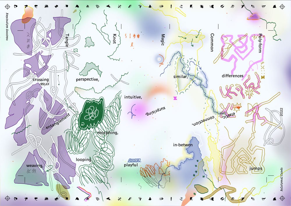
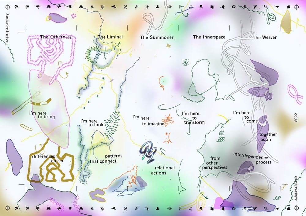
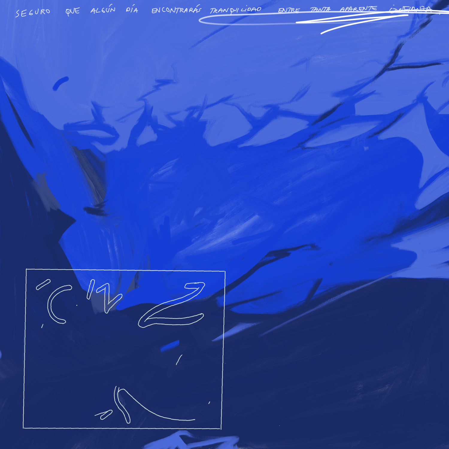
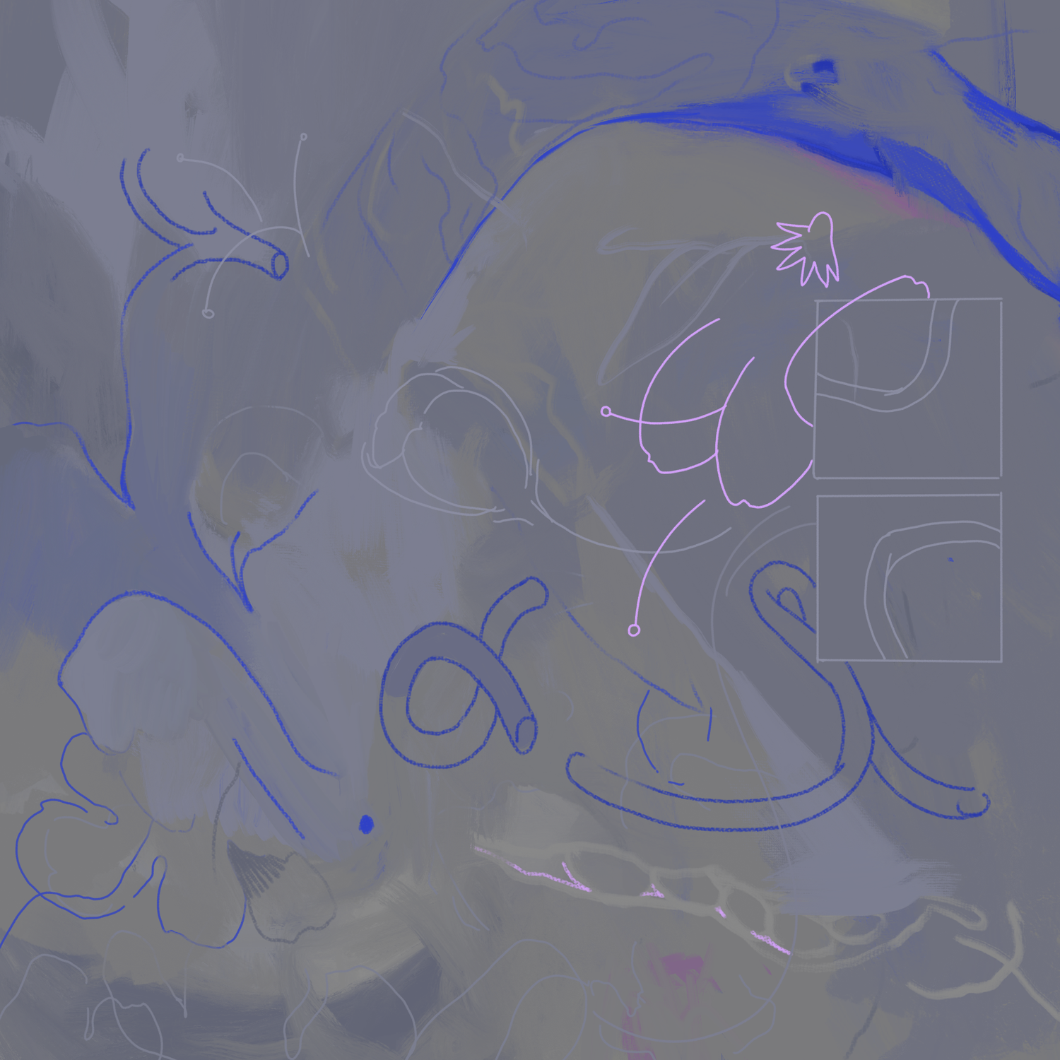
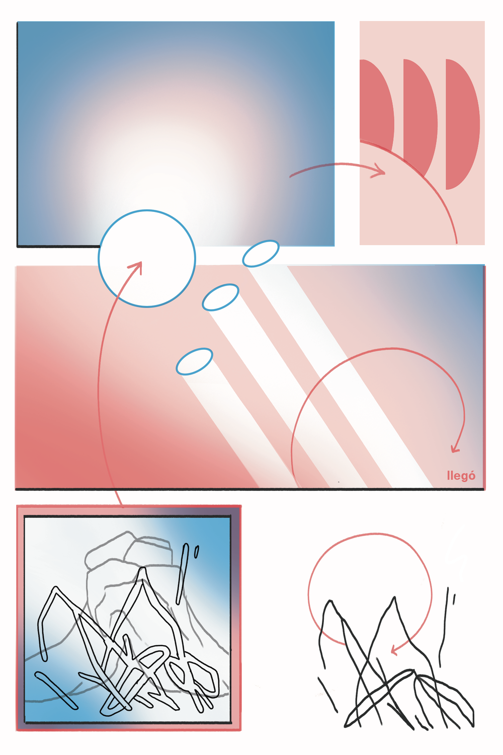
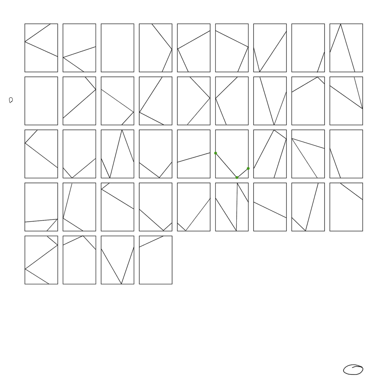
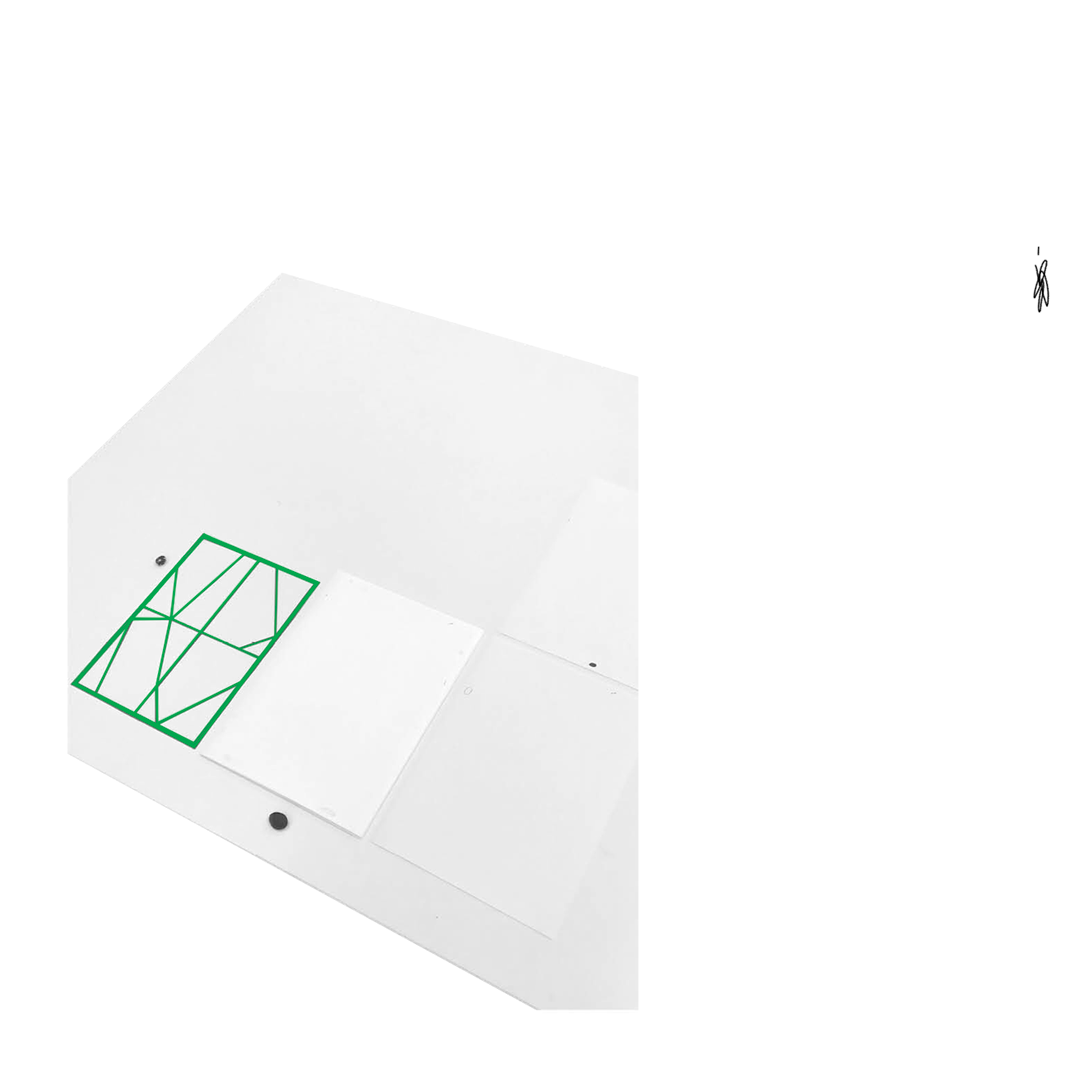
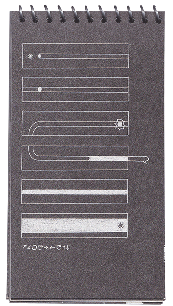
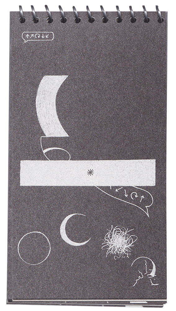
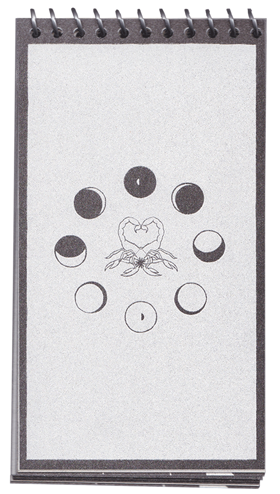
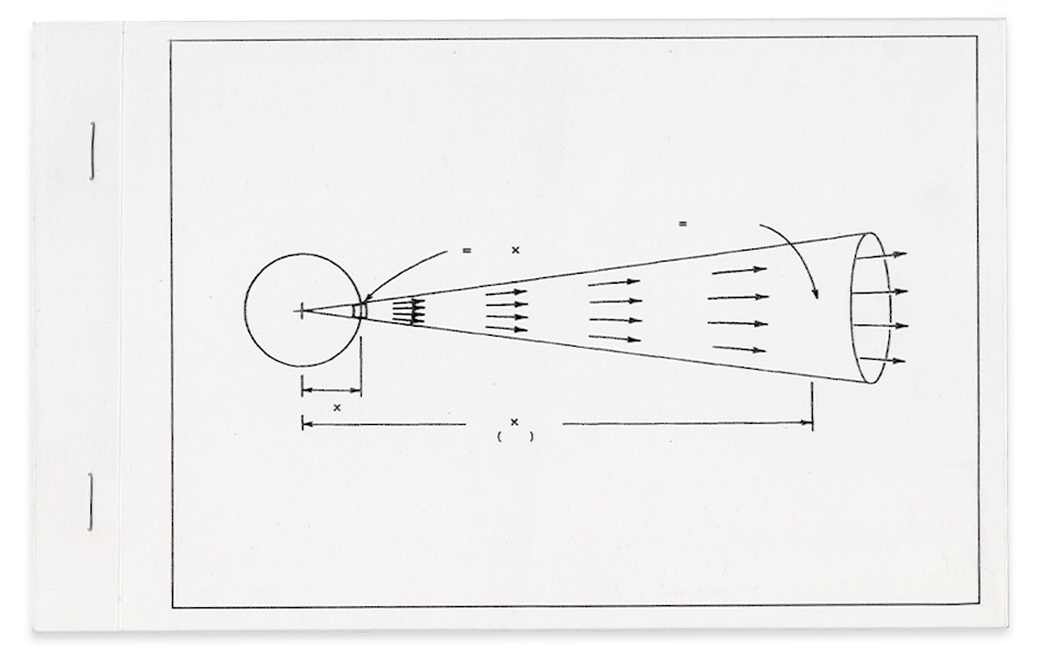
We developed multiple conceptual directions, mapping how different Sales principles could be translated into diagrams and symbolic systems. The work included mind map sketching, system proposals, and compact/cropped variants, exploring how the same logic could scale across contexts.
Although the final outcome was conceptual and not all assets were implemented, the project produced a broad set of core ideas, visual frameworks, and representational strategies that informed the team’s thinking and work as seeds for future projects.
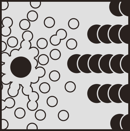
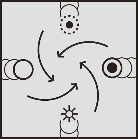
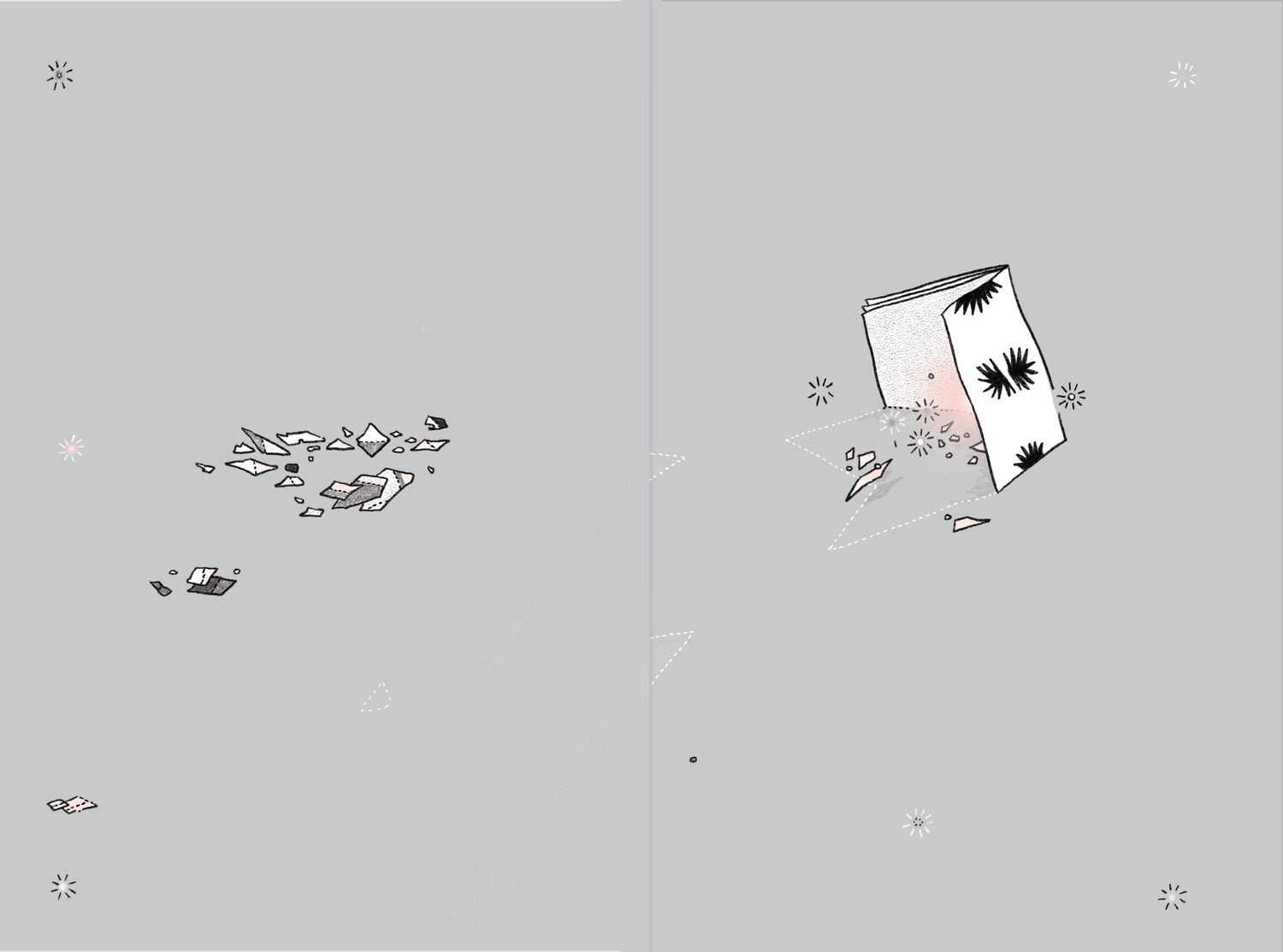
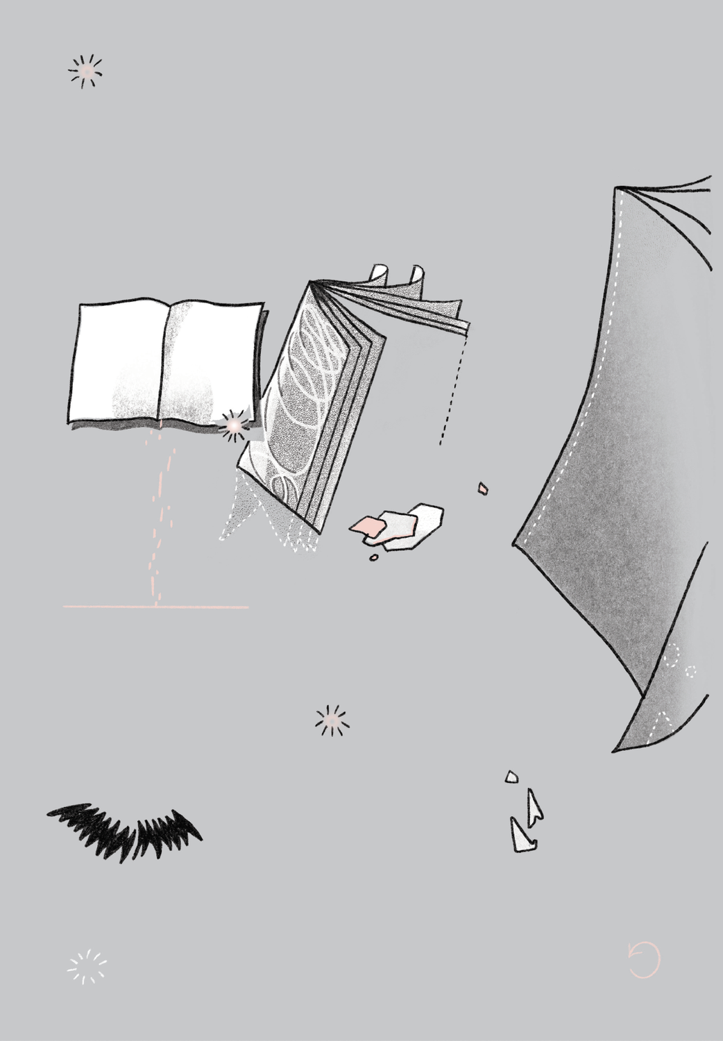
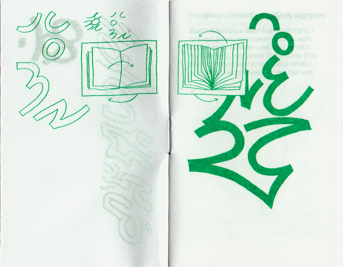
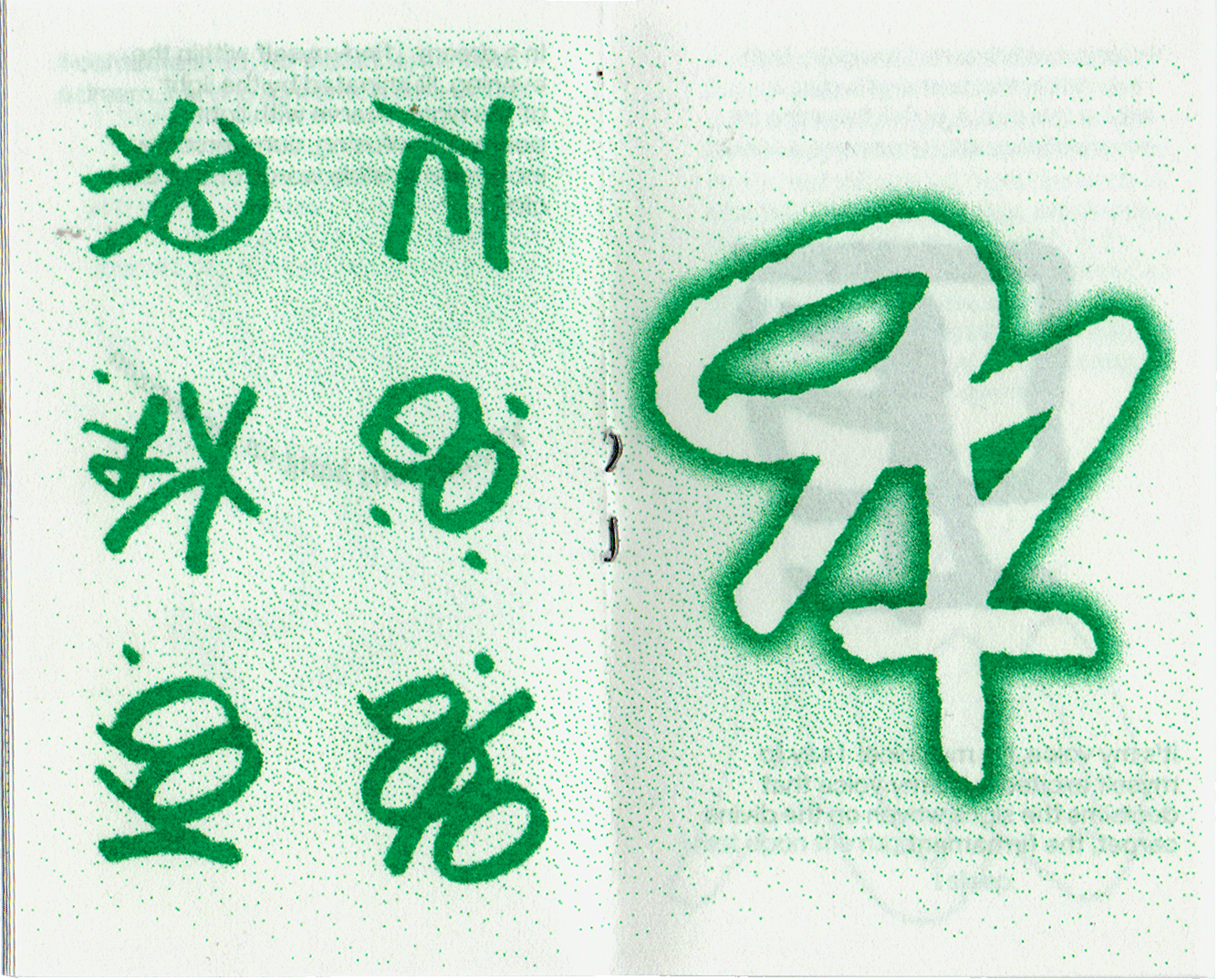
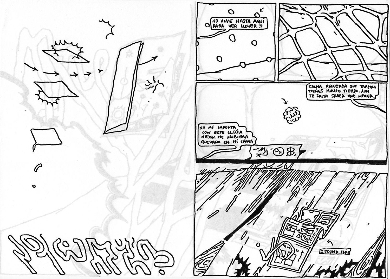
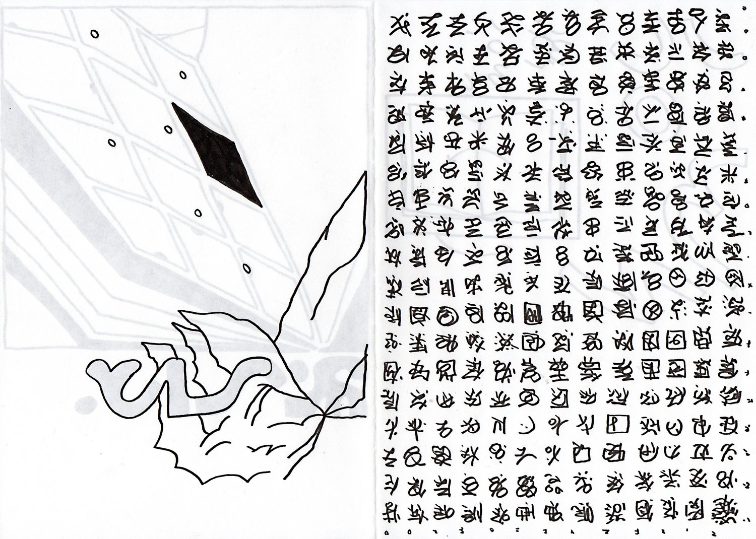
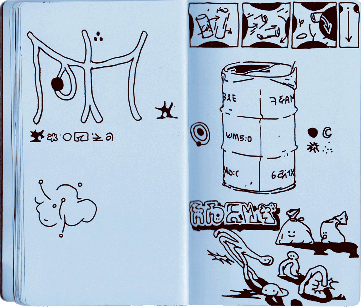
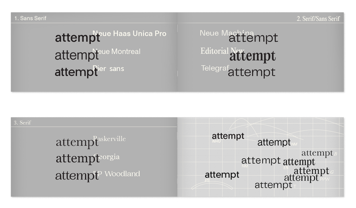
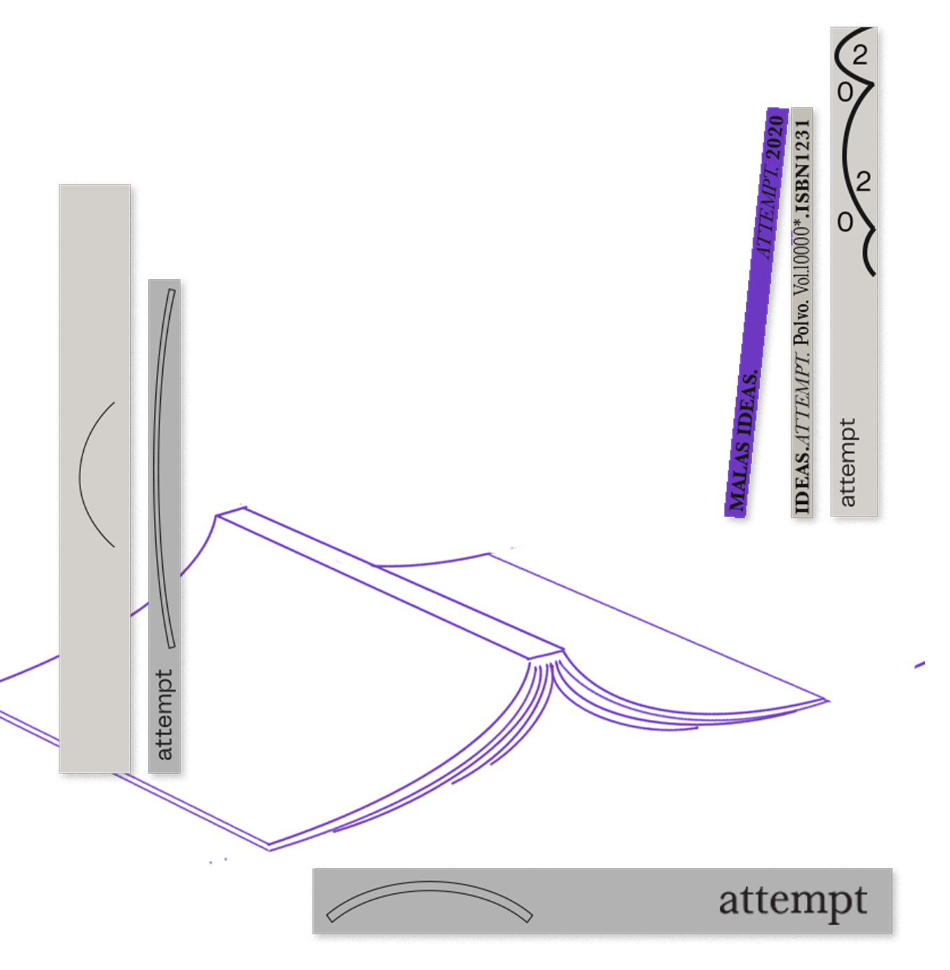
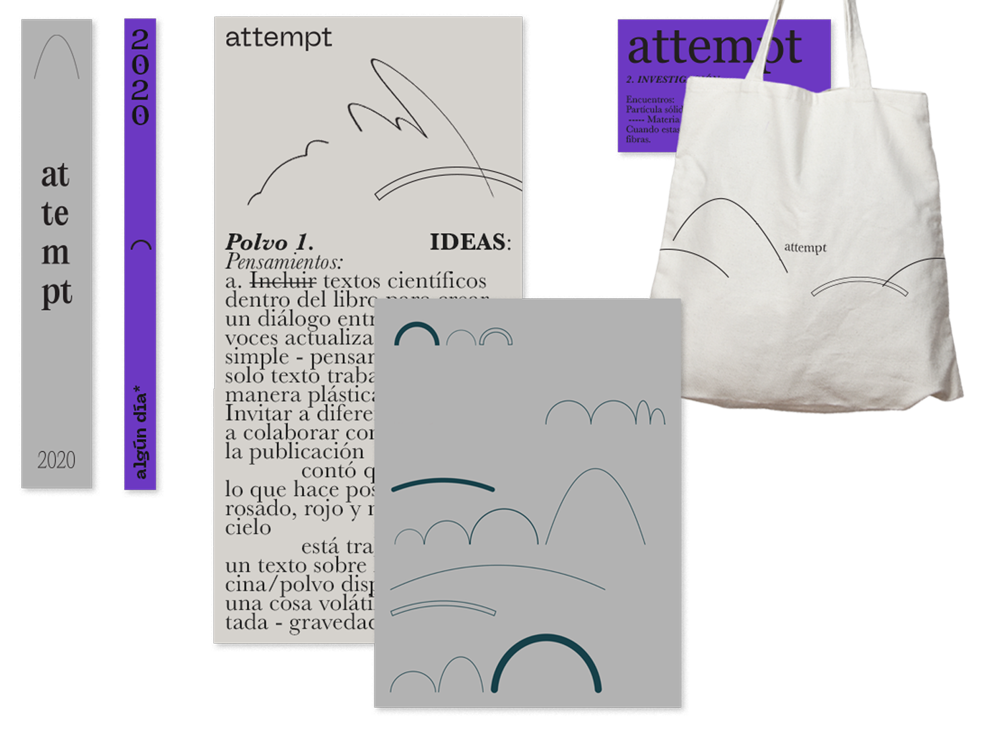
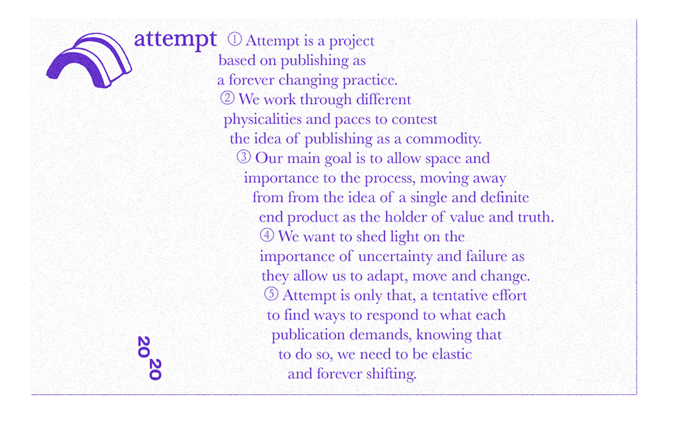
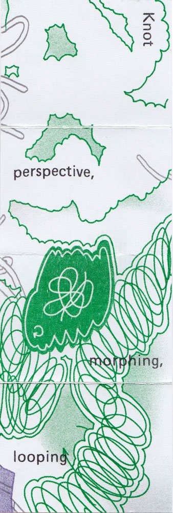
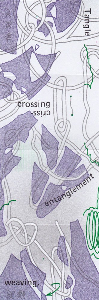
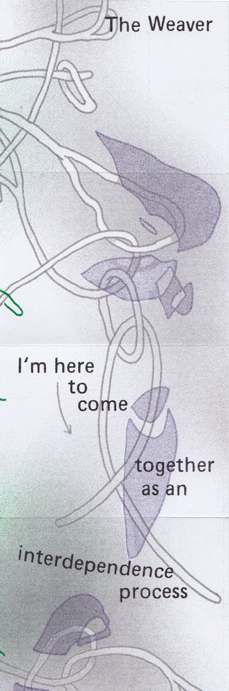
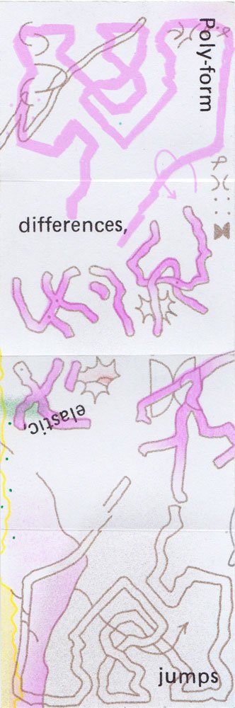
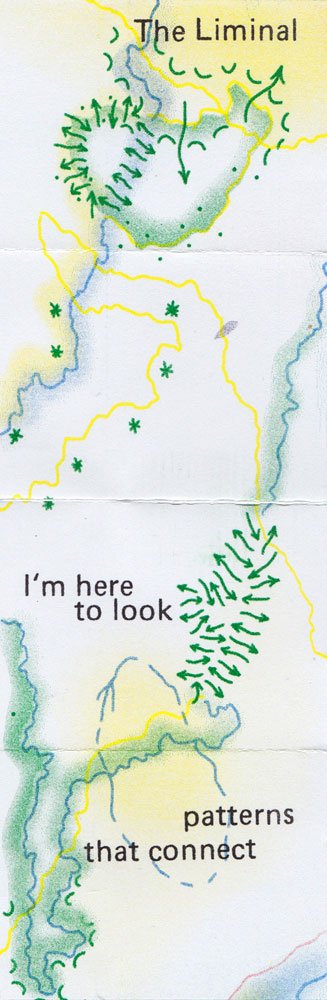
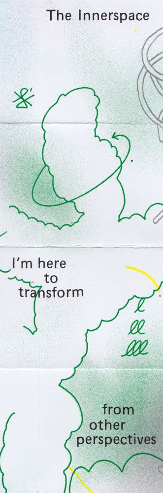
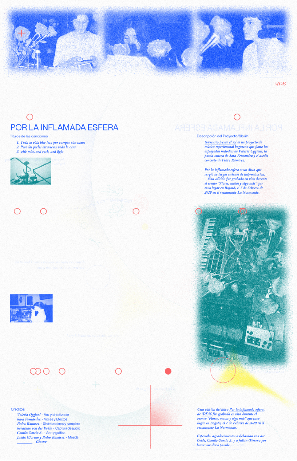
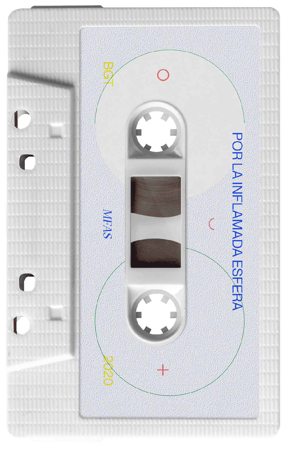
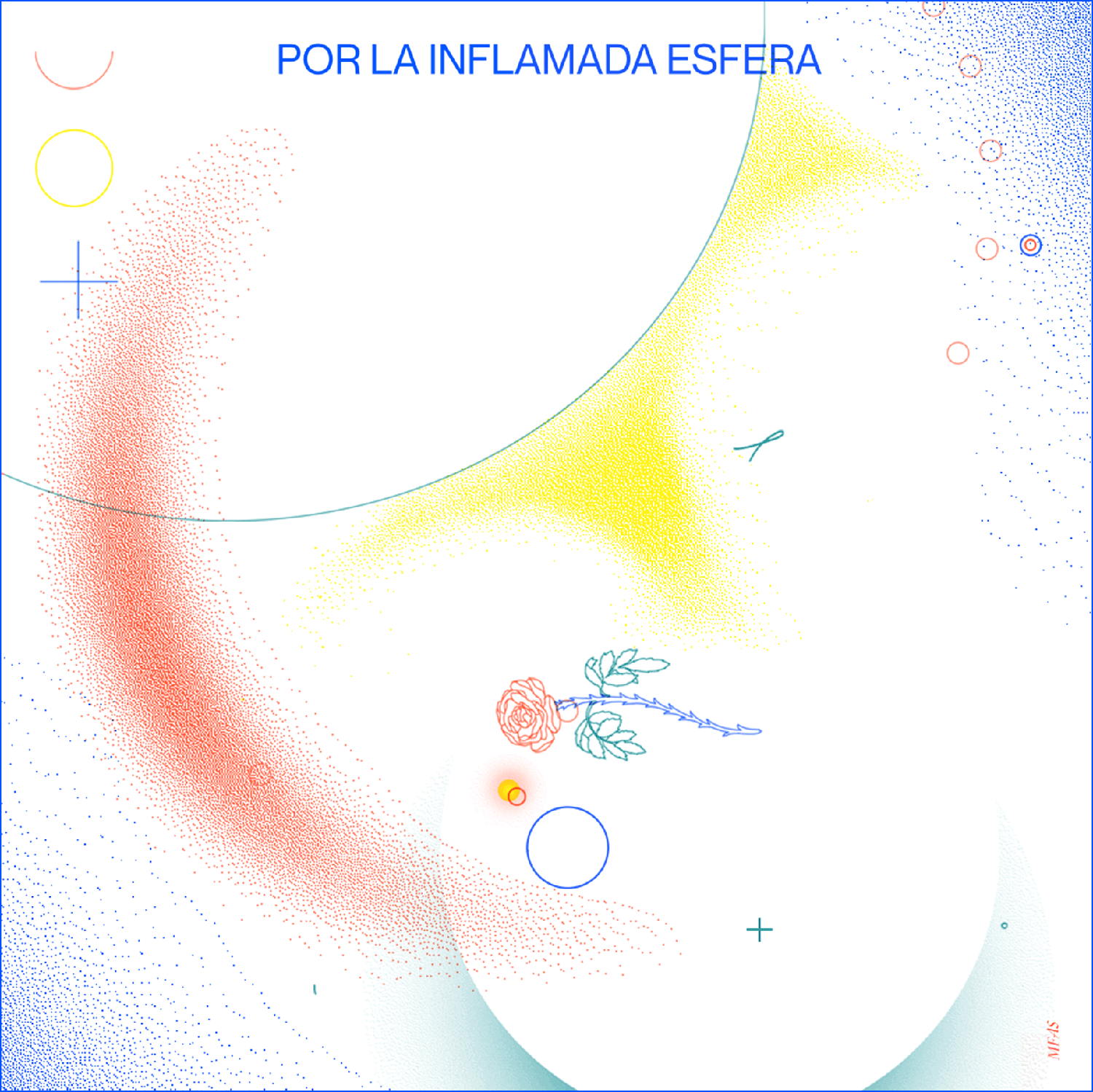
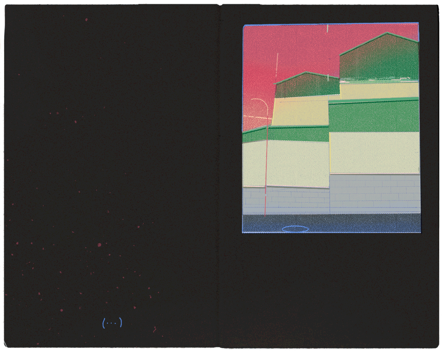
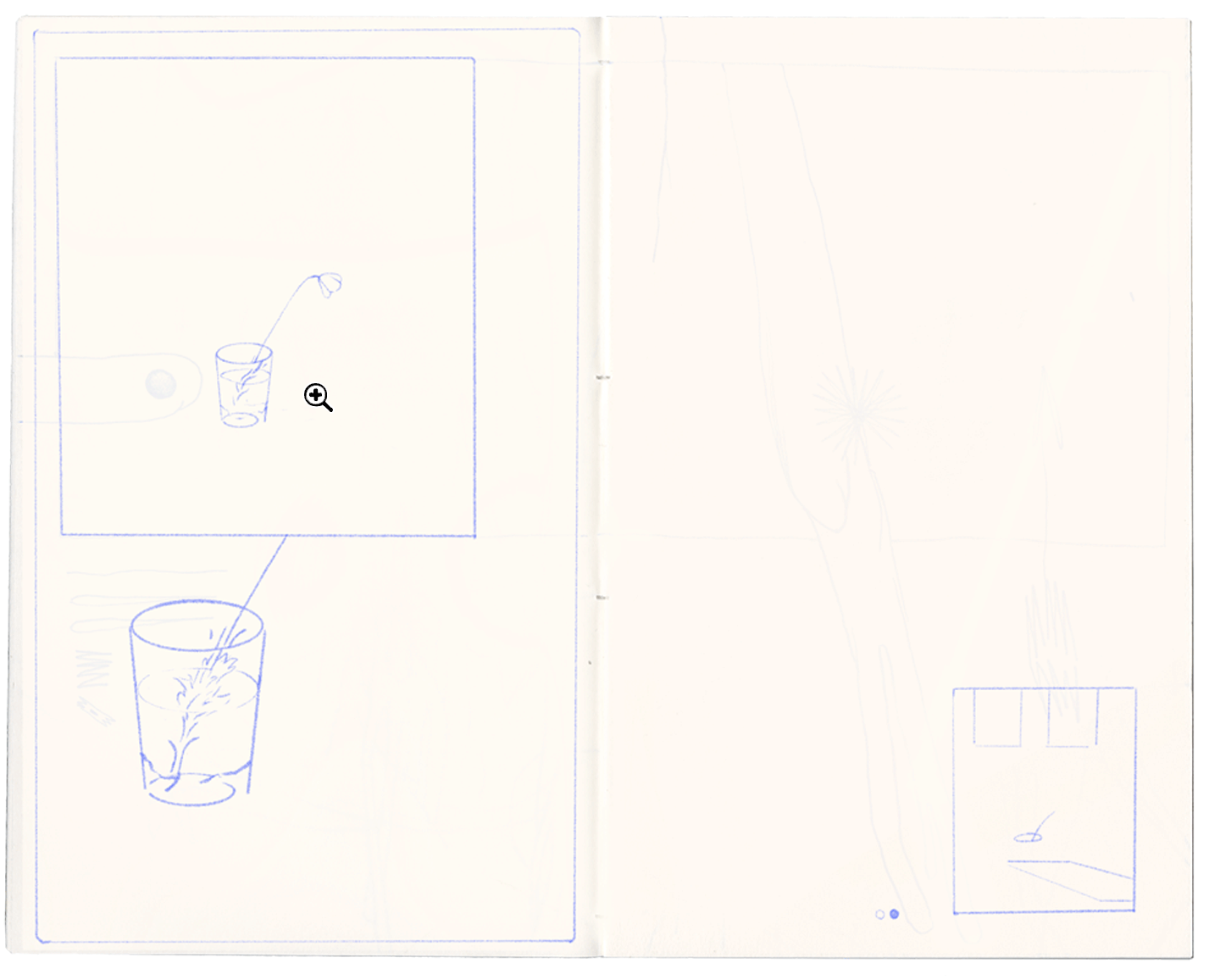
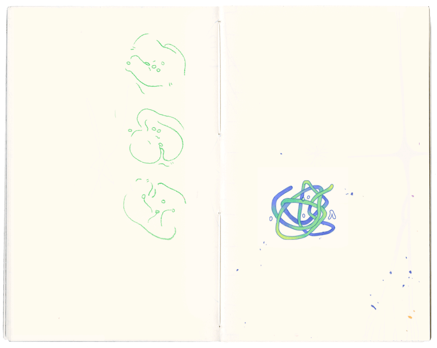
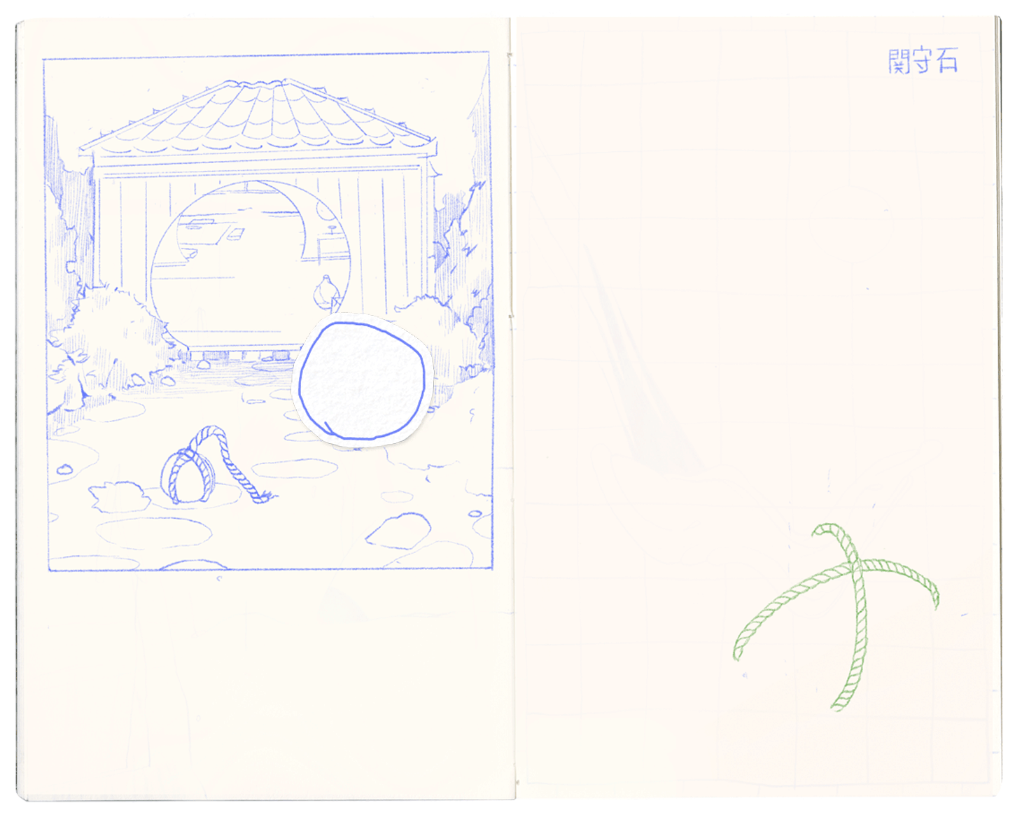
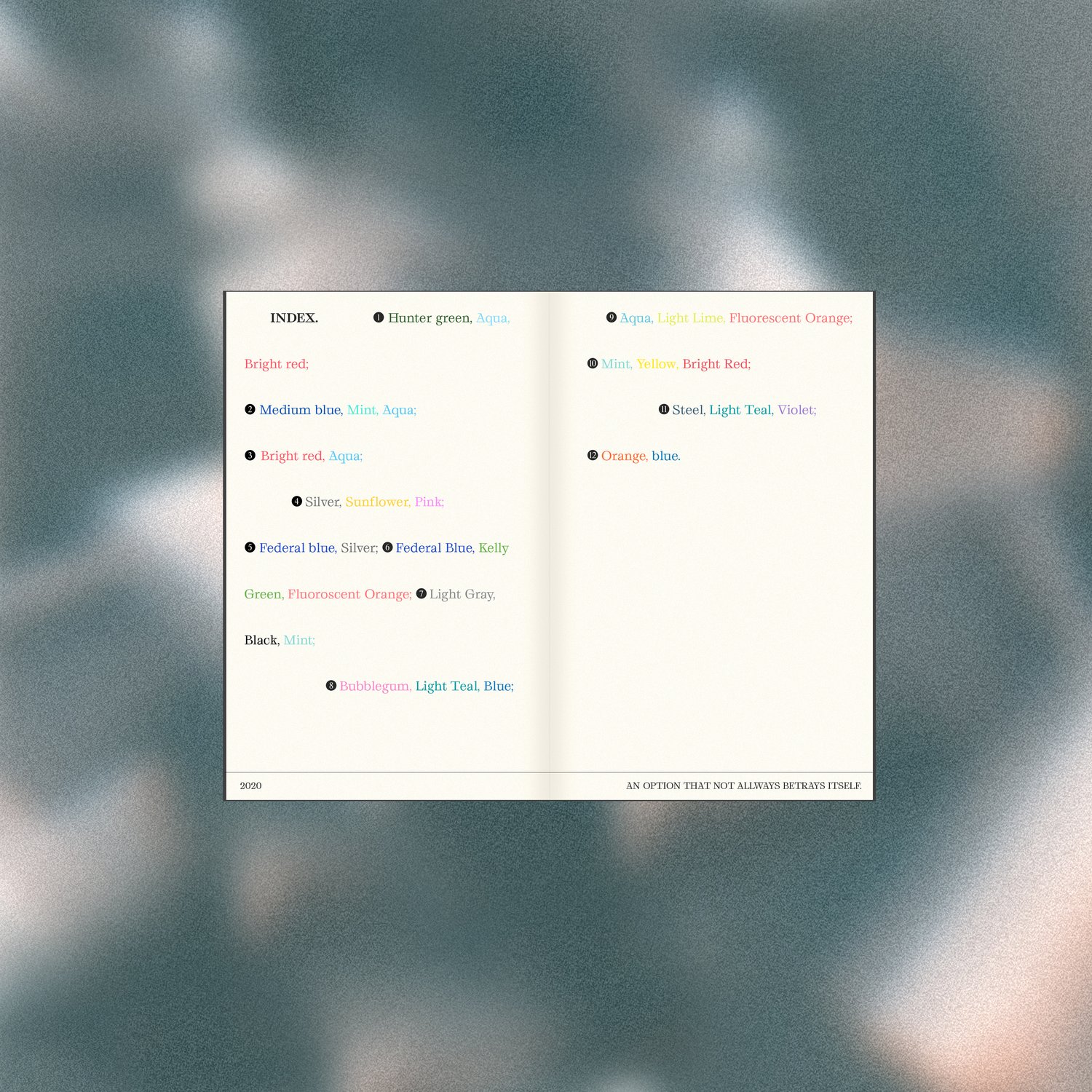
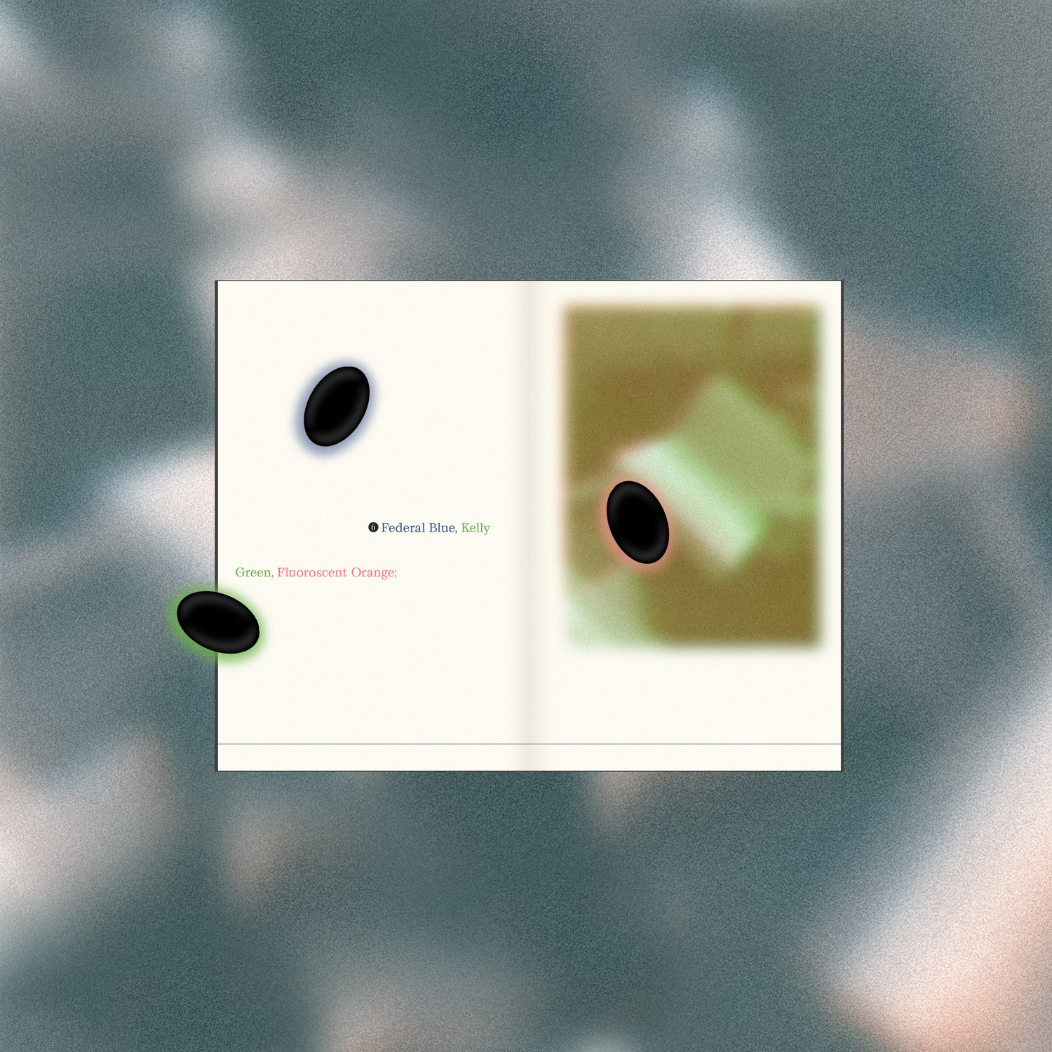
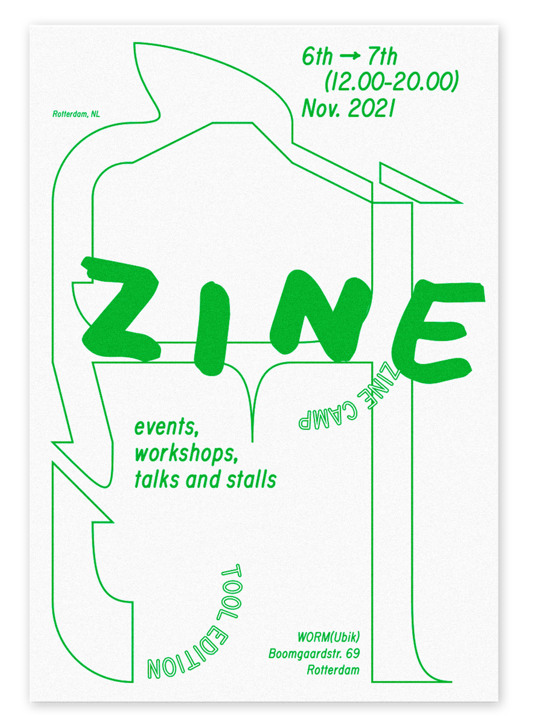
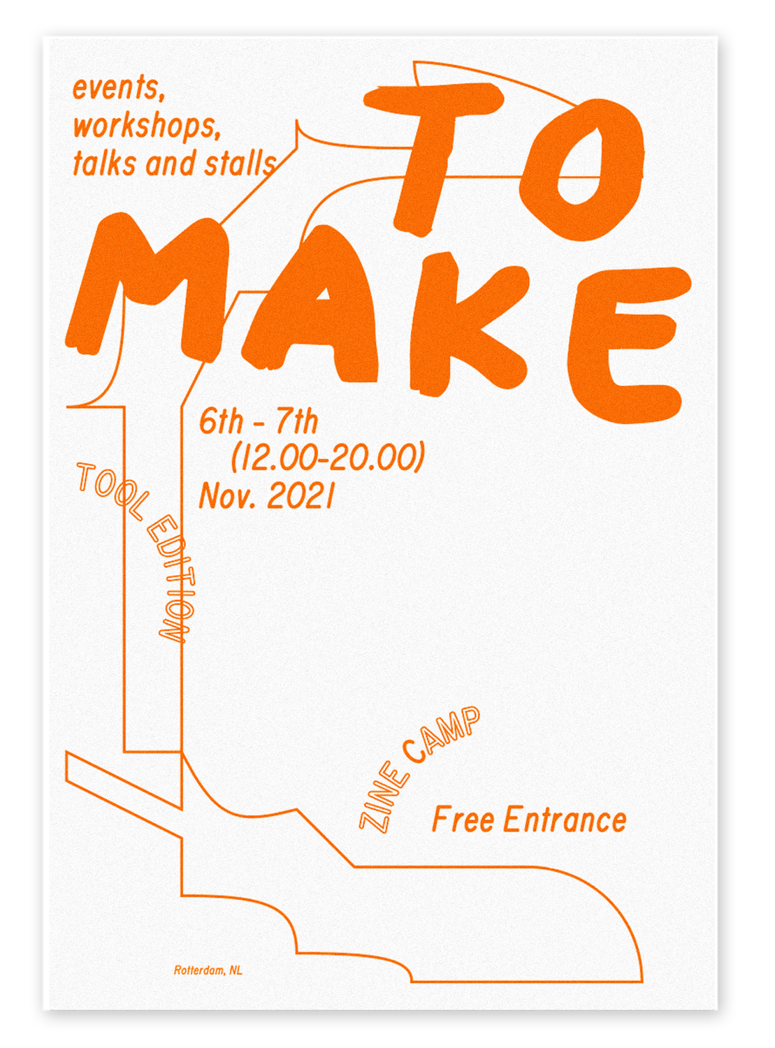
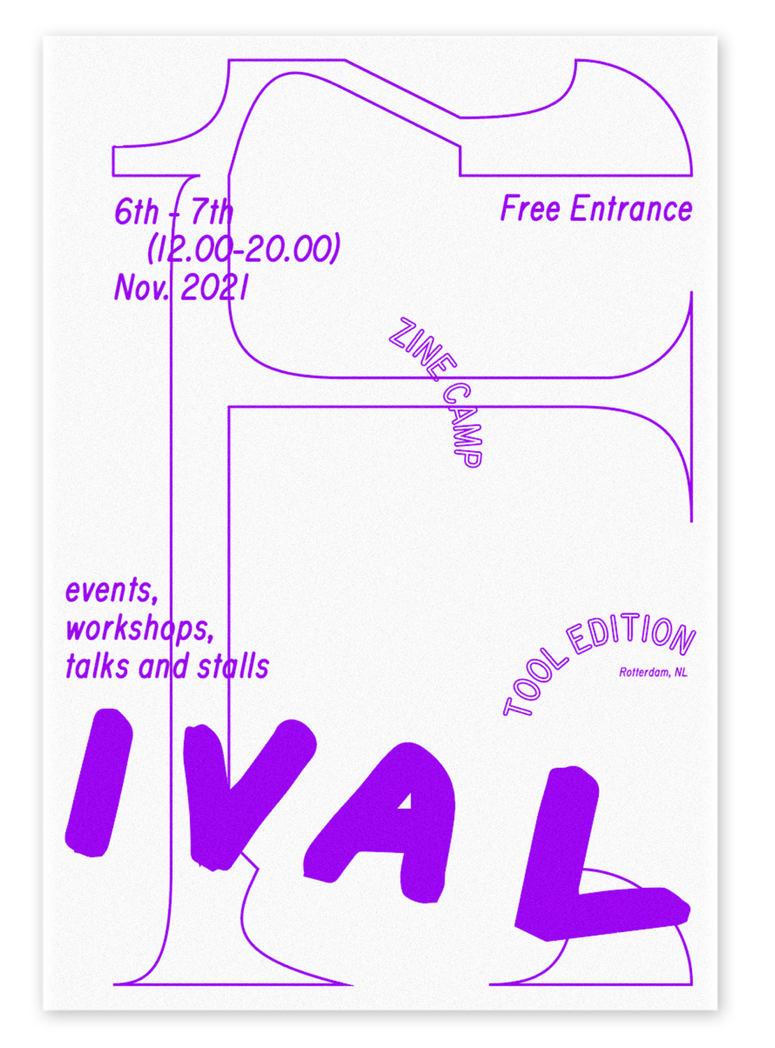
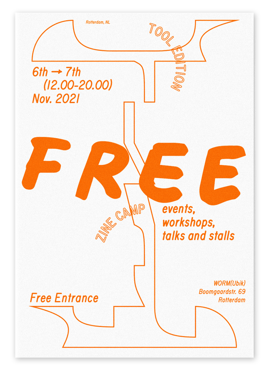
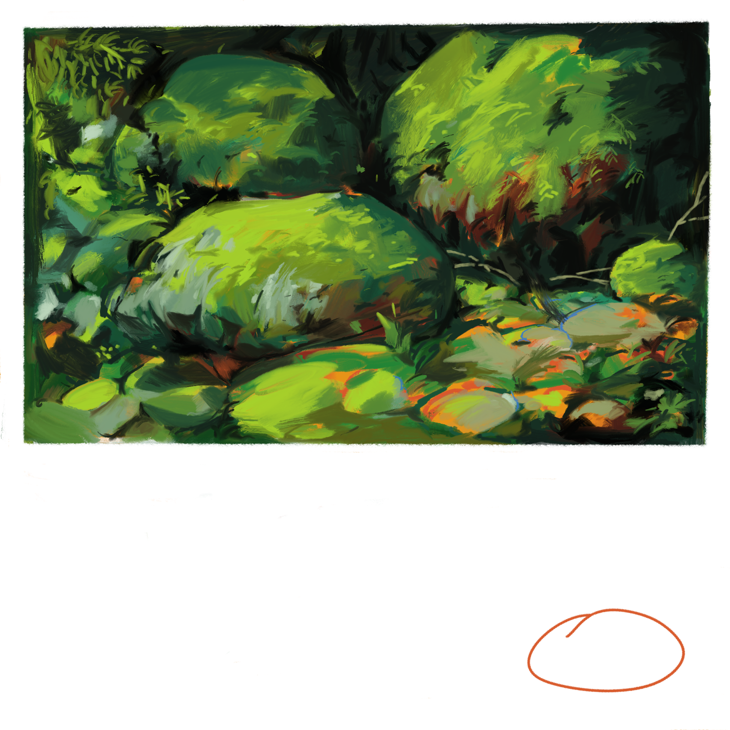
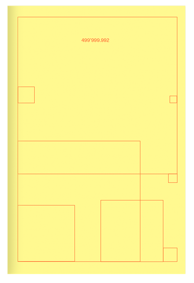
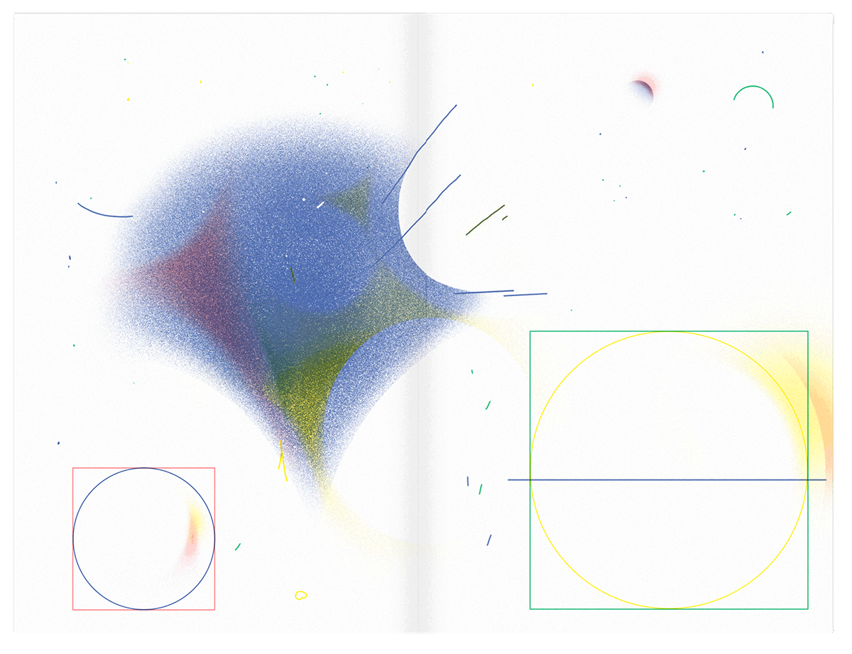
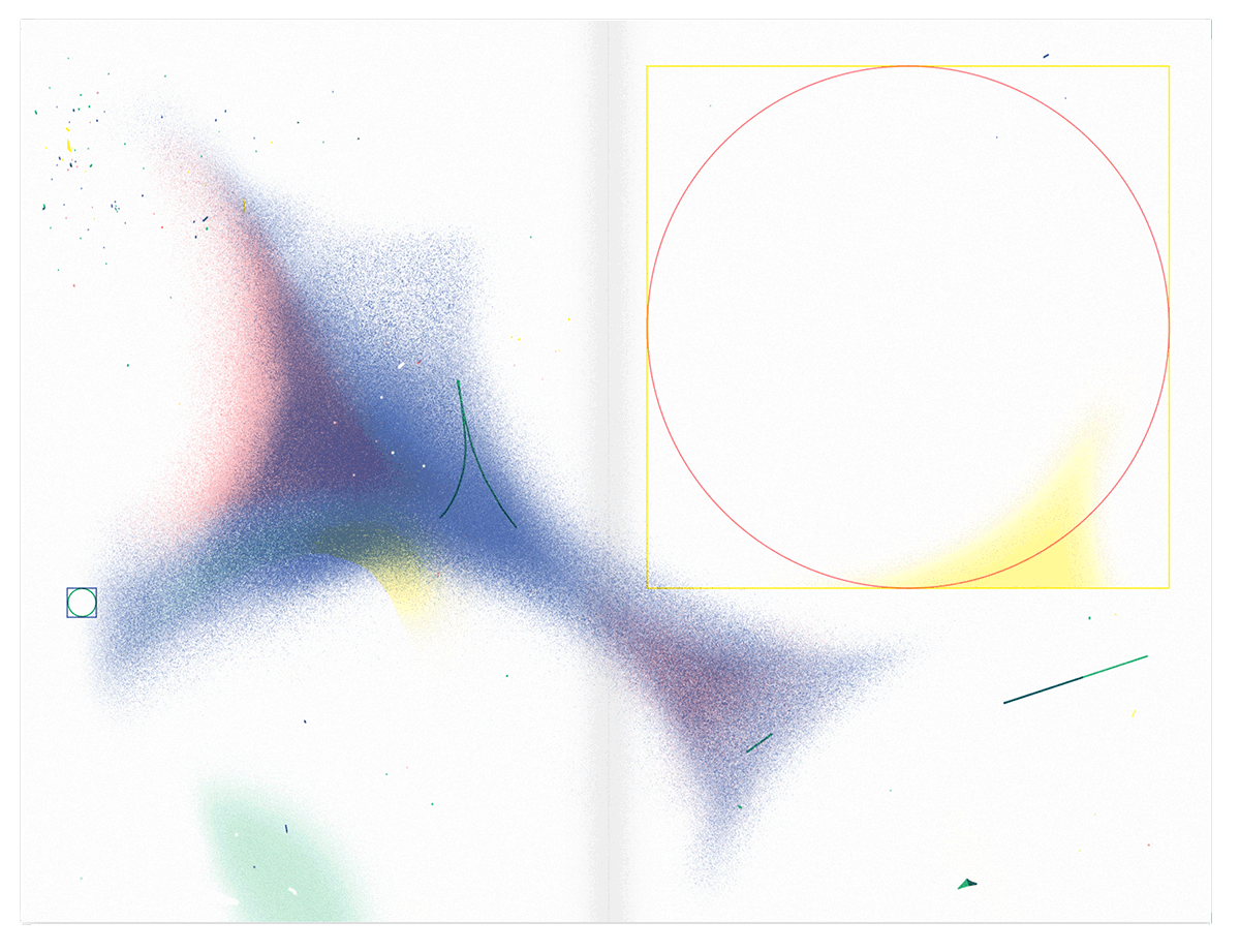
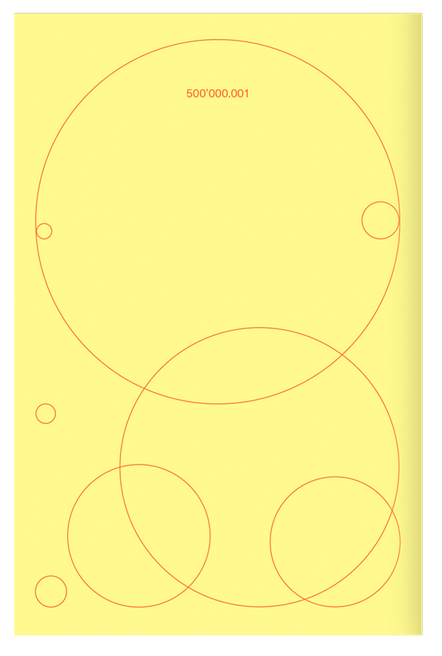
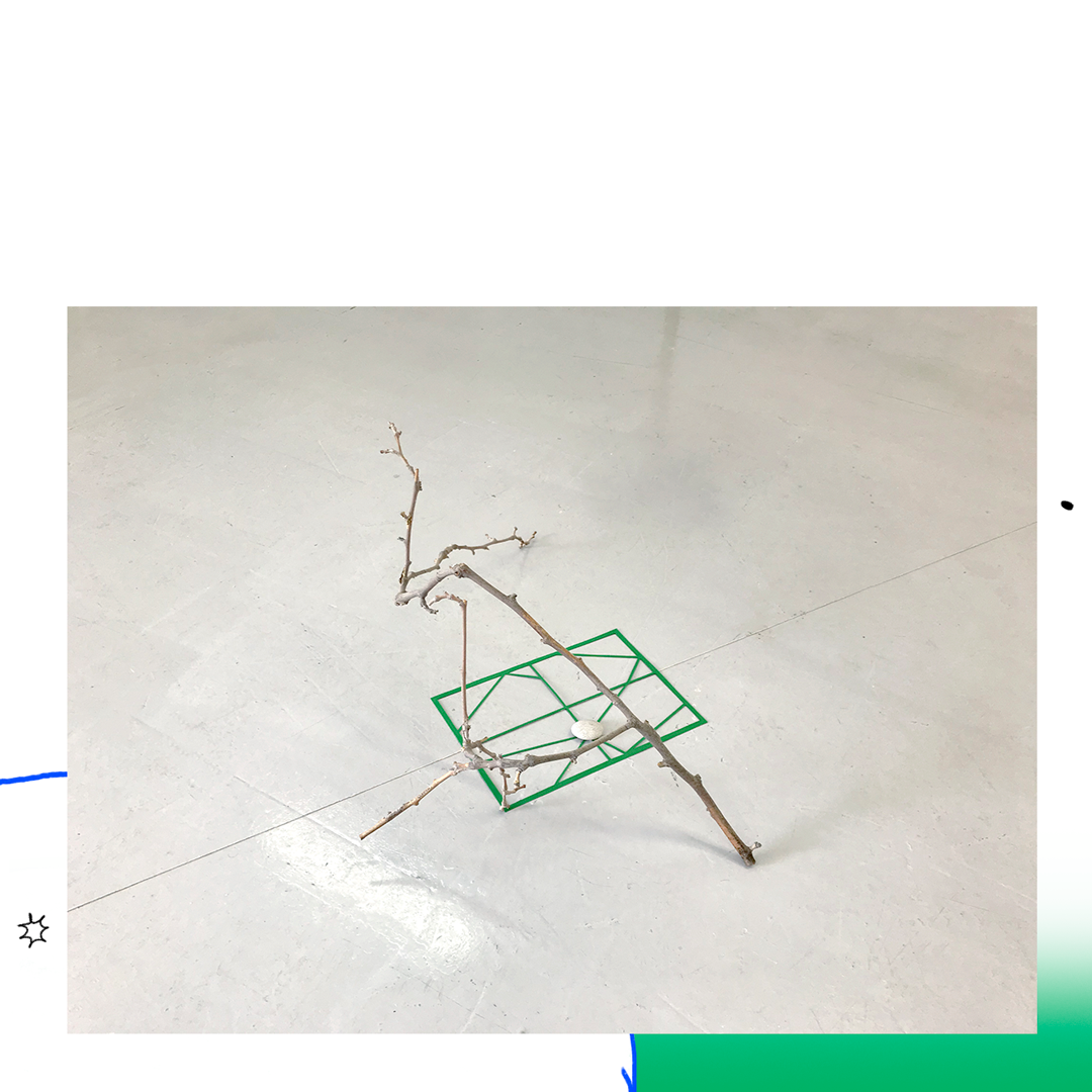
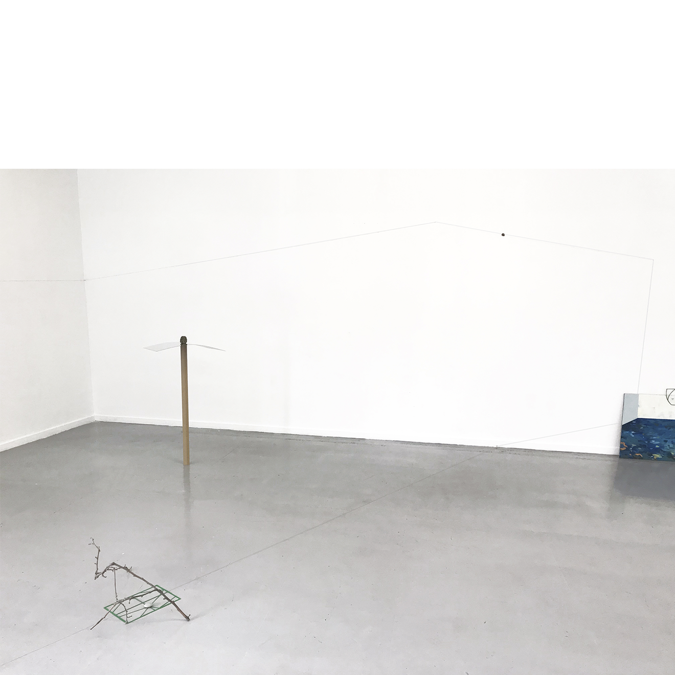
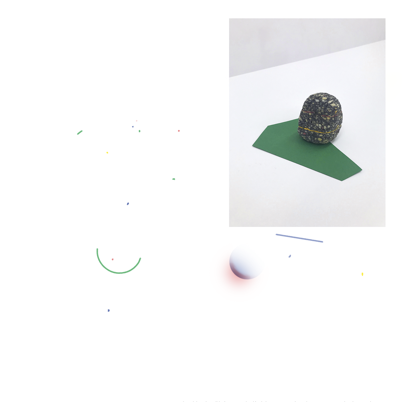
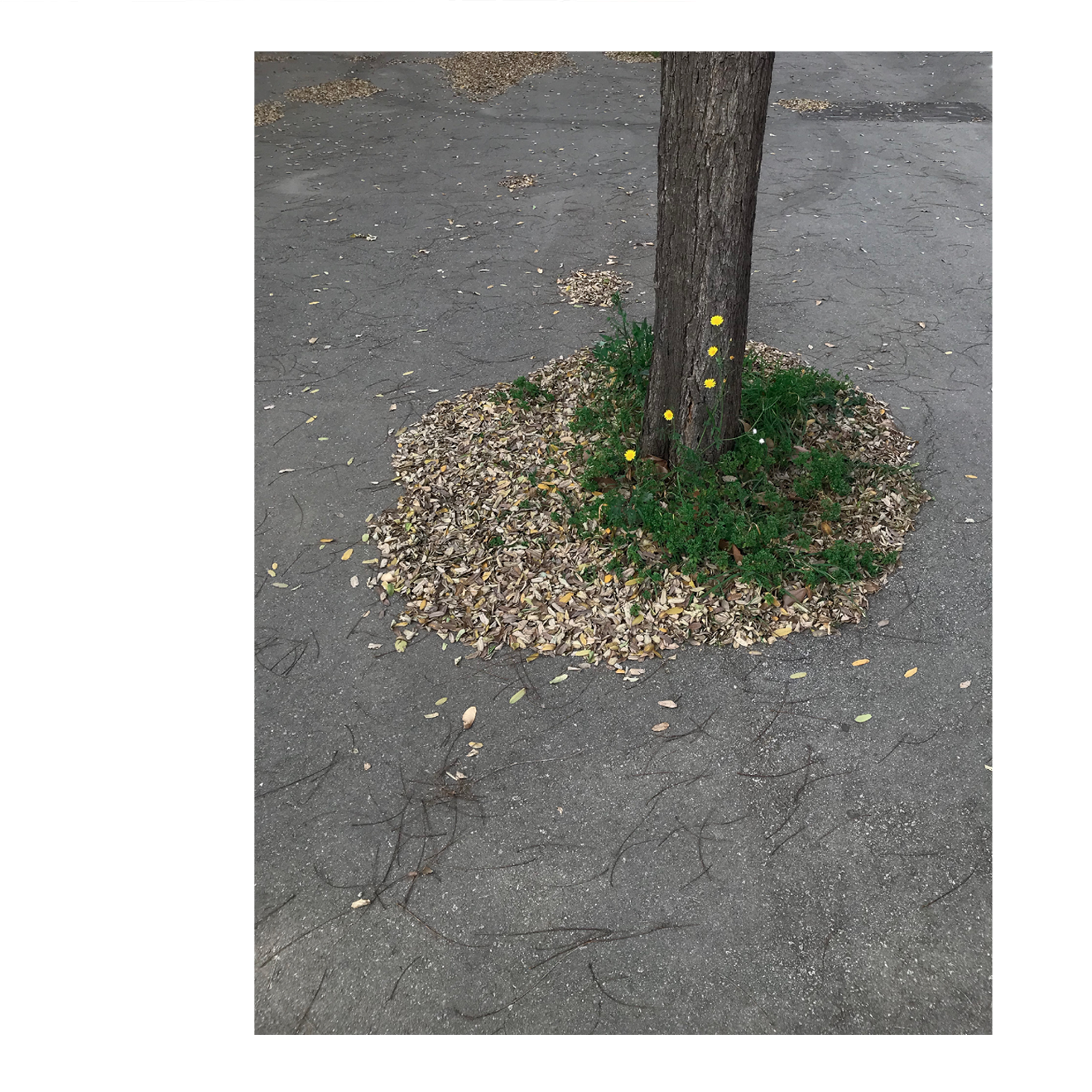
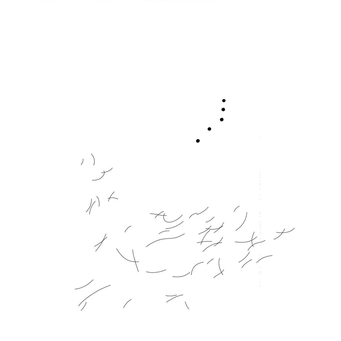
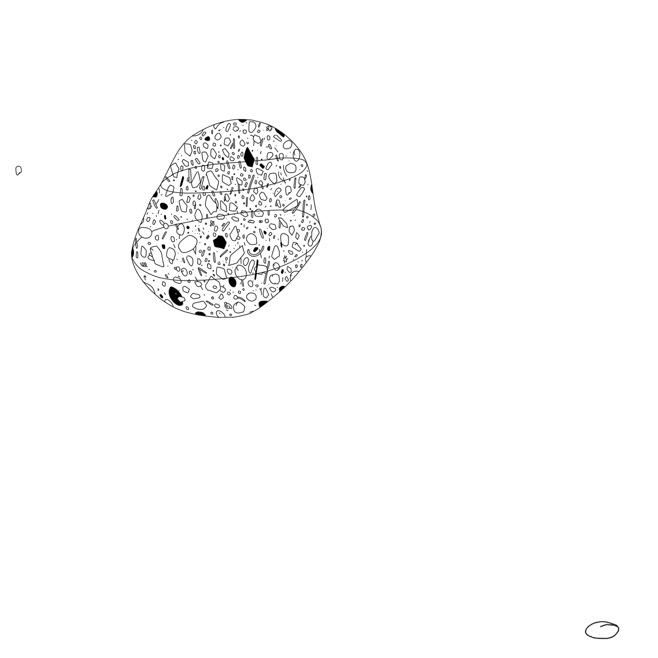
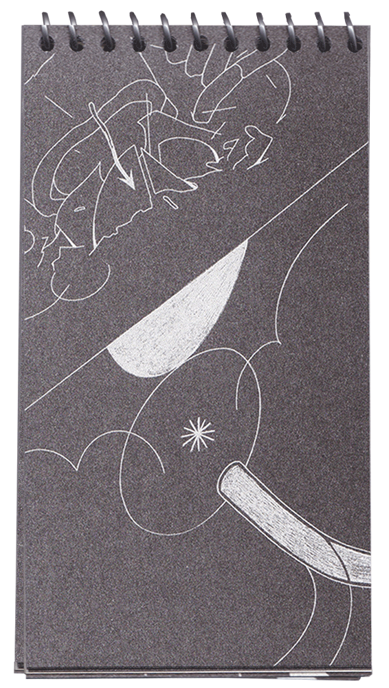
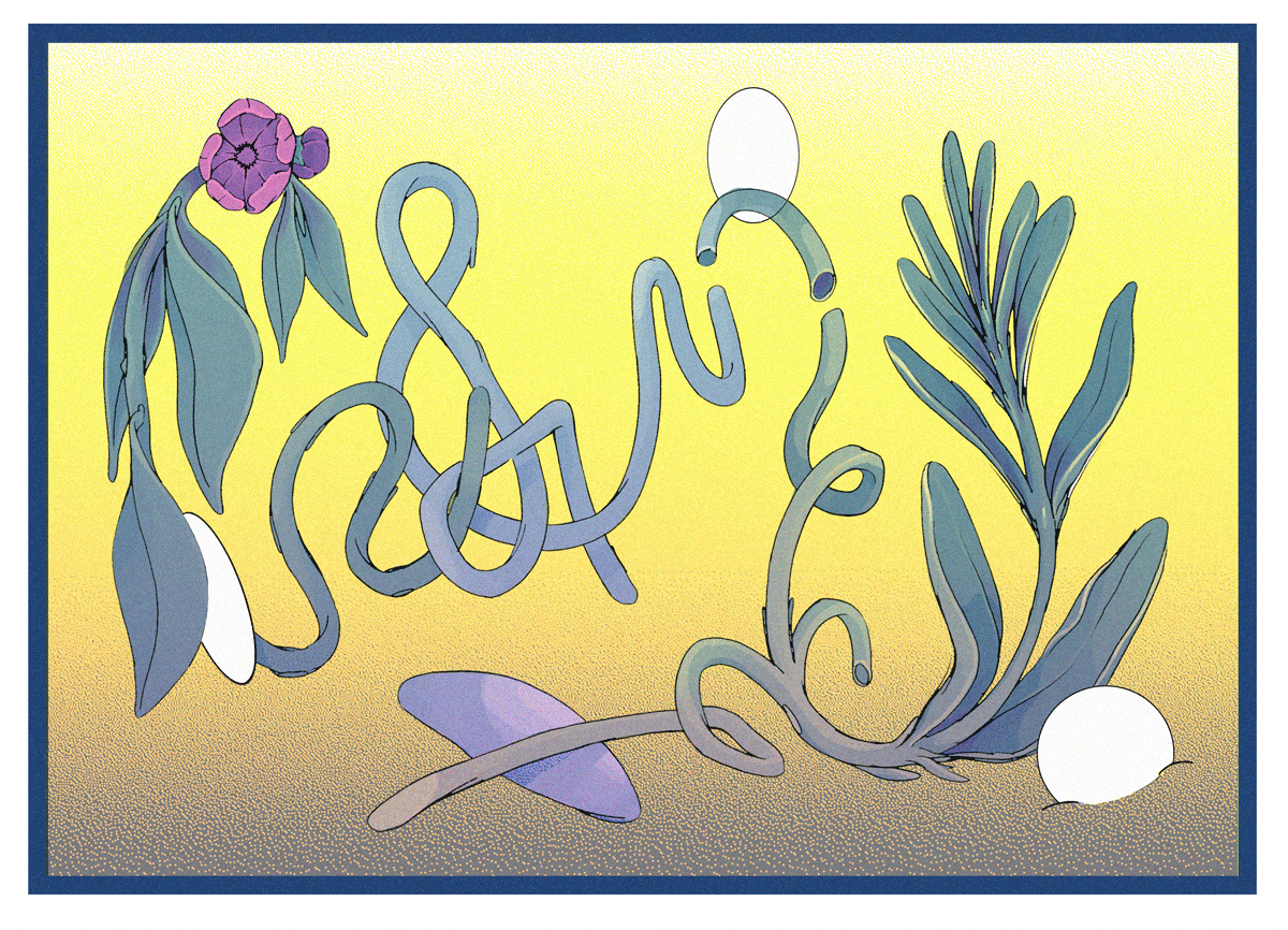
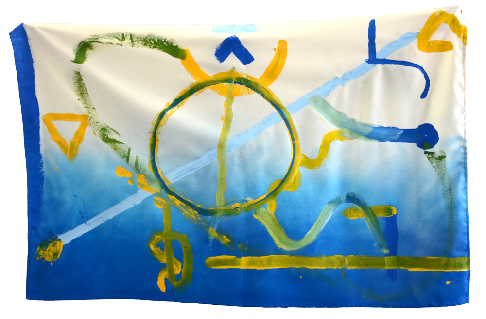
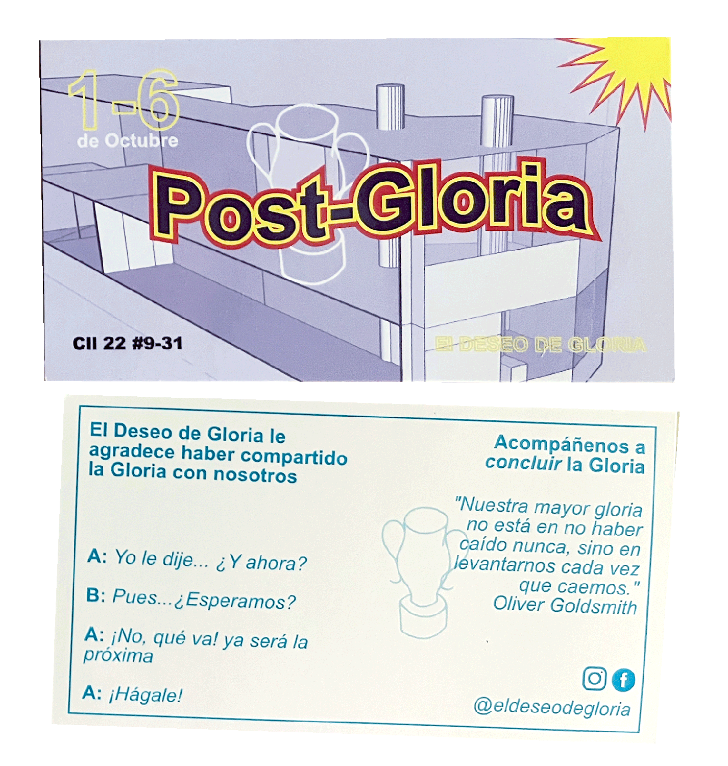
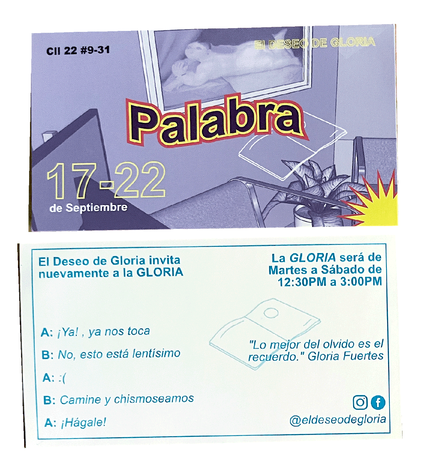
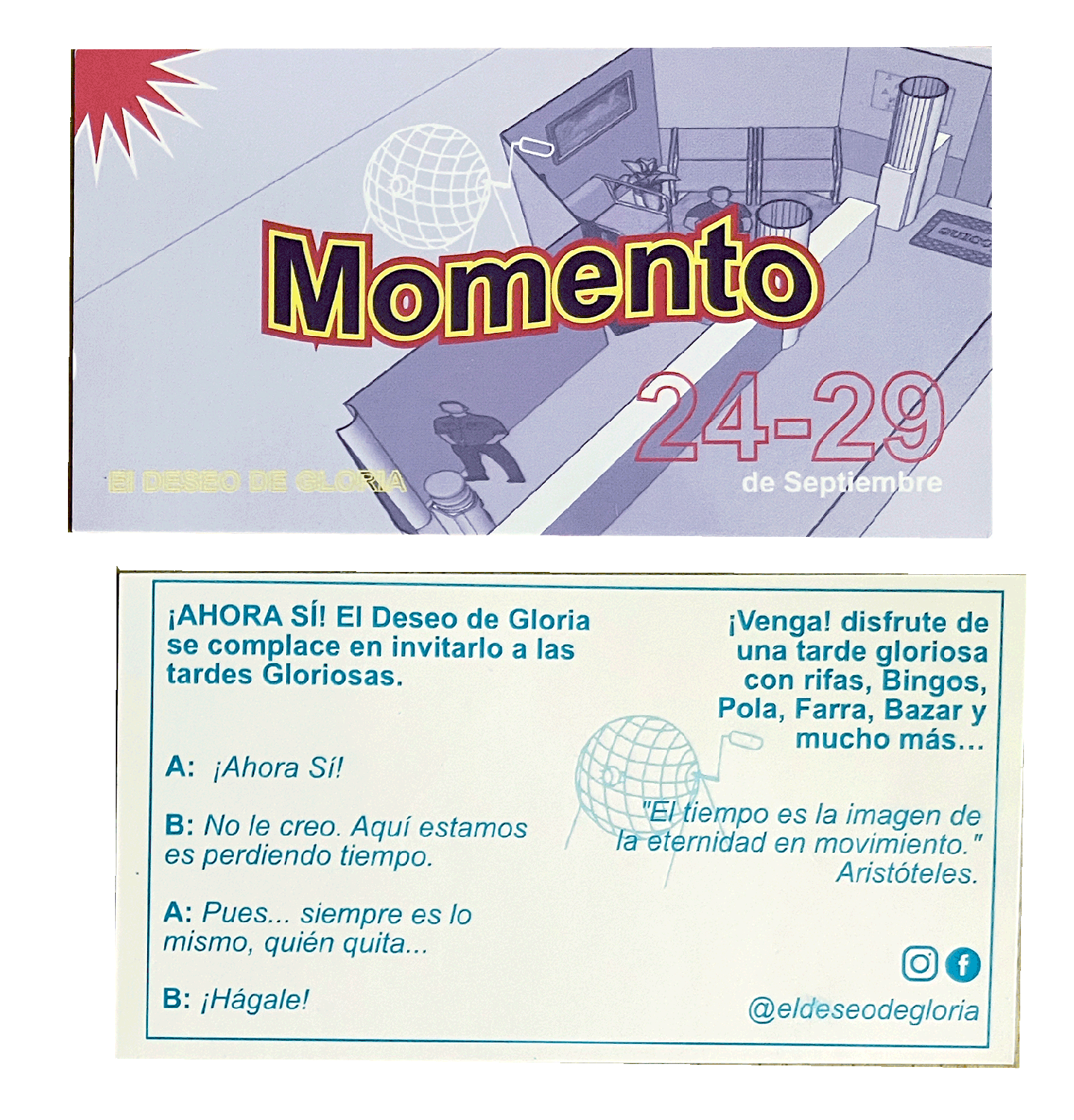
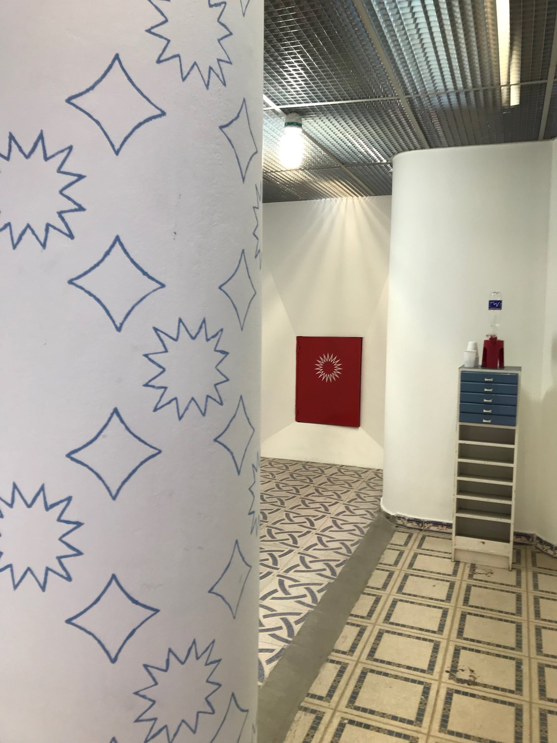
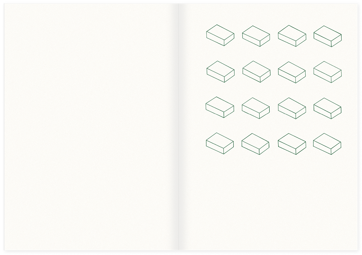
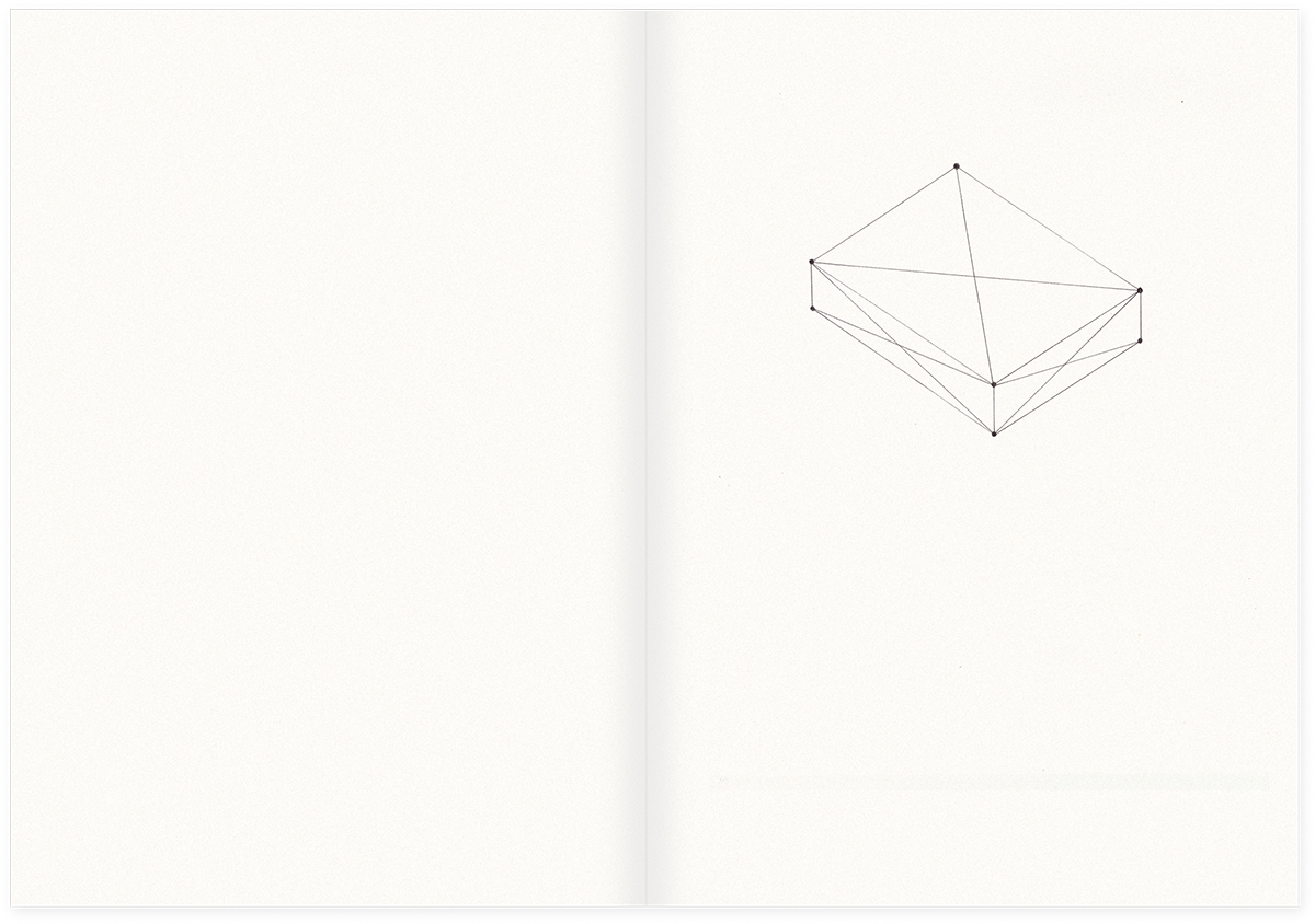
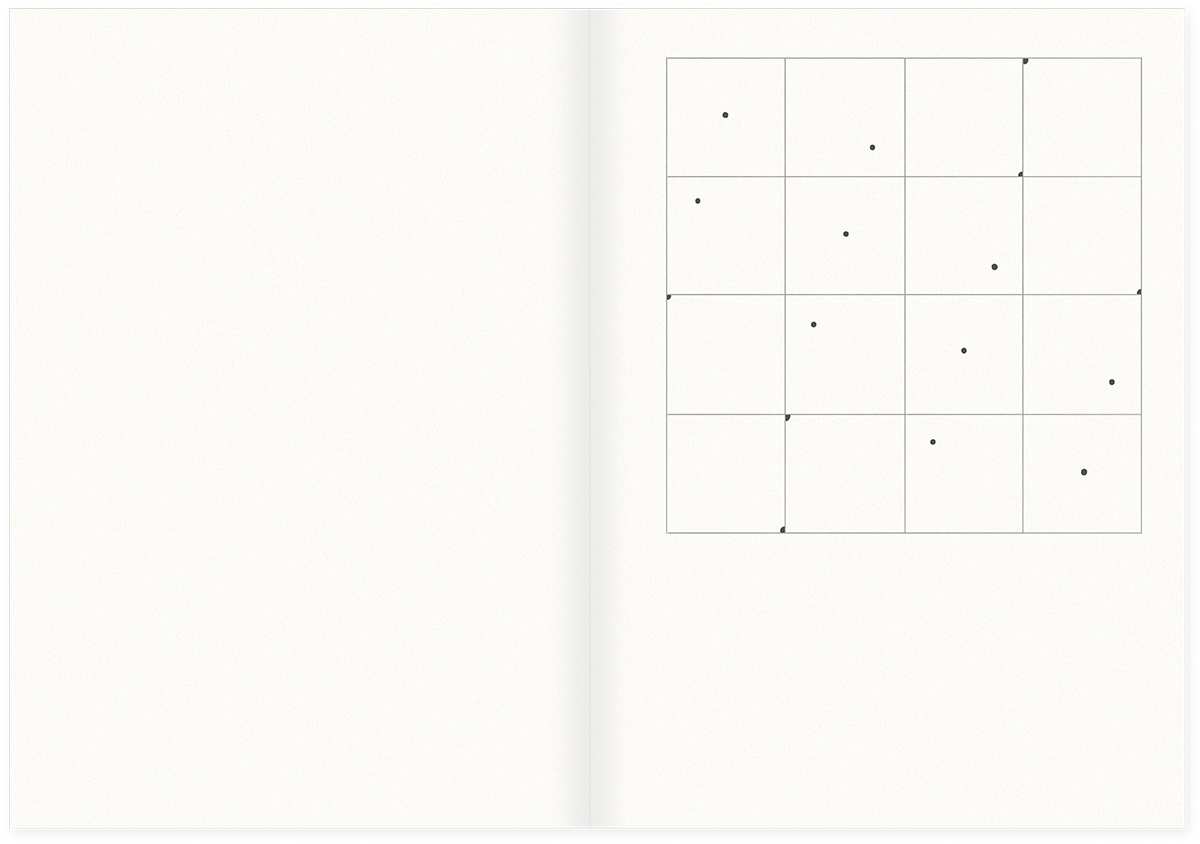
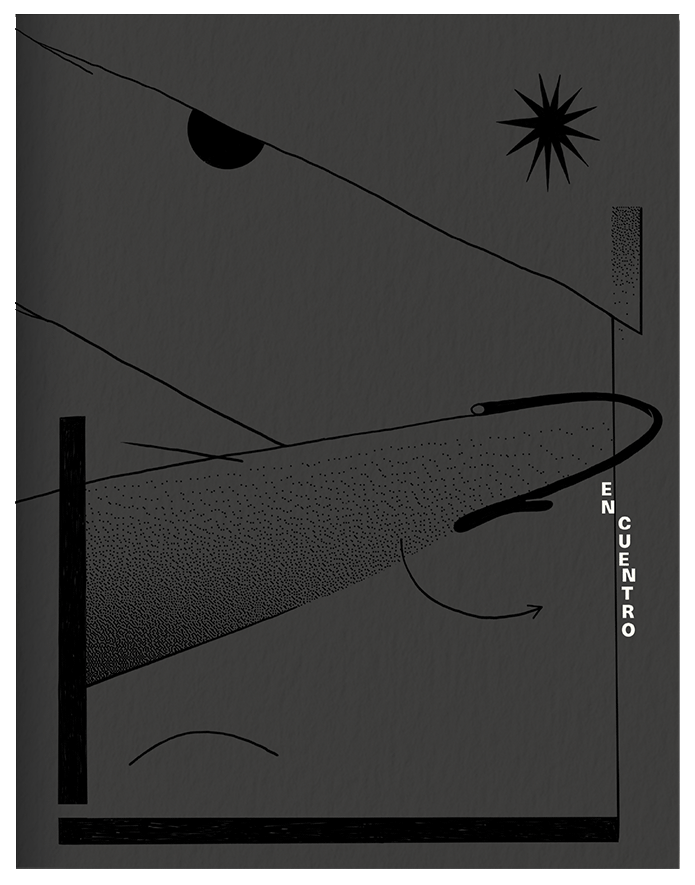
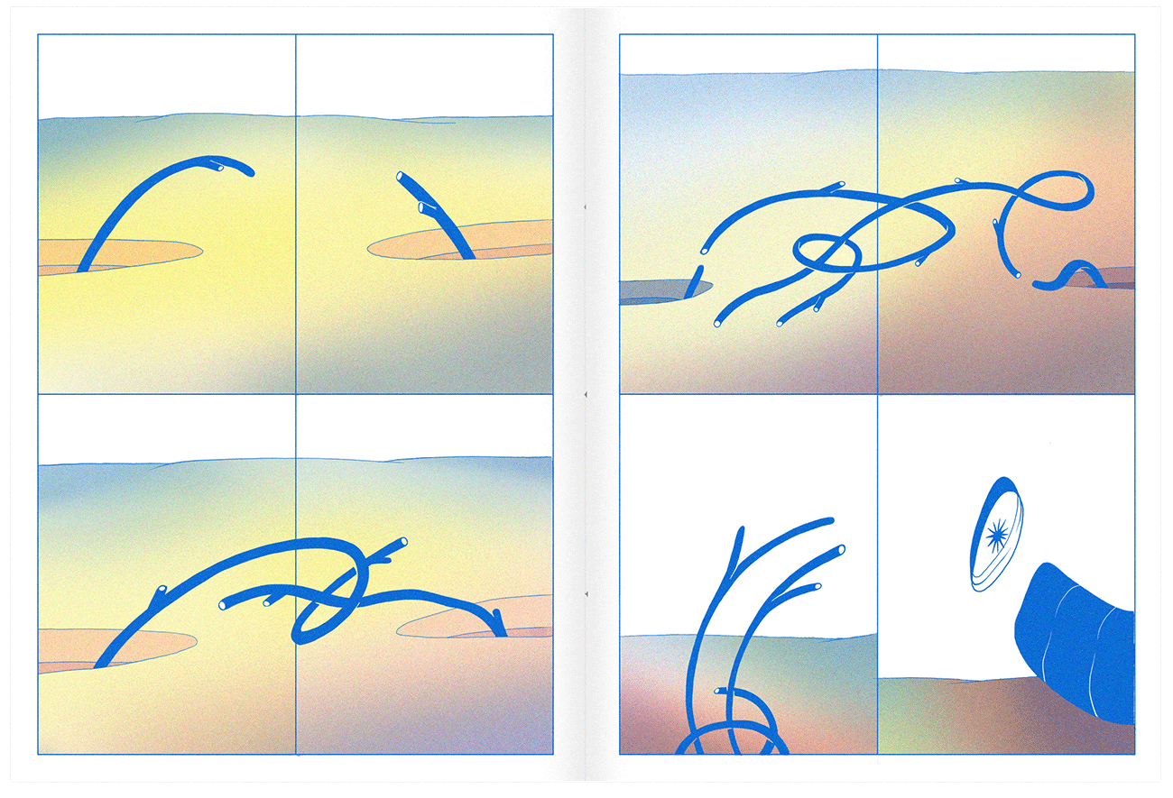
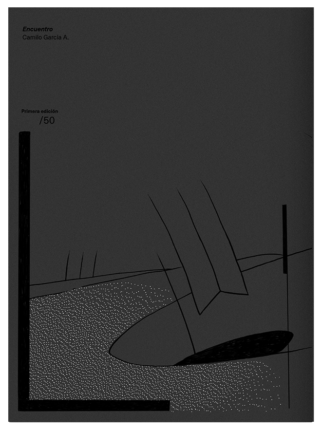
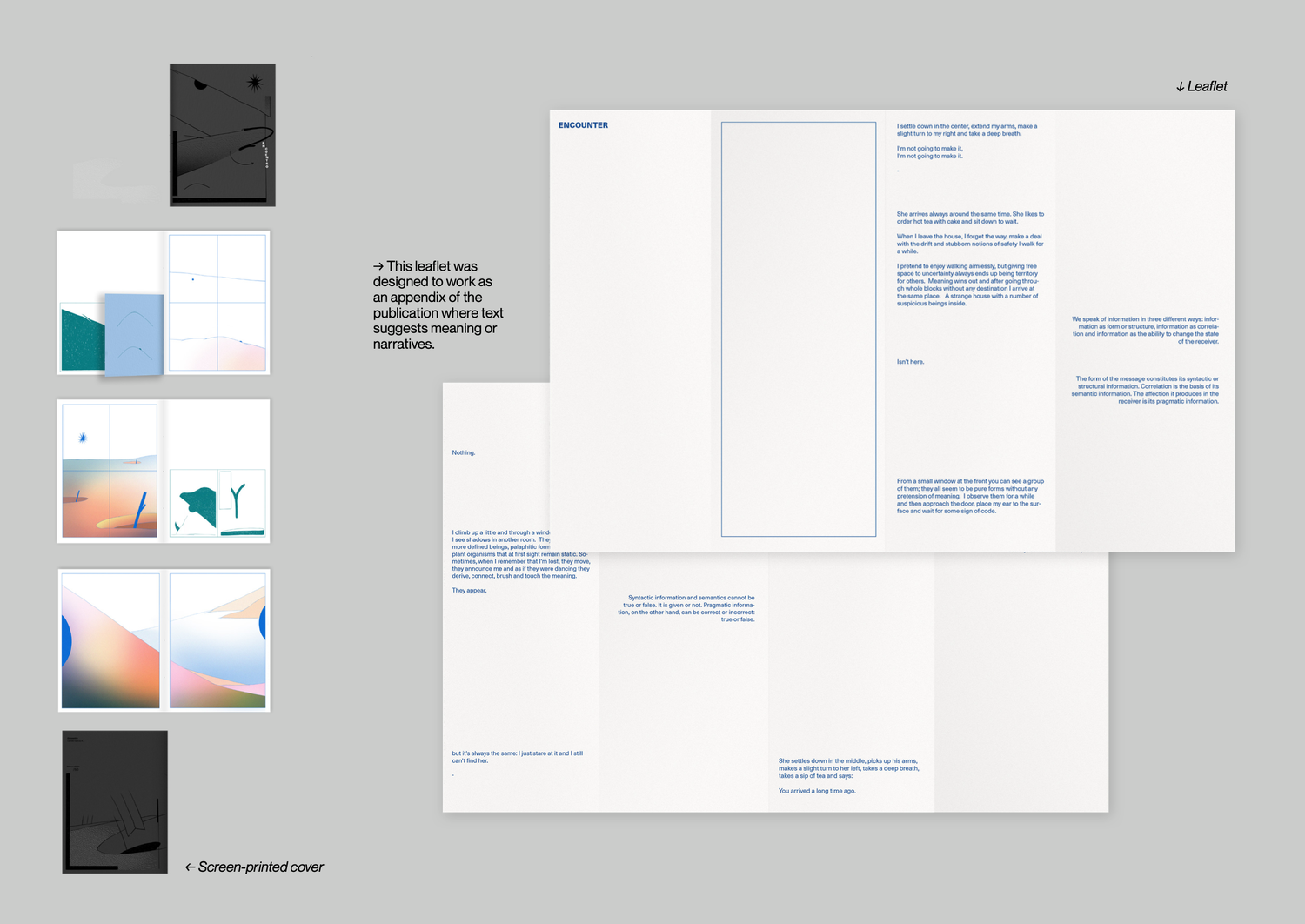
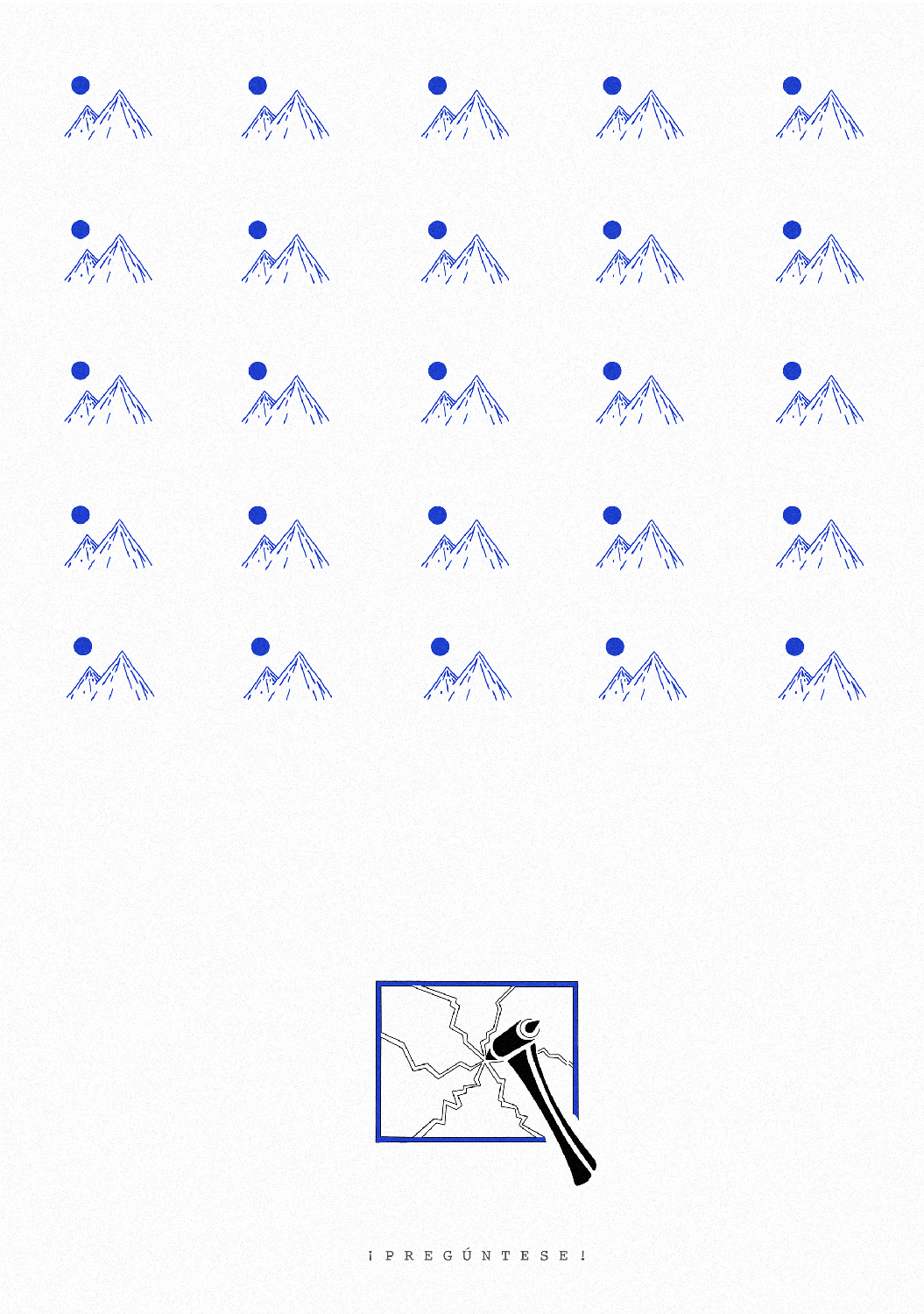
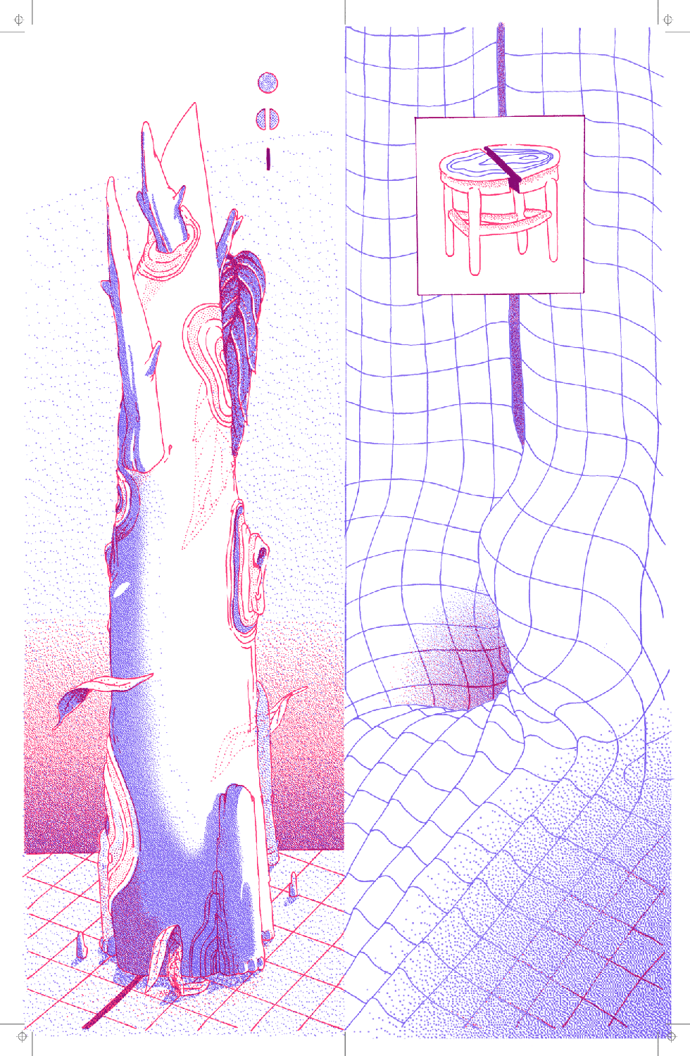
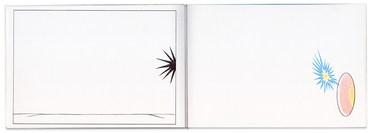
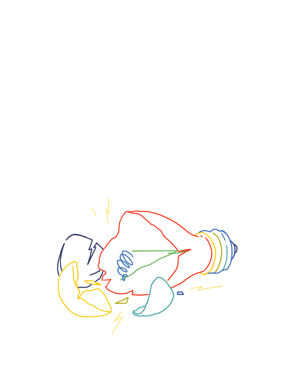
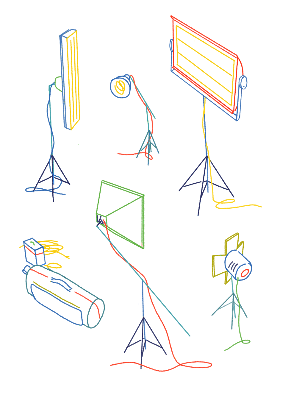
The images shown here include research references, conceptual frameworks, draft diagrams, and symbol explorations.
Links:
- Operate’s Website