Filters

Media:

Luisterwijsheden

Design , Printing , Binding

Description:

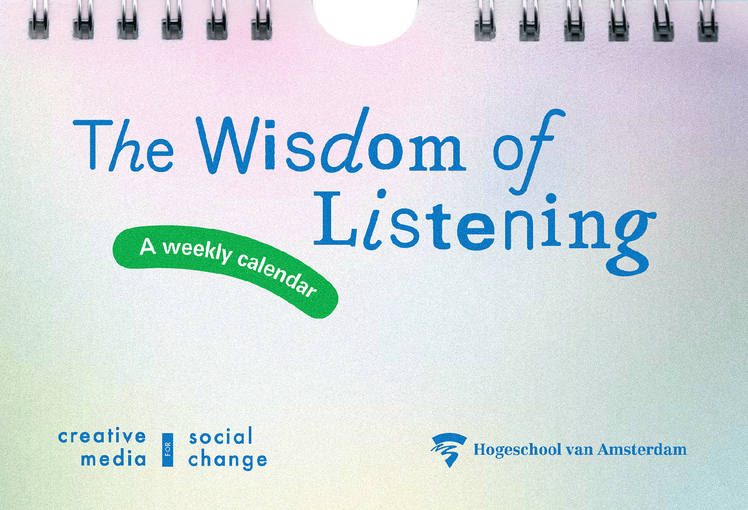
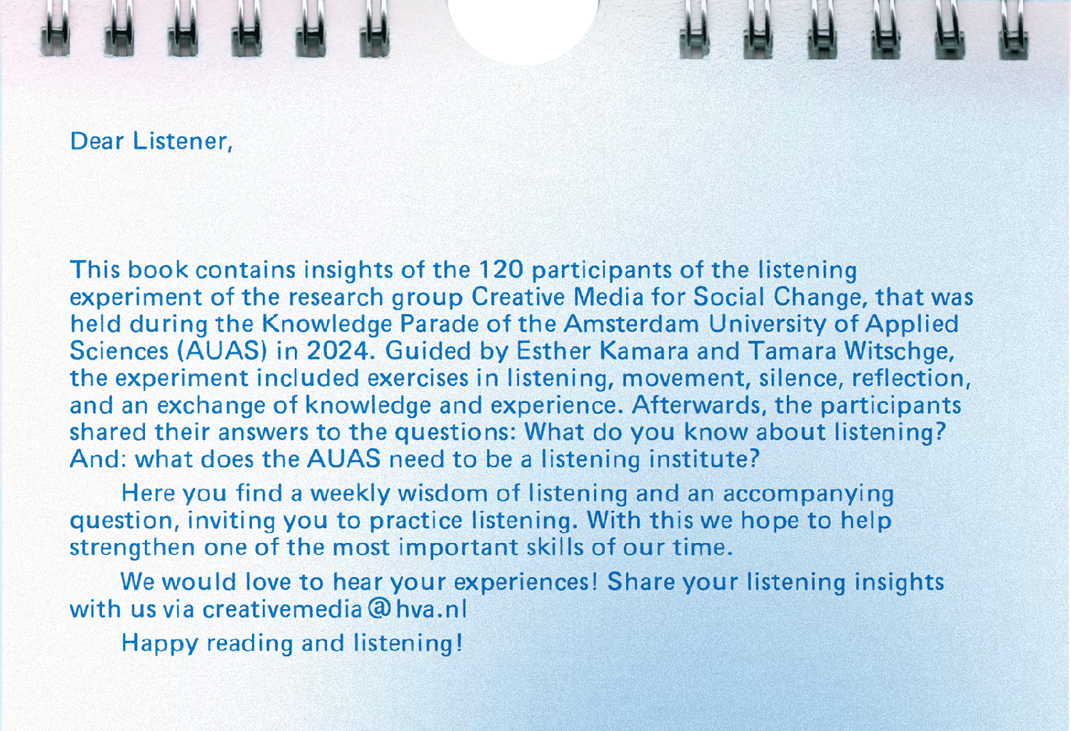
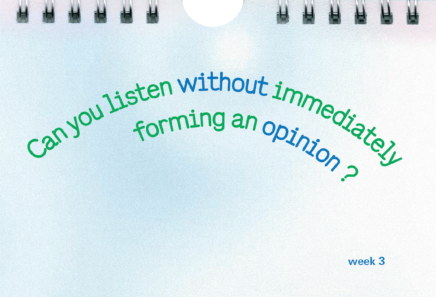
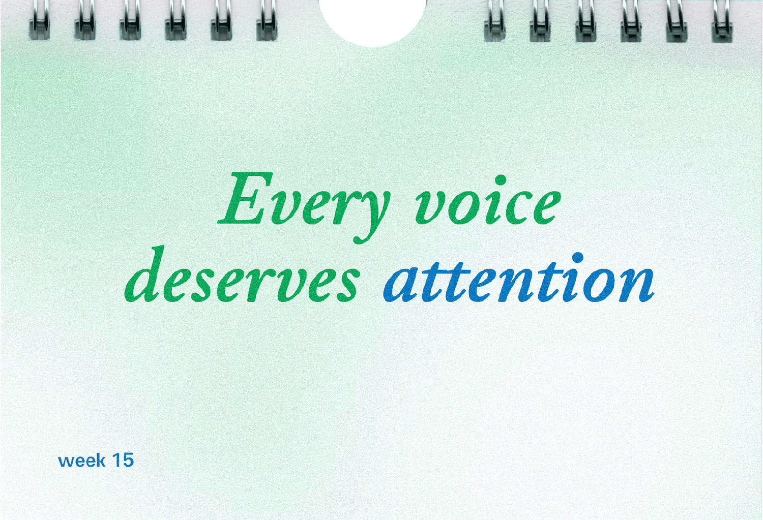
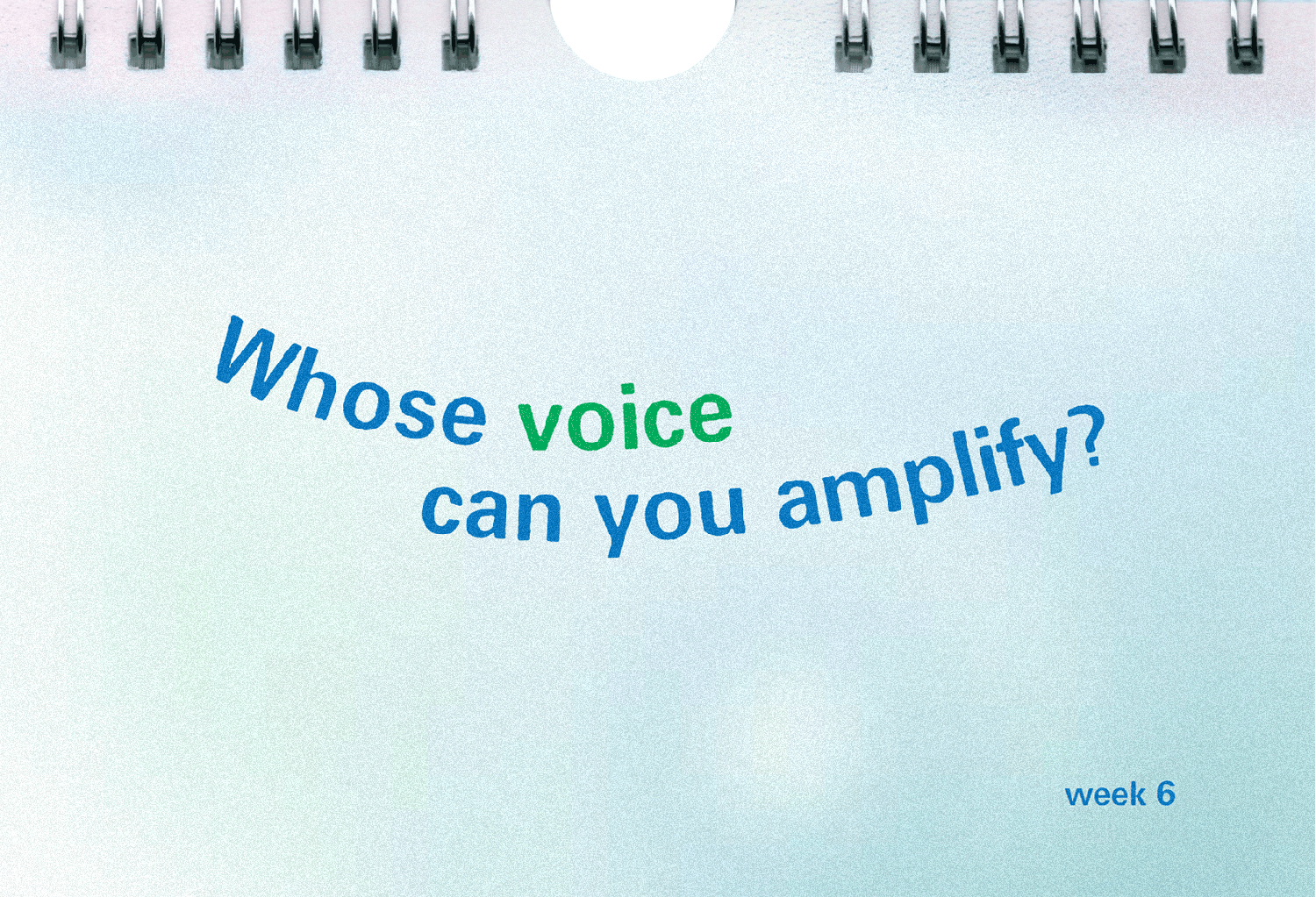
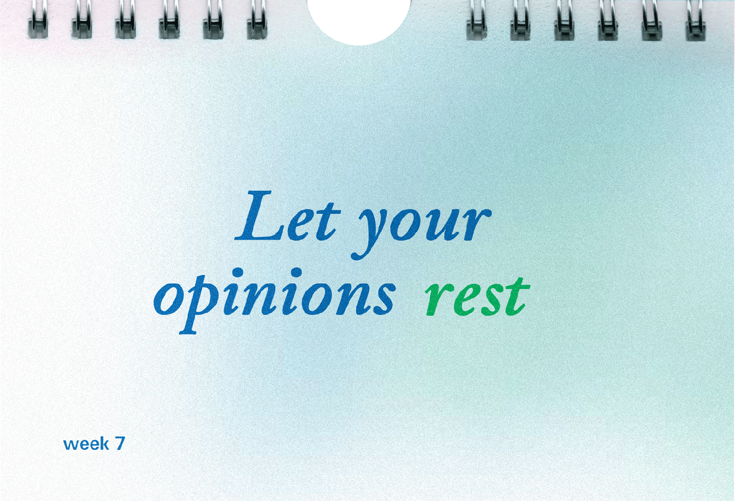
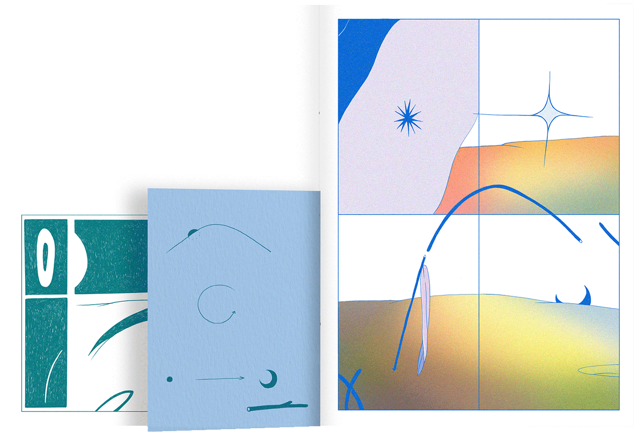
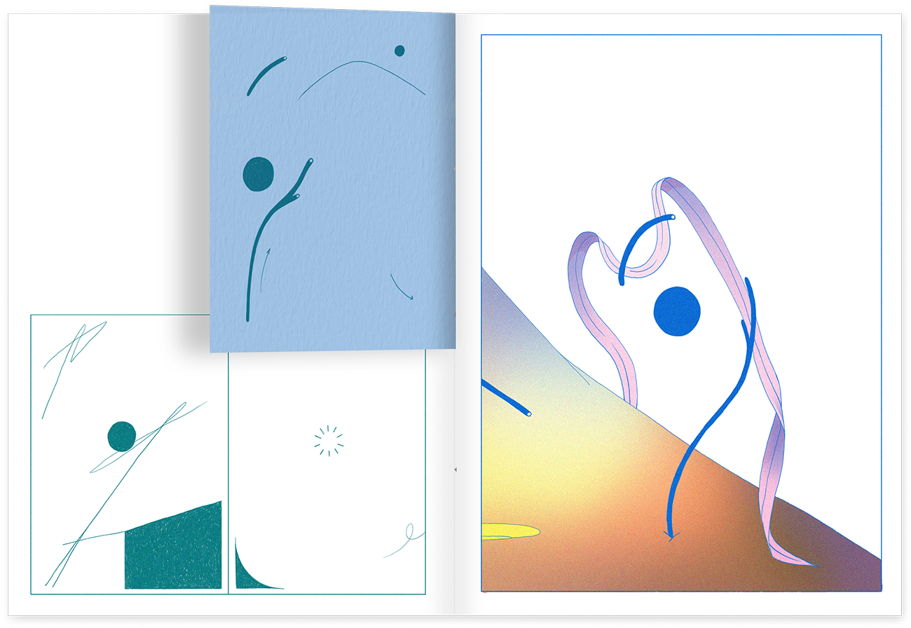
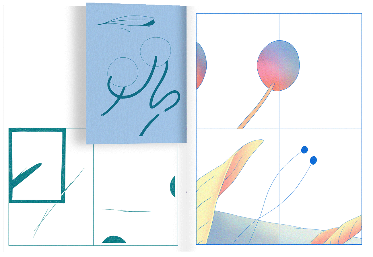
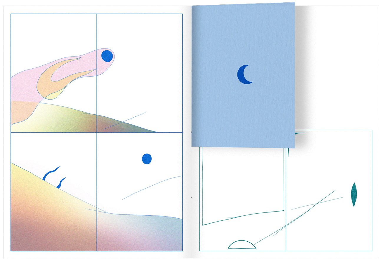
A listening calendar that propose a time effort to listen more to others. Every day a sentence with a new question.

I was commissioned to make the creative direction, graphic design and print production.

Details:

  • 105p.
  • 100 copies.
  • RISO printed using 4 inks
  • Arena rough 120g

Images:

  • Cover
  • Spread
  • Spread
  • Spread
  • Spread
  • Spread

Floating Words

Coding , Design , Drawing , Printing , Binding

Description

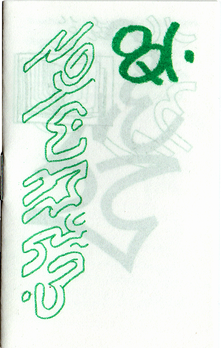
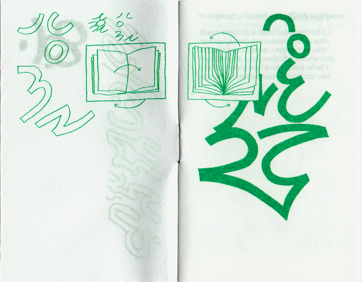
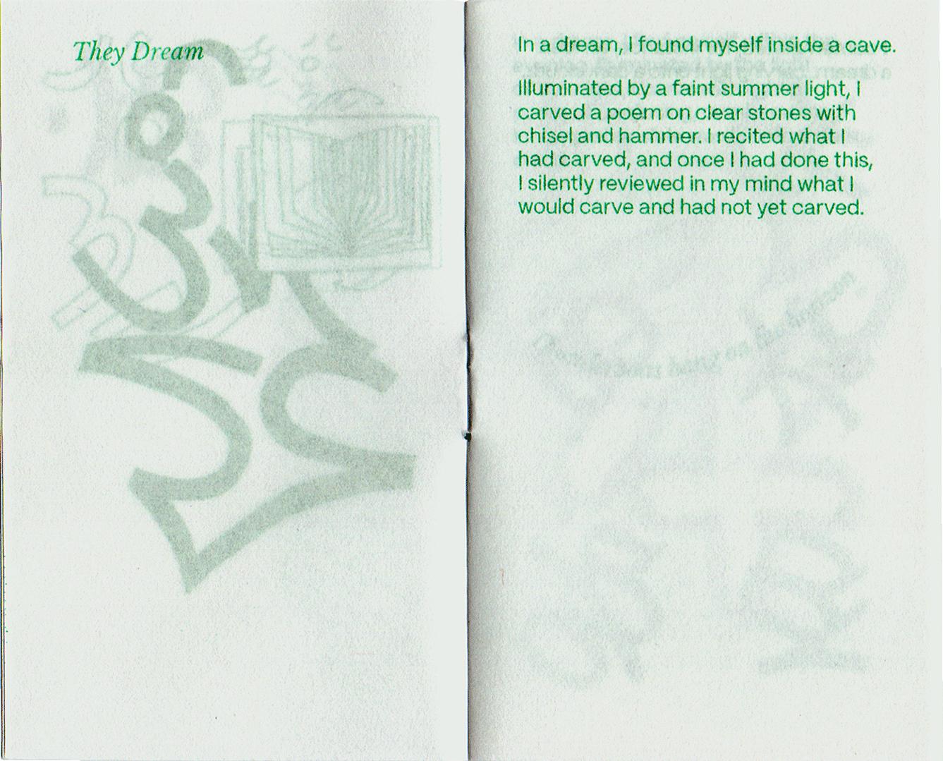
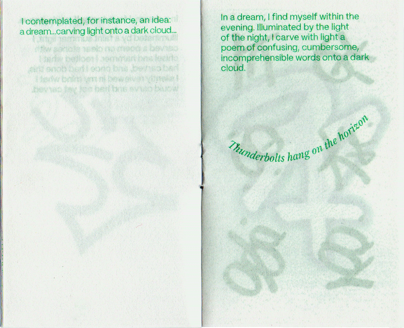
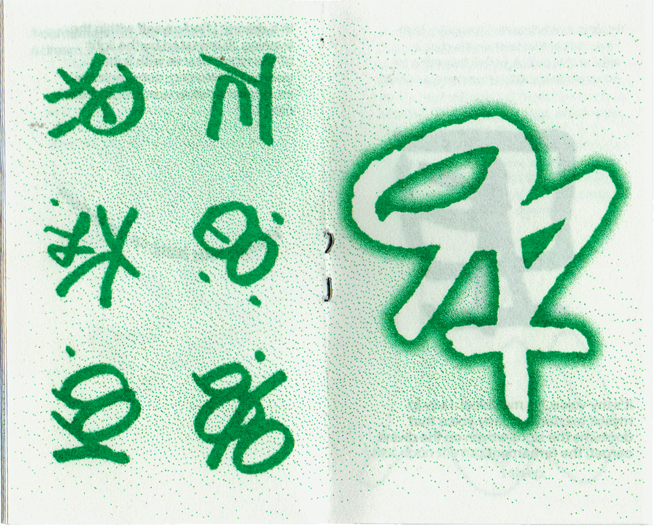
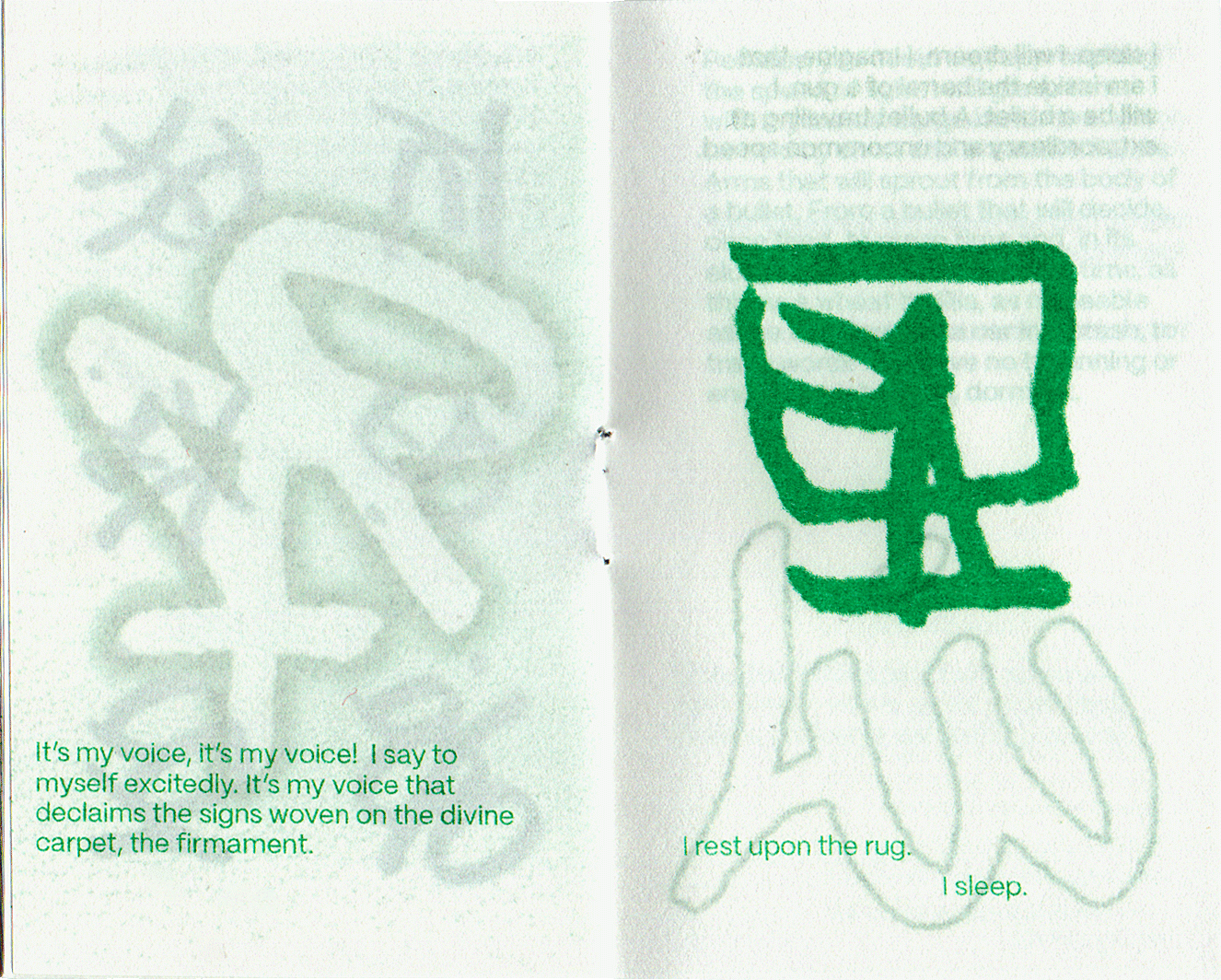
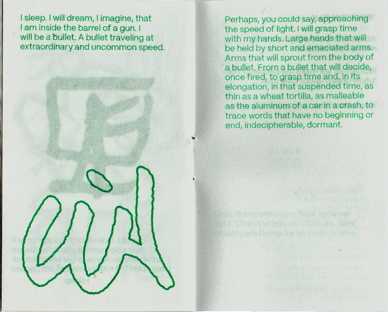
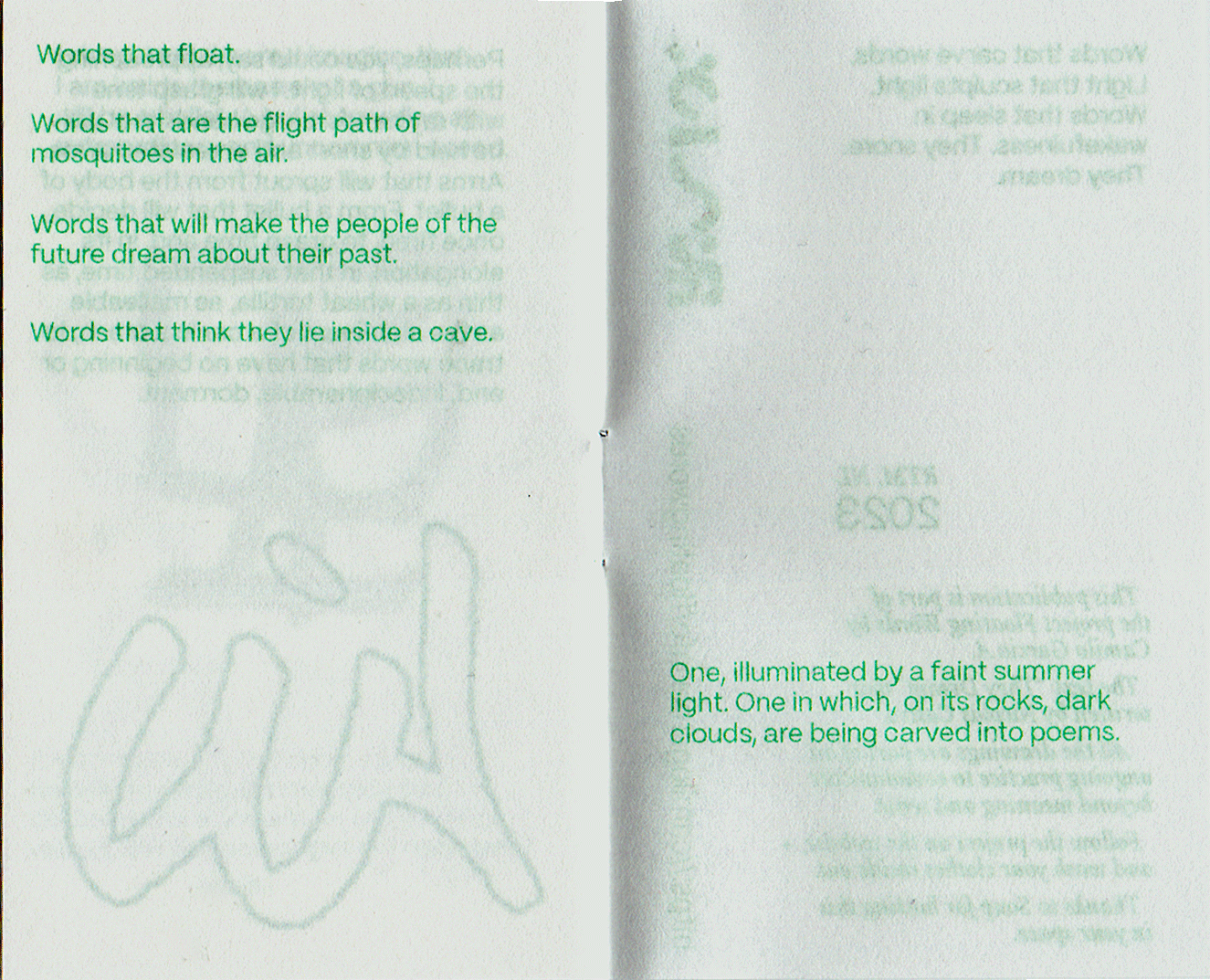
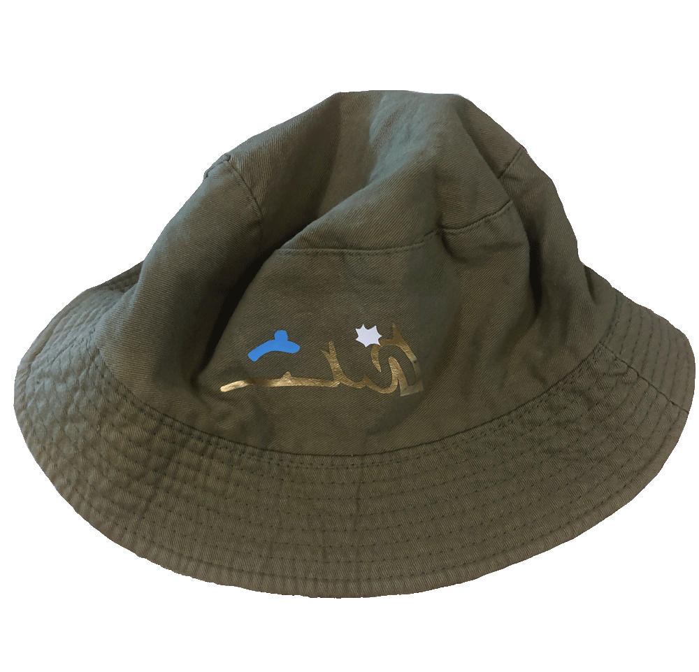
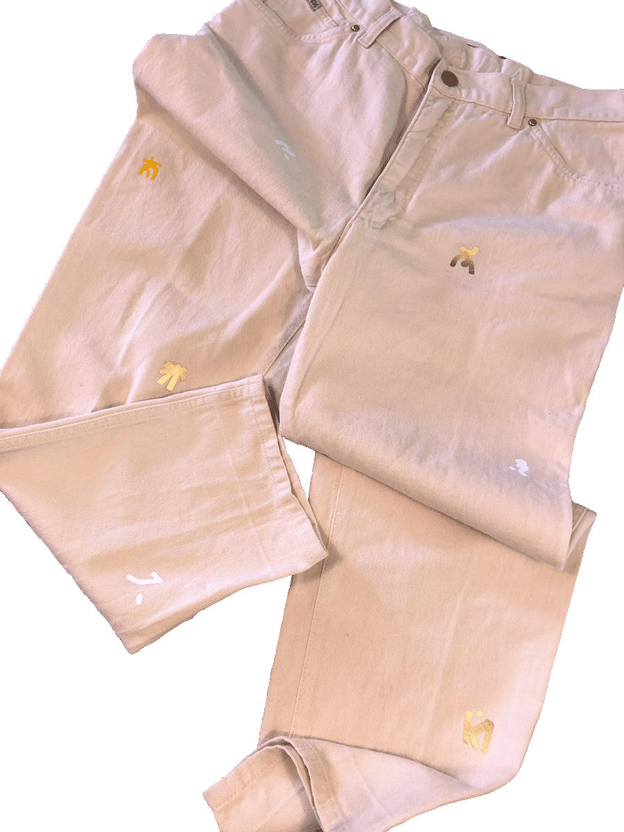
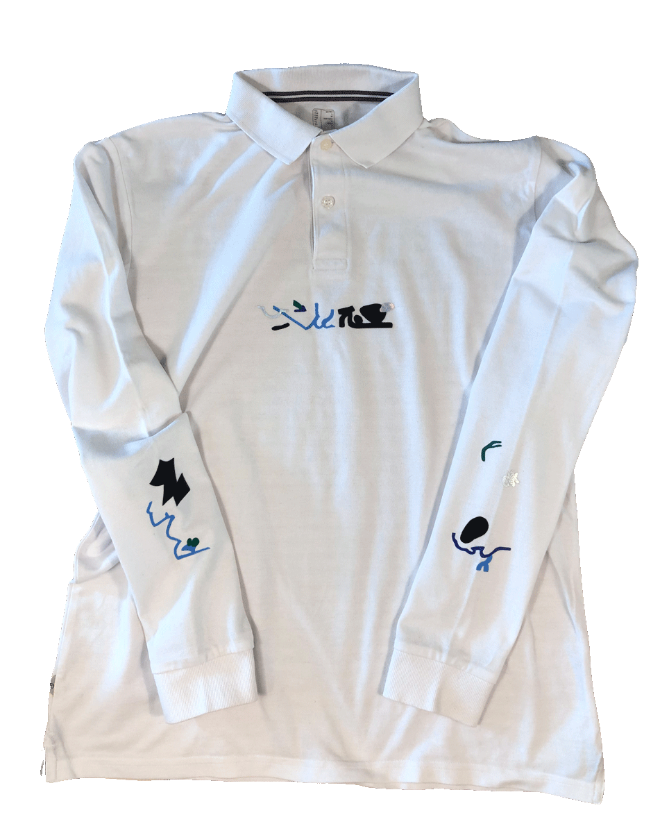
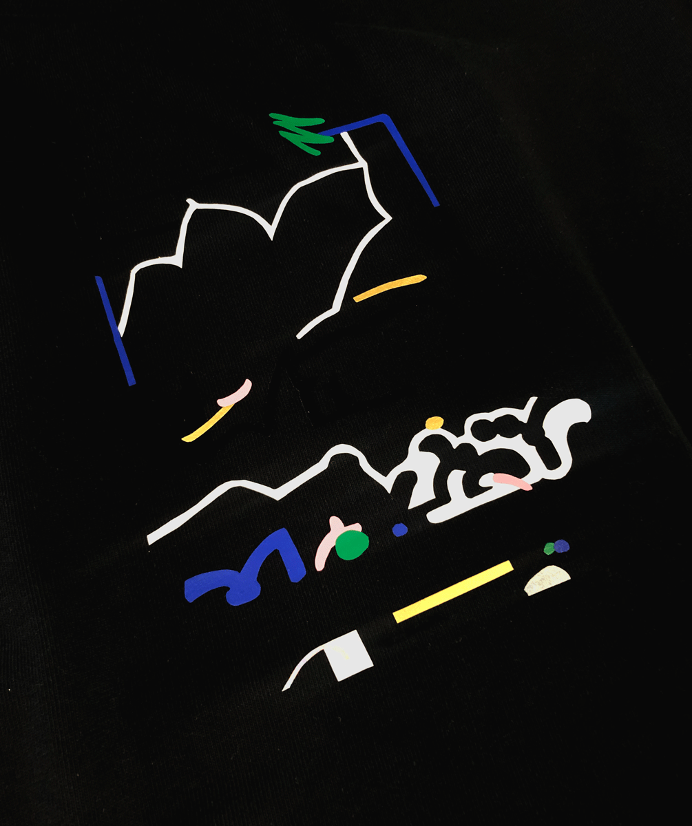
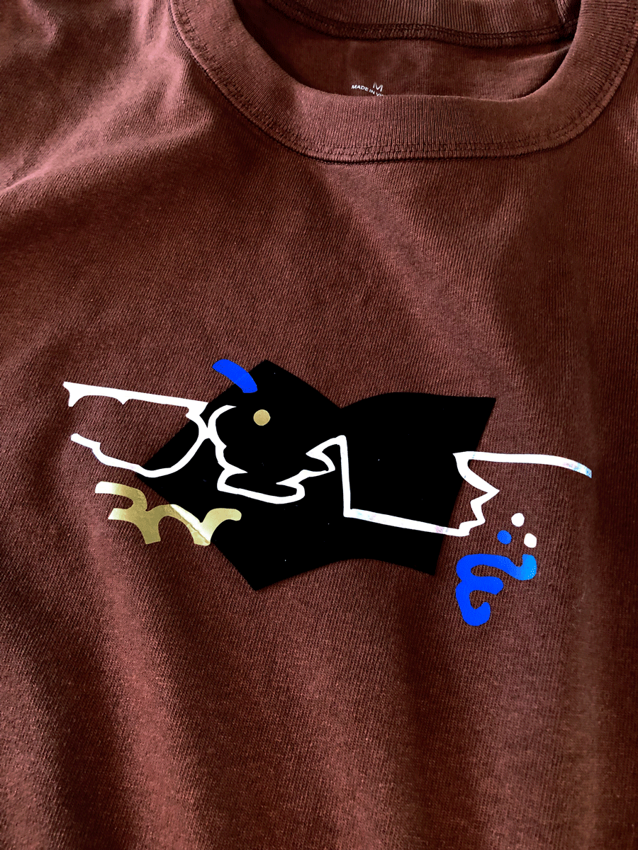
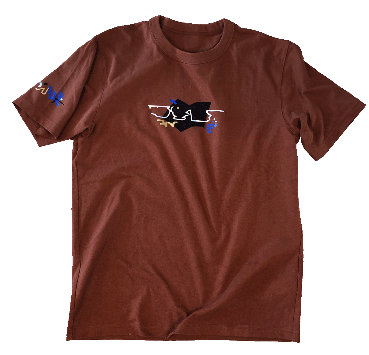
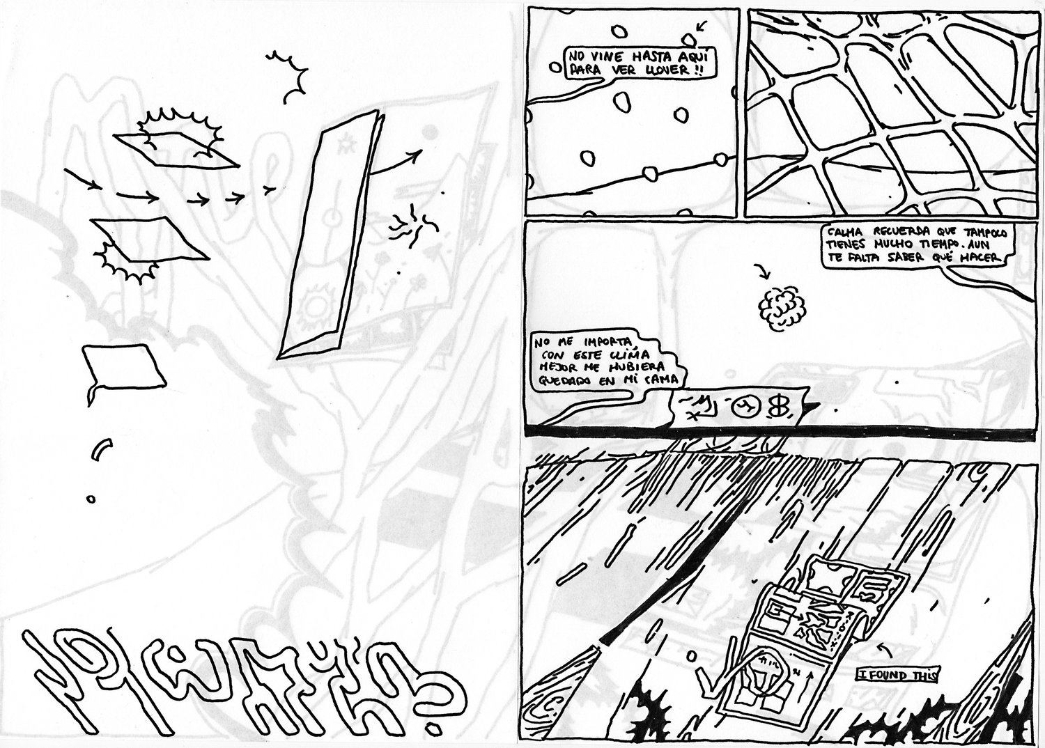
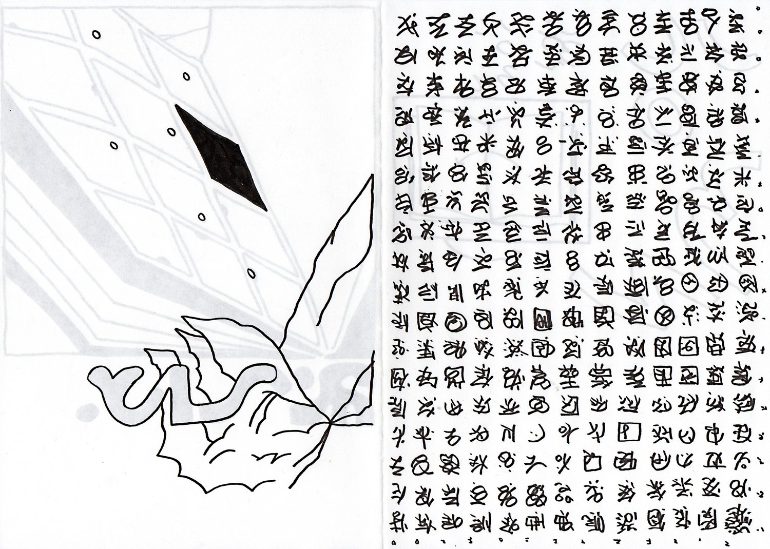
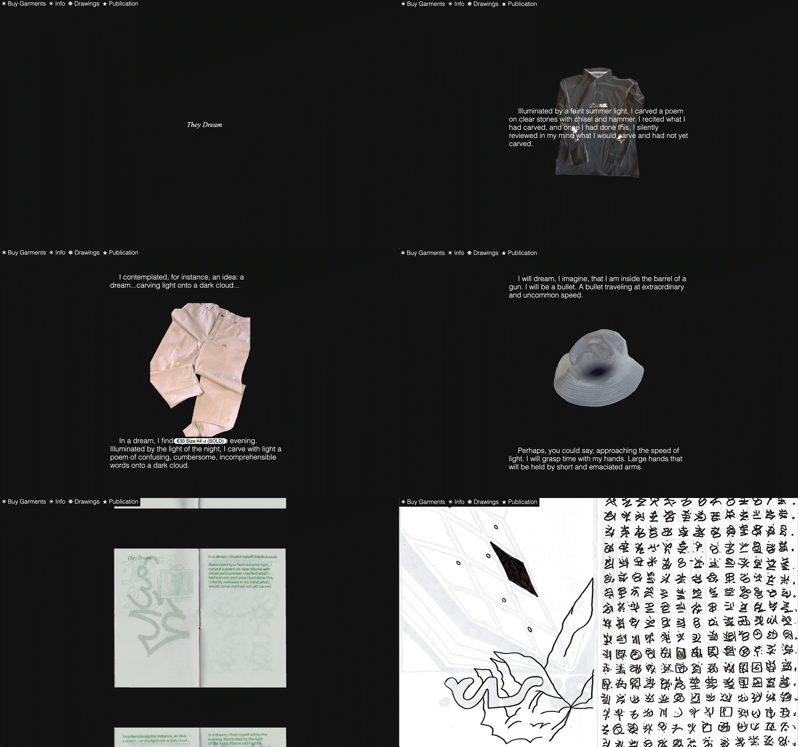
Floating Words is a collection of works, part of an ongoing process to explore asemic writing. Words exist as a graphic intention. There is no clarity. Doesn’t my activate upon reading them? Do they just exist to my eyes?

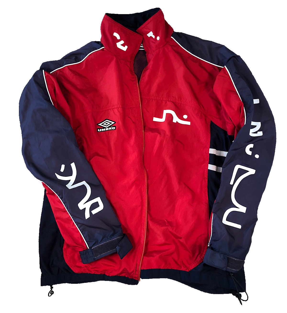
All the stamped designs on the garments were hand cut and pressed by me using leftover material from Diantres, a screen printing and design studio from Bogota, Colombia. I’m grateful for your generosity and love.

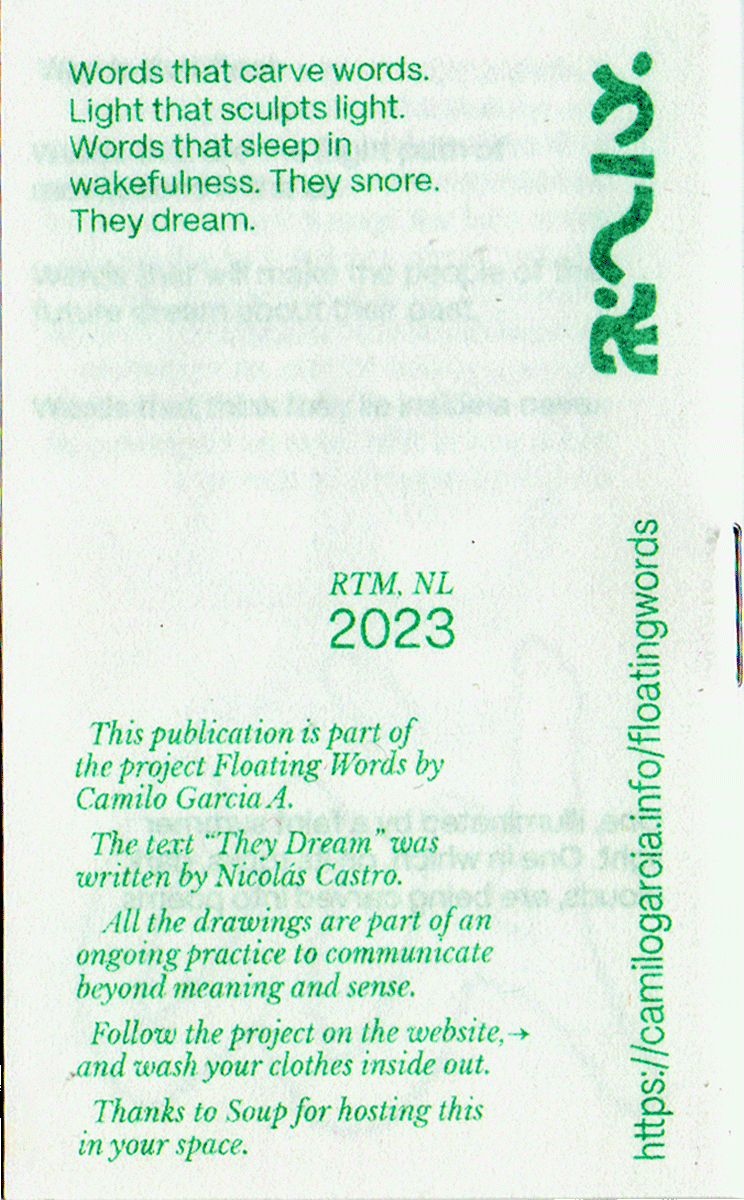
The text “They Dream” was written by Nicolás Castro.

  • All the drawings are part of an ongoing practice to communicate beyond meaning and sense.

  • All of the garments are single pieces and the ones marked with a ↺ were found in second-hand shops.

🌱 Self-hosted

Images:

  • Book

  • Book

  • Book

  • Book

  • Book

  • Book

  • Book

  • Book

  • Book

  • Garment

  • Garment

  • Garment

  • Garment

  • Garment

  • Garment

  • Garment

  • Drawing

  • Drawing

  • Drawing

  • Drawing

  • Website

We De Try

Concept , Illustration , Printing , Binding , Design

Description

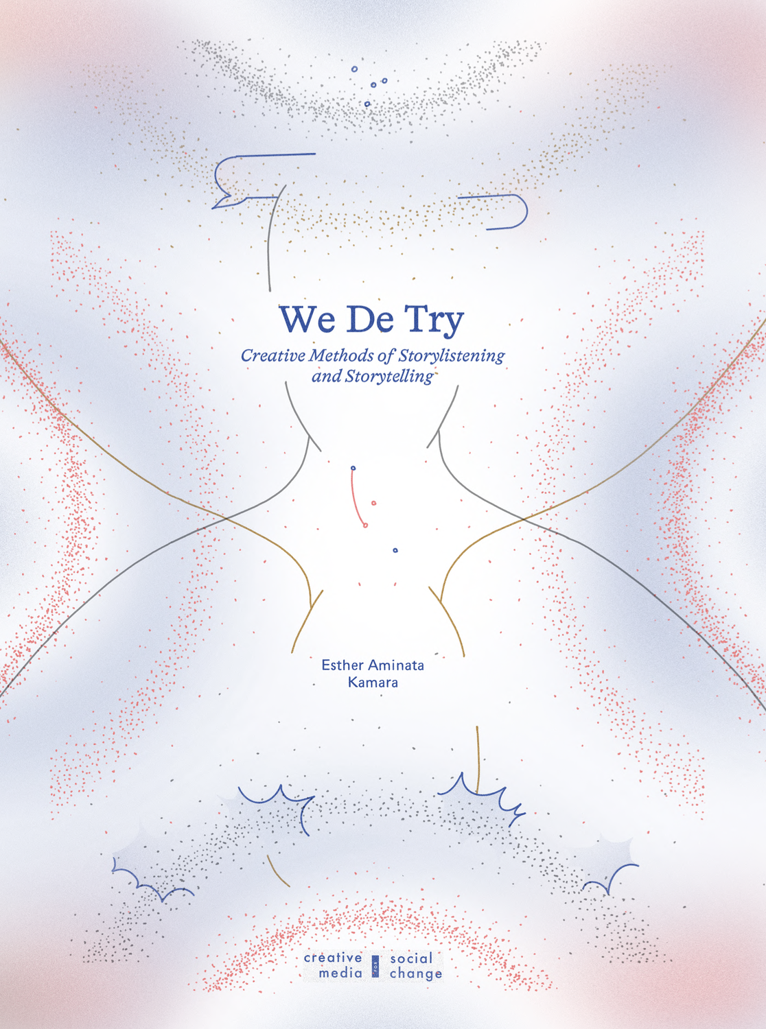
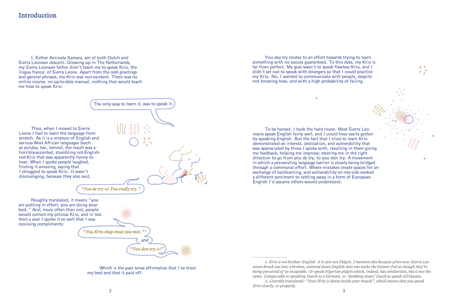
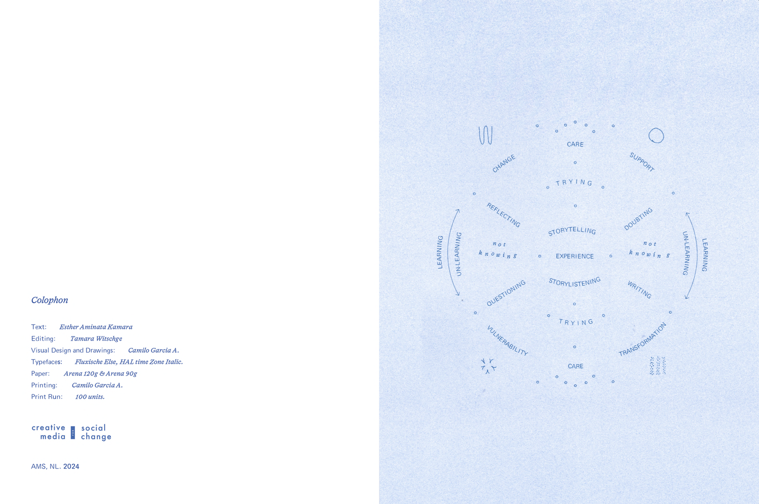
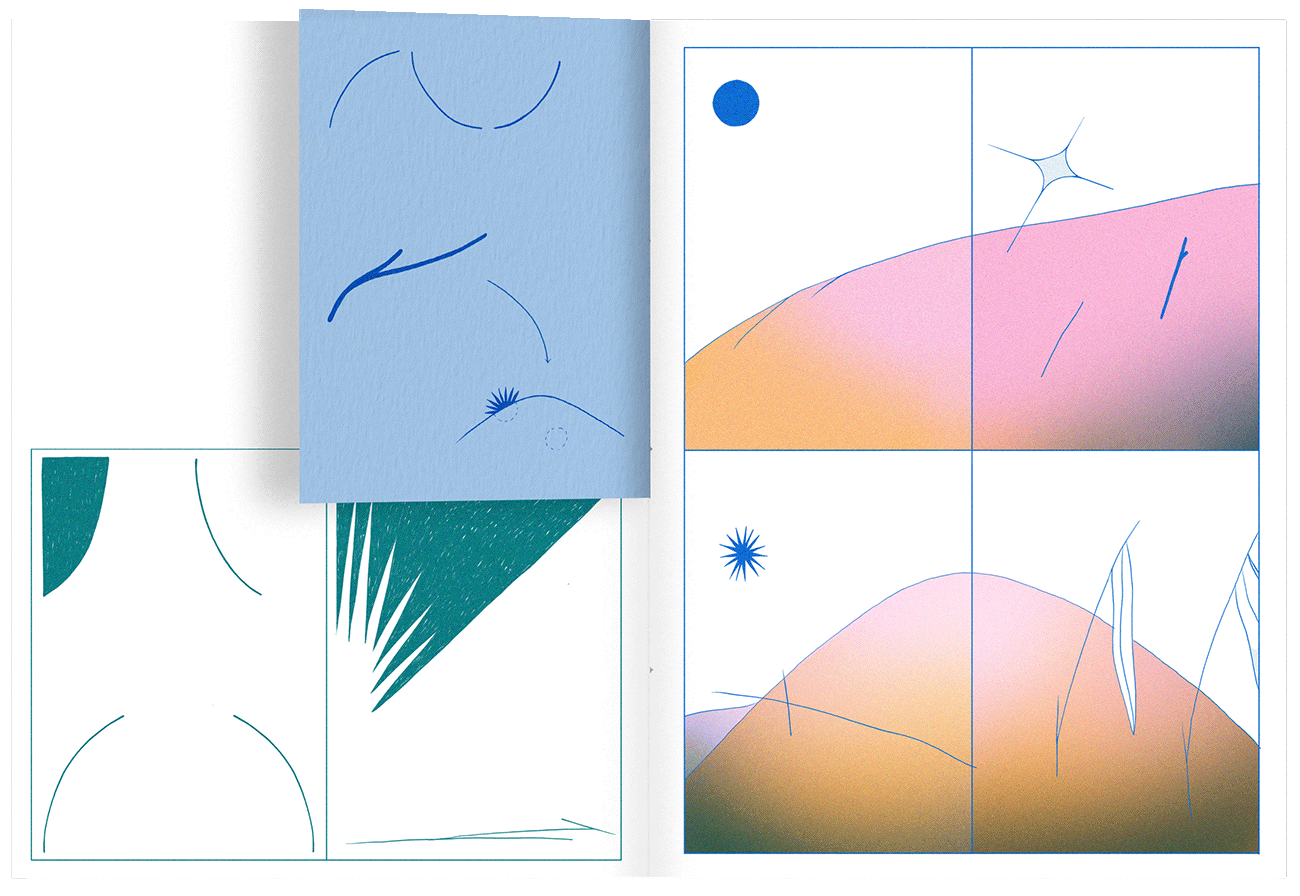
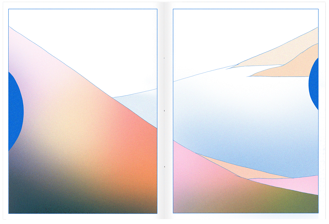
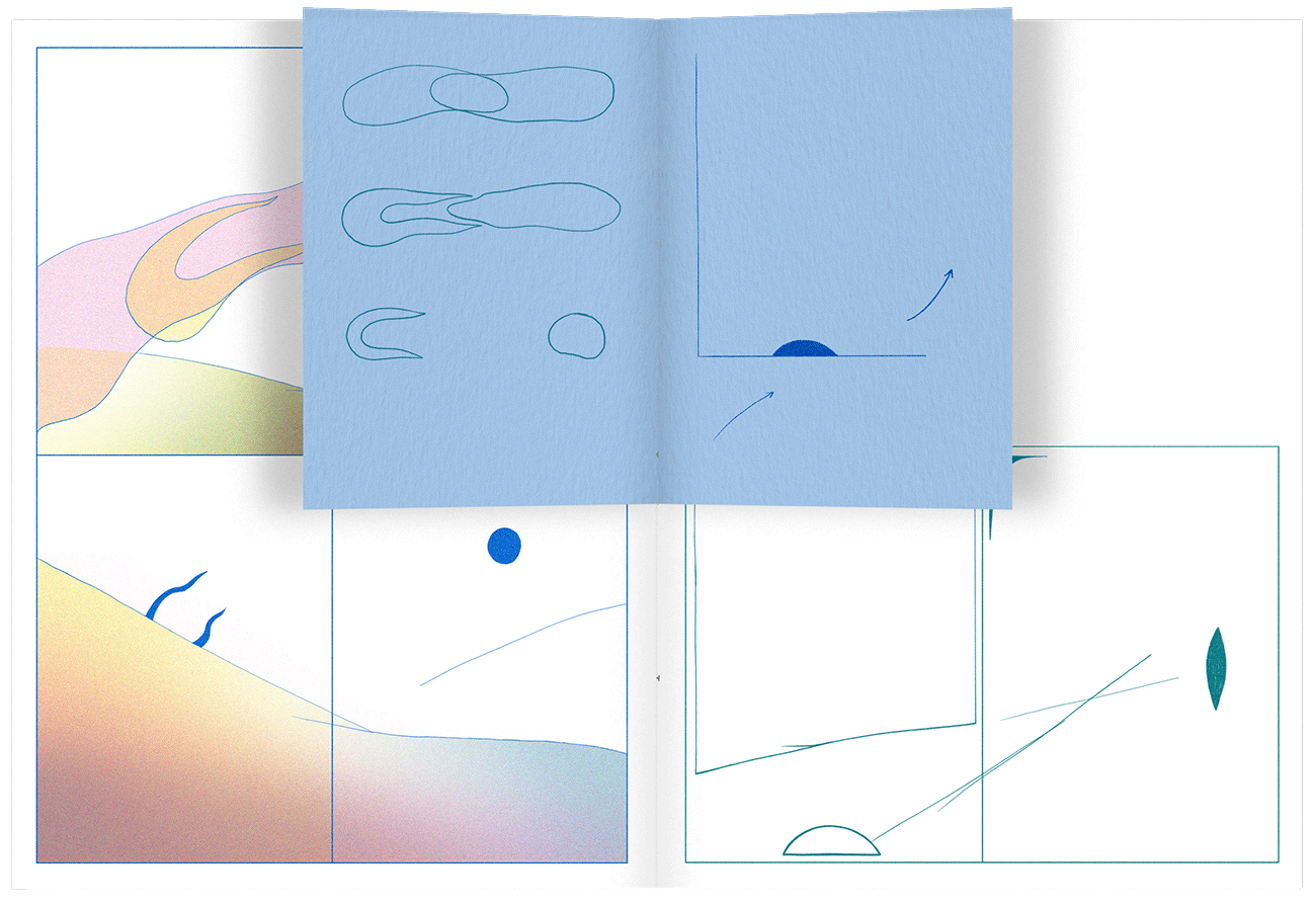
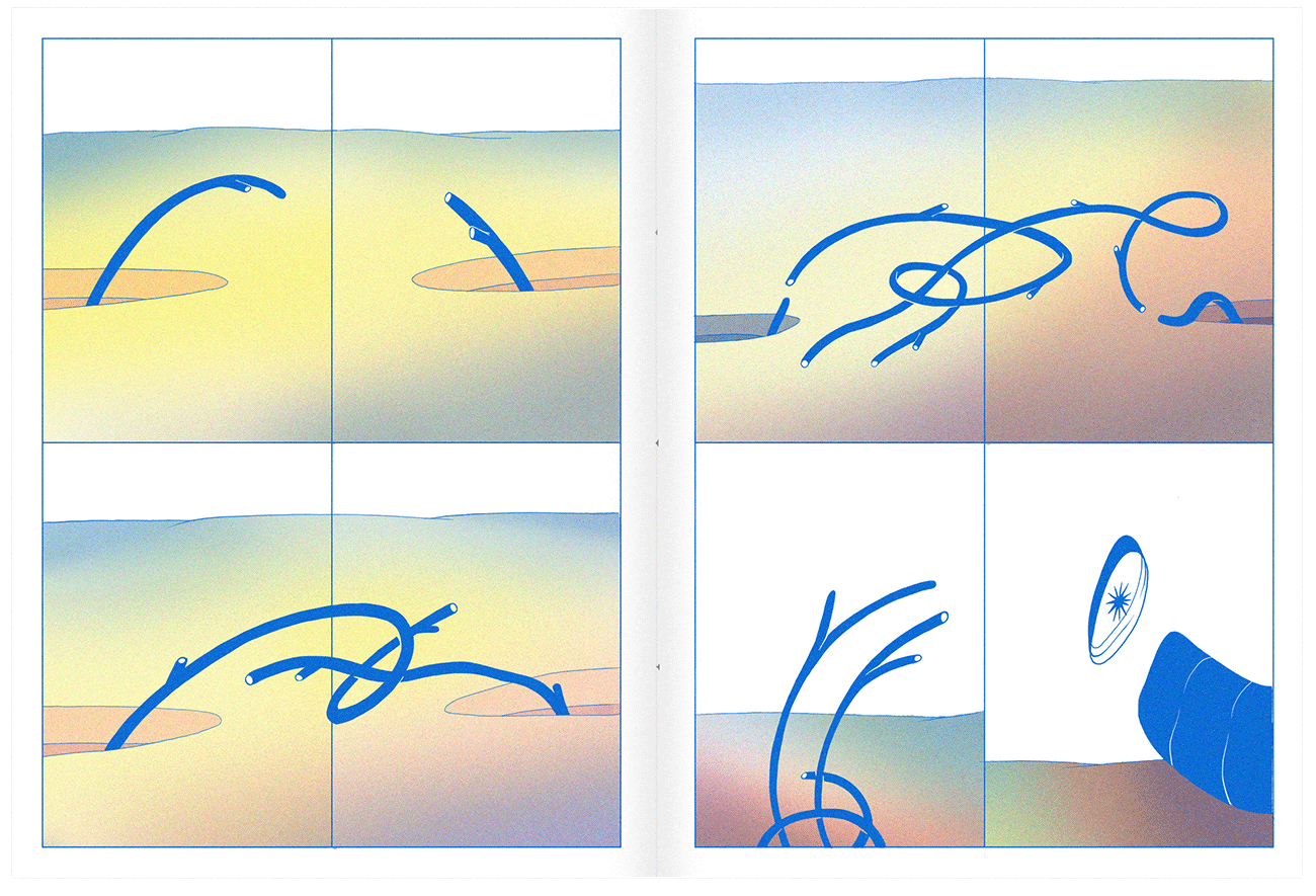
We De Try is a publication developed with Esther Aminata Kamara and Creative Media for Social Change, exploring storytelling and story-listening as research practices within higher education. The research follows a process of questioning how stories are listened to, interpreted and shared, and what care and responsibility mean within these encounters.

How can a publication give form to a personal and non-linear research journey while inviting the reader to listen along the way?

Working with Esther, I first explored different forms the research could take, including an interactive website, a podcast series and an illustrated book. Together we chose to develop the book, and I translated her writing and research journey into a visual and material form.

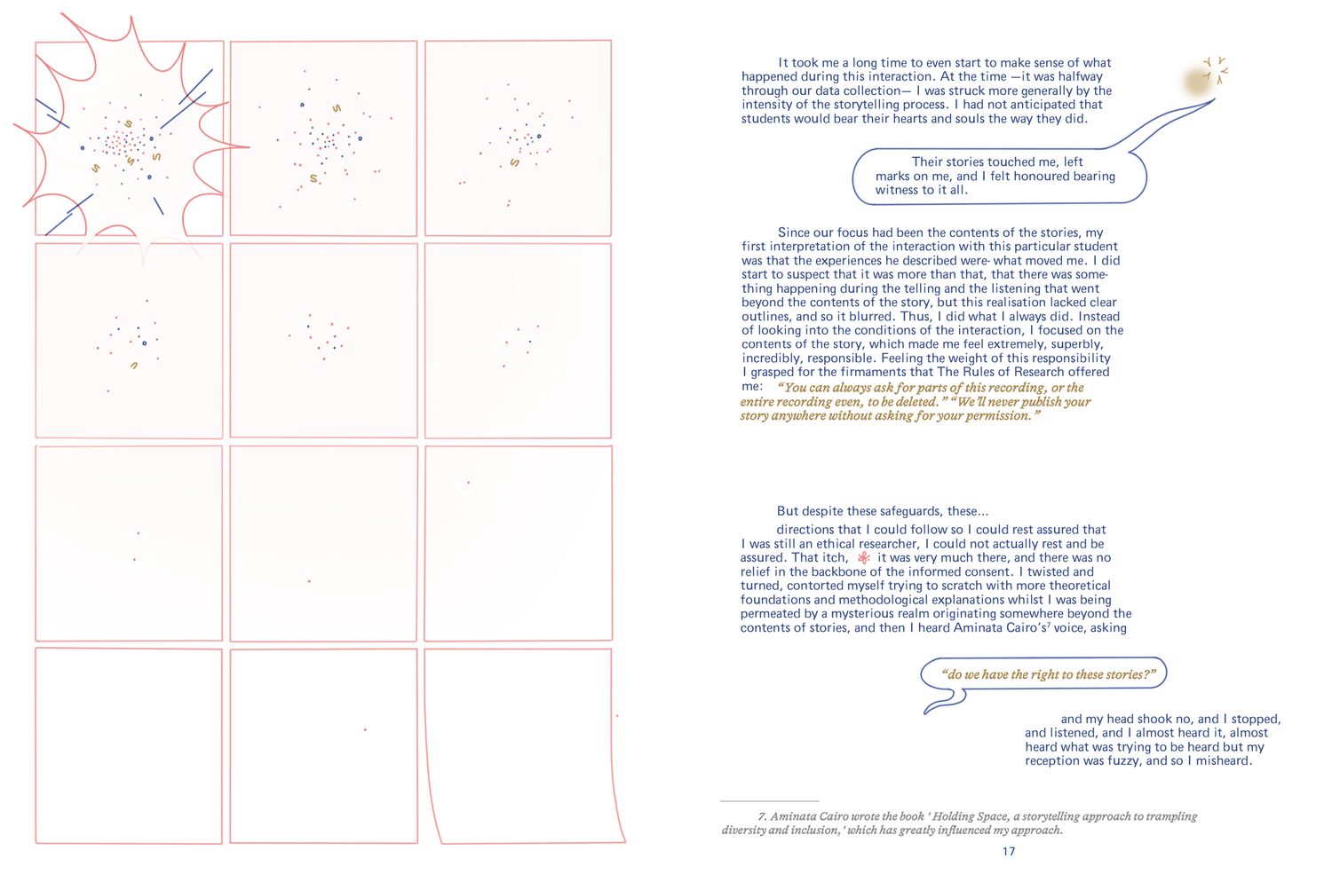
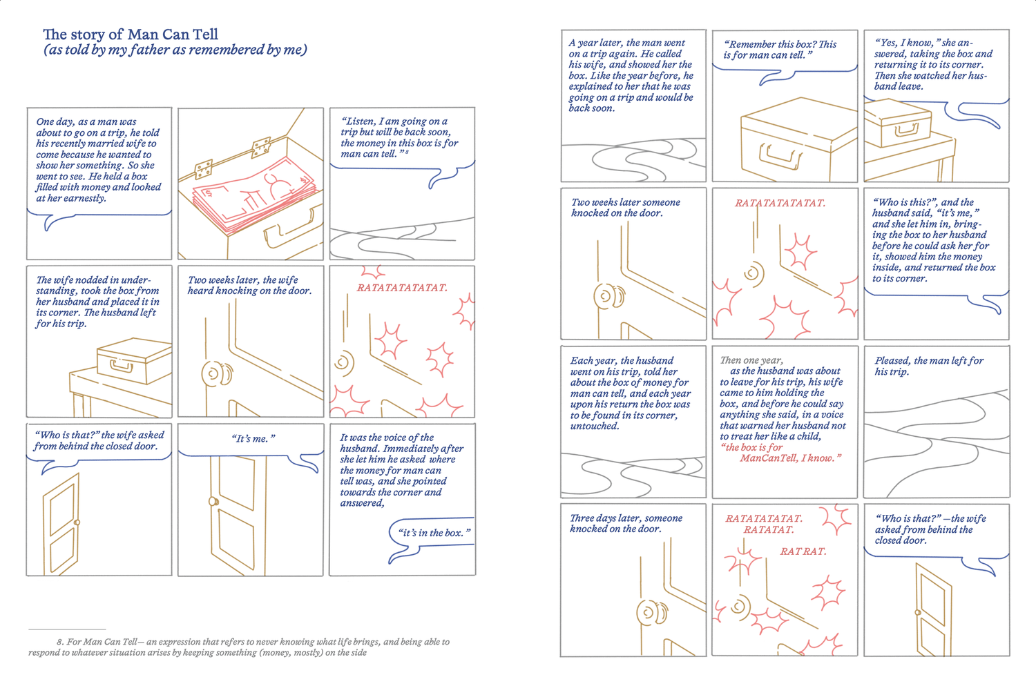
I designed and illustrated the publication as a continuous reading experience, using drawings, diagrams, shifts in composition and speech-like elements to accompany the movement between personal stories, research reflections and theoretical ideas. The visual language moves alongside the writing and helps give rhythm and form to the changes in voice and perspective.

The final publication was printed and binded by me in 4 color RISO printing, carrying the project from early publishing exploration through design, illustration and final production.

My role:

  • Publishing concept
  • Format exploration
  • Illustration
  • Publication design
  • RISO printing & production

Research & writing:

  • Esther Aminata Kamara

Editorial collaboration:

  • Tamara Witschge

Details:

  • 32p
  • 50 copies.
  • Paper: Natural Arena 120g & 240g
  • RISO print 4 inks

Images:

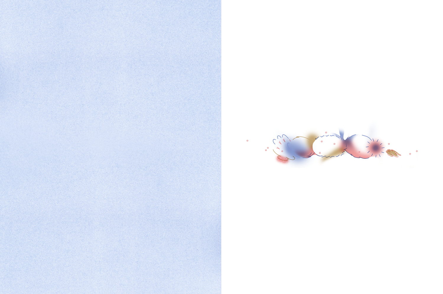
  • We De Try illustrated book cover
  • We De Try illustrated book opening spread
  • We De Try illustrated book text and drawing spread
  • We De Try illustrated book research spread
  • We De Try illustrated book diagram and text spread
  • We De Try illustrated book contents spread
  • We De Try illustrated book interior page
  • We De Try illustrated book cover

Diffraction Game

Printing , Design

Description

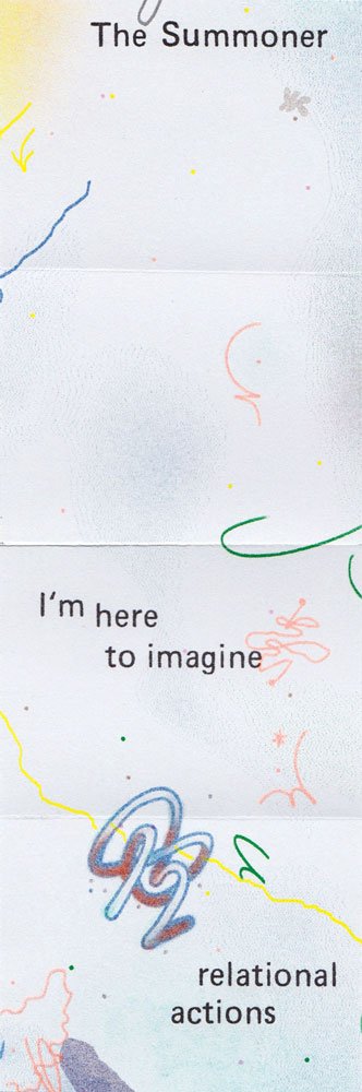
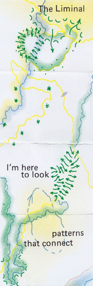
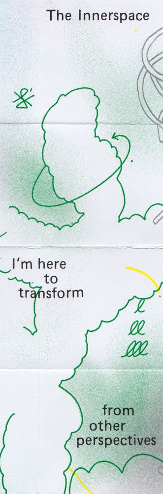
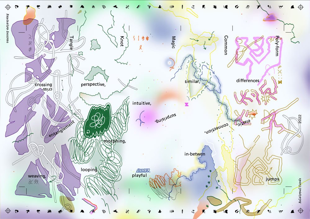
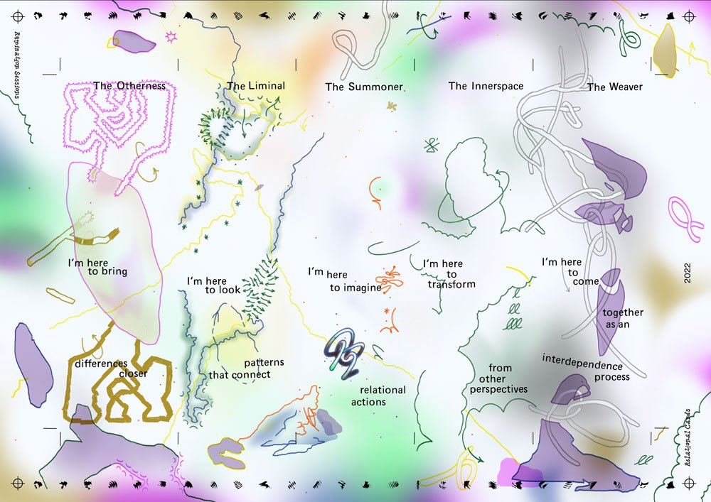
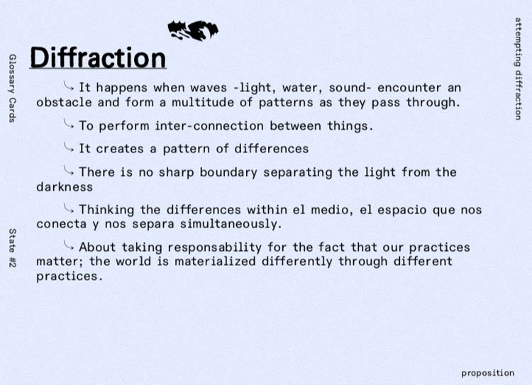
Looking to expand the possibilities of “connecting” as part of the Living glossary for a diffractive publishing practice, I created a role-like game that would reflect and expand the glossary itself by proposing different approaches to it.

The different characters would perform for different perspectives on the connections among:

The liminal, the weaver, the summoner, the otherness, the inner space.

Images:

  • Card
  • Card
  • Card
  • Card
  • Card
  • Card
  • Card
  • Card
  • Card
  • Card
  • Card

Diffraction/Reflection

Drawing , Printing , Binding

Description

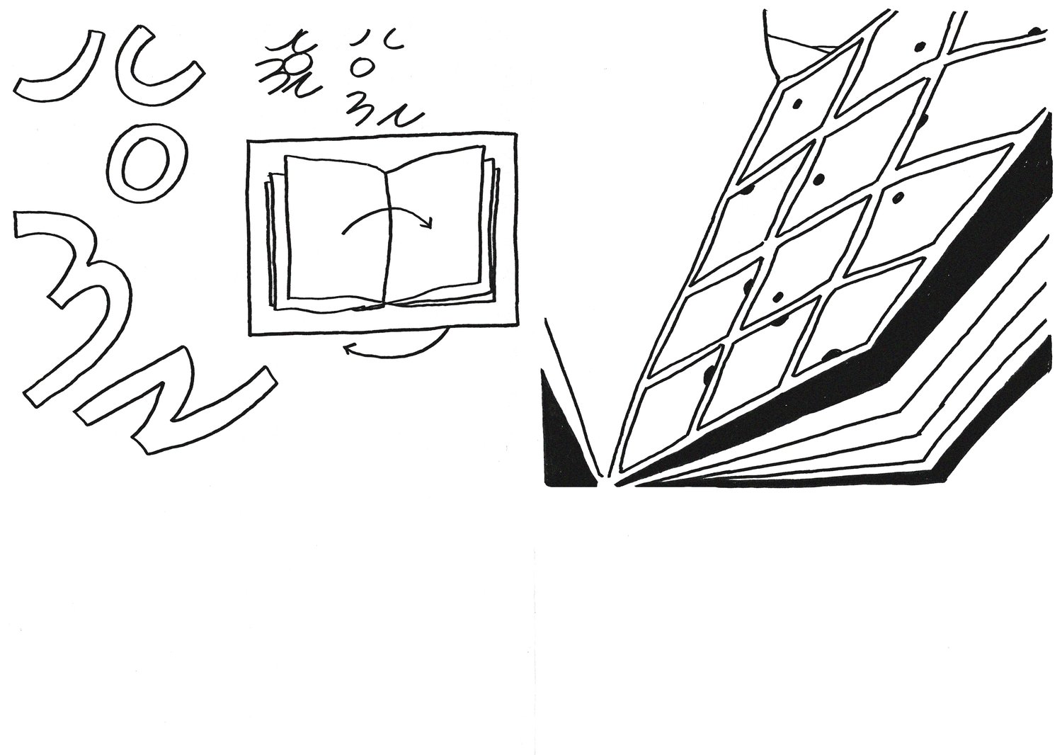
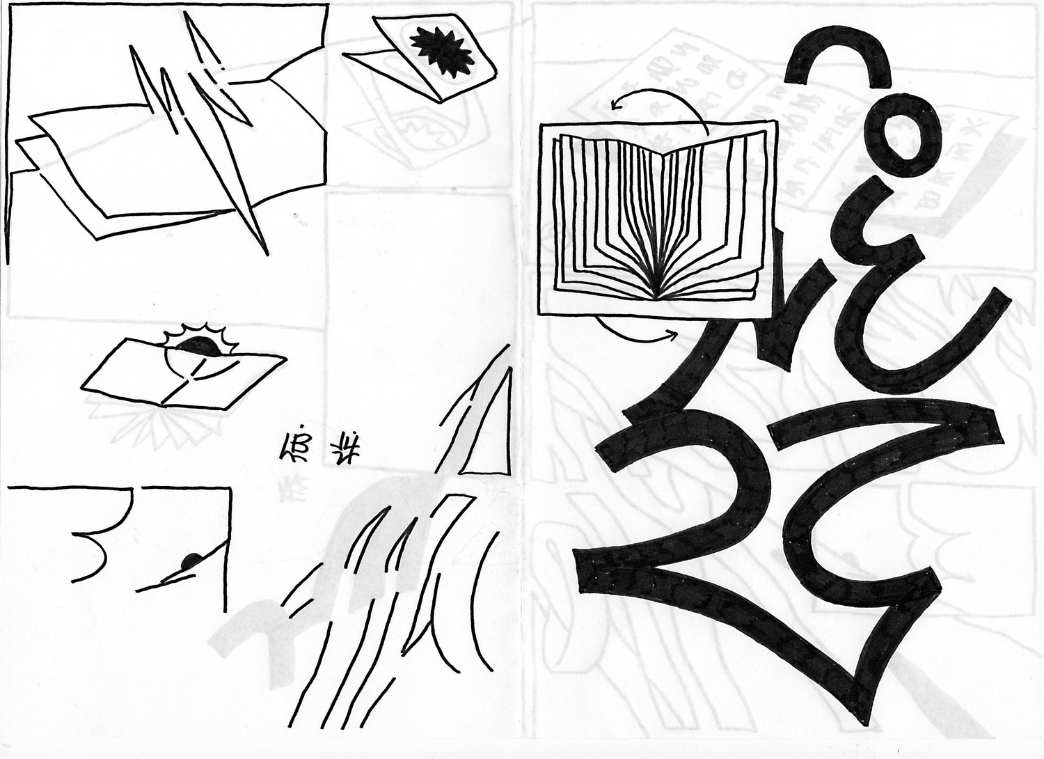
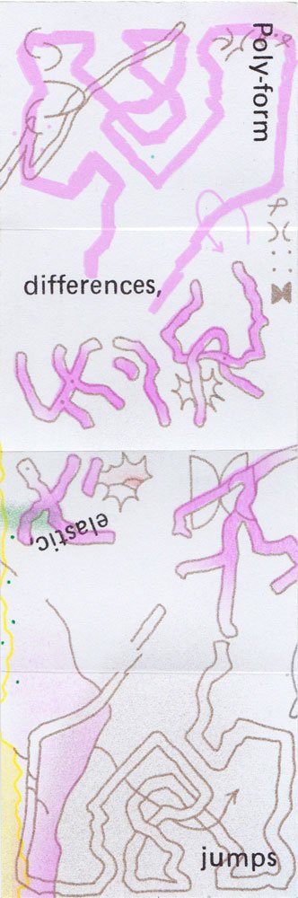
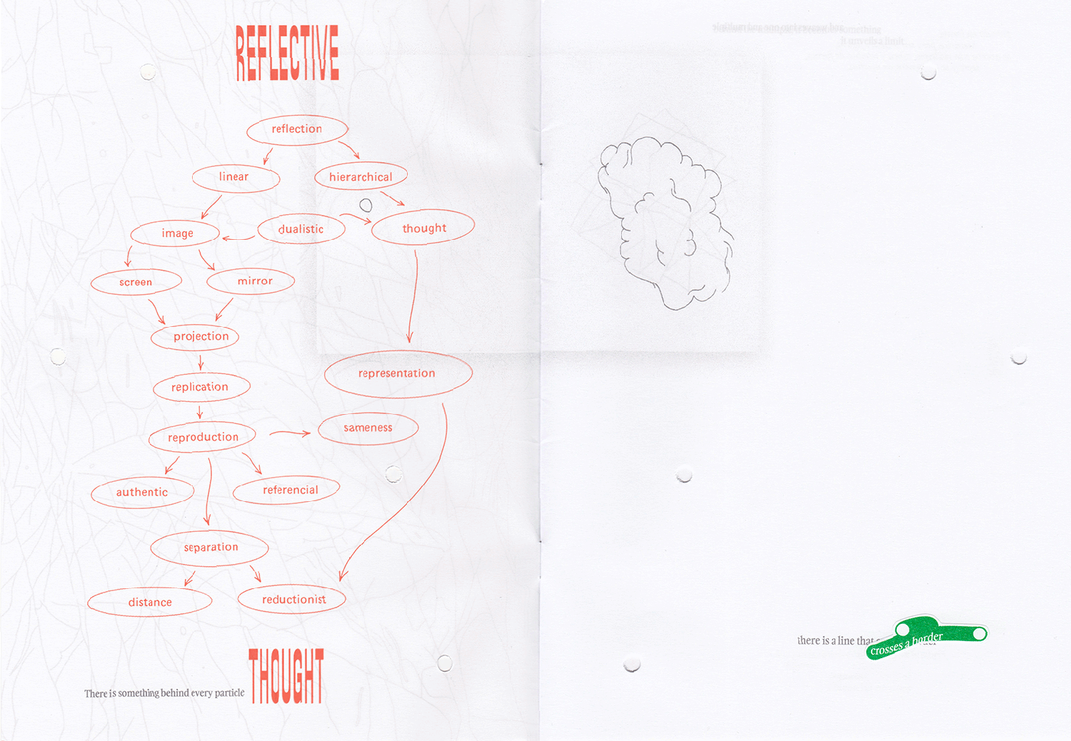
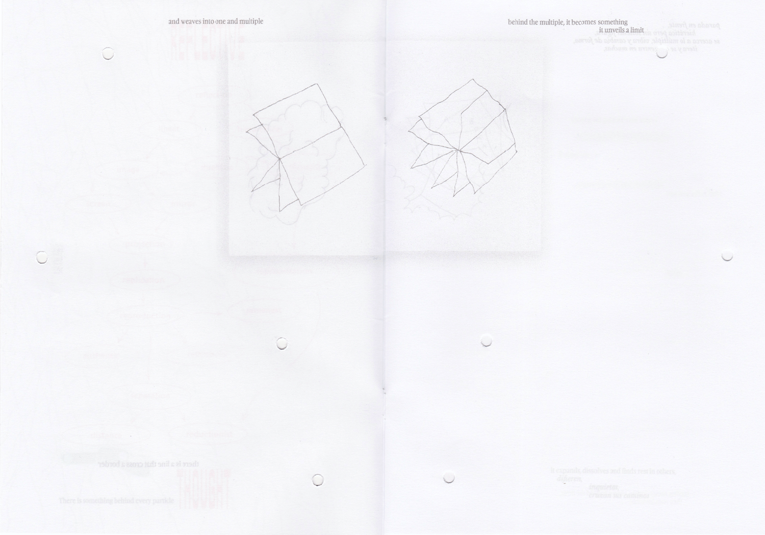
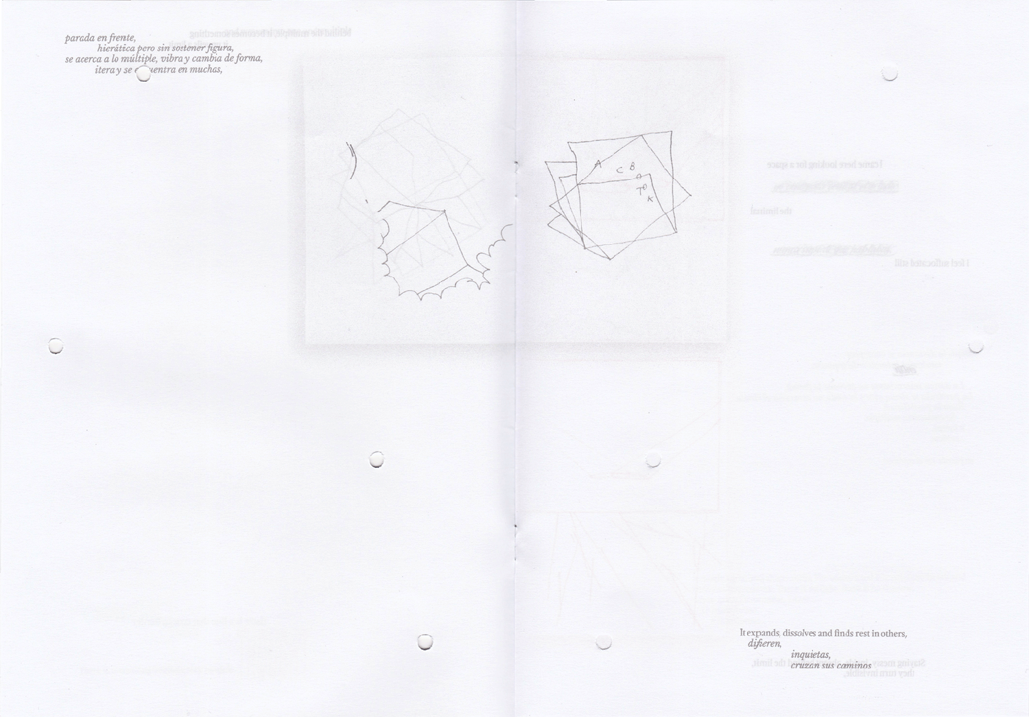
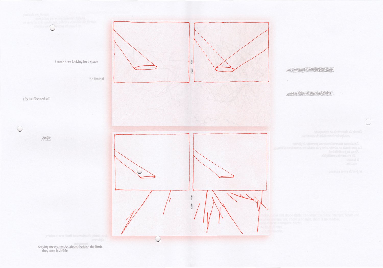
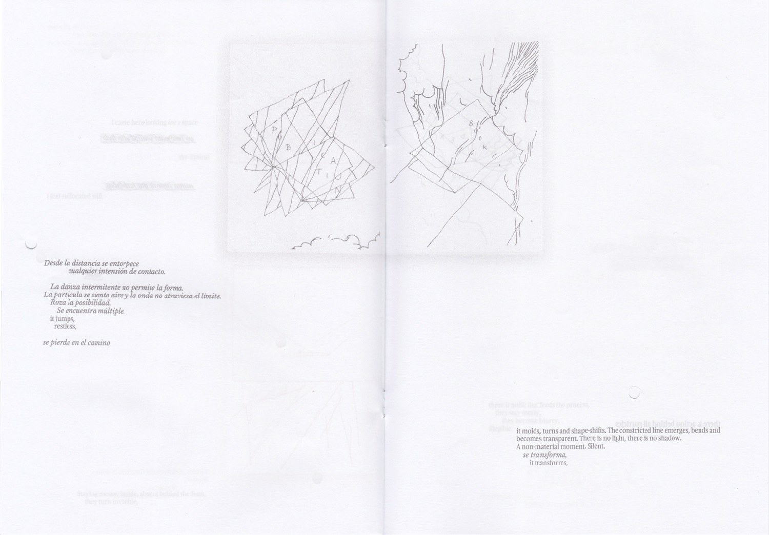
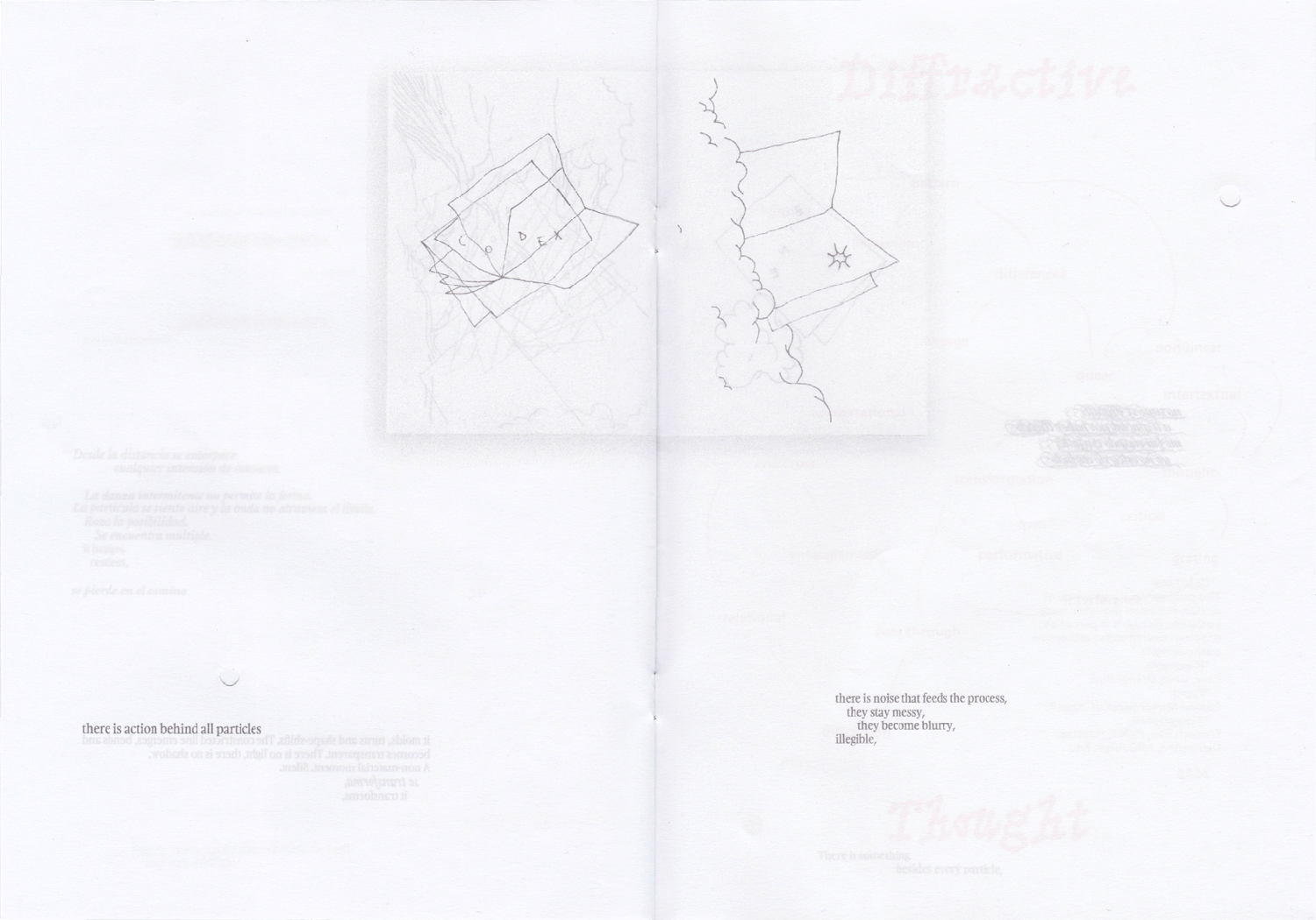
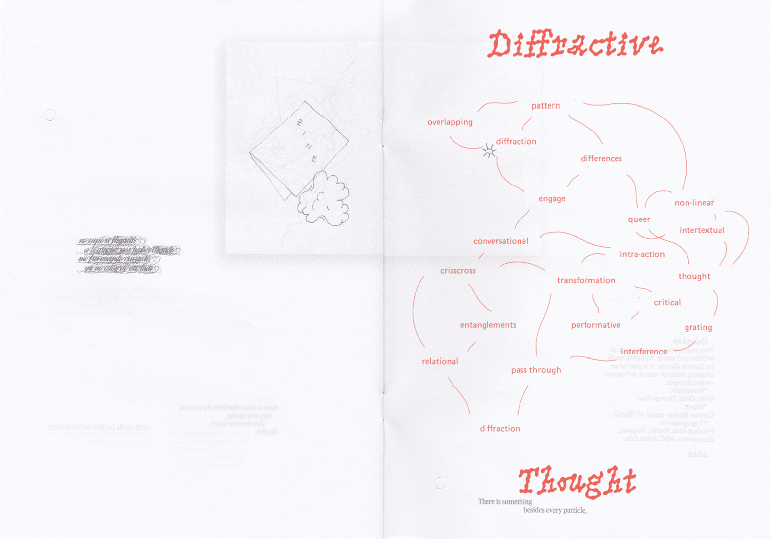
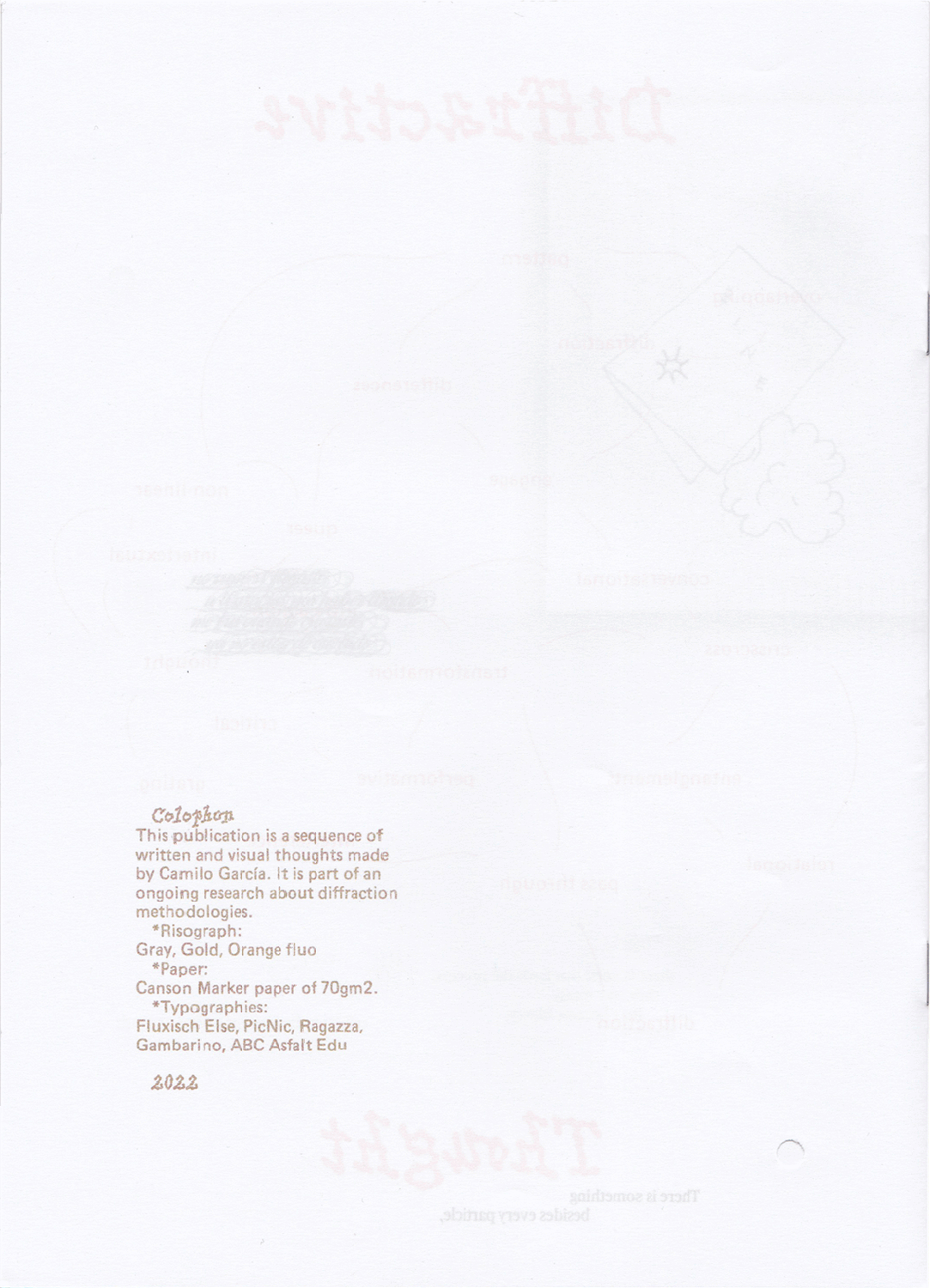
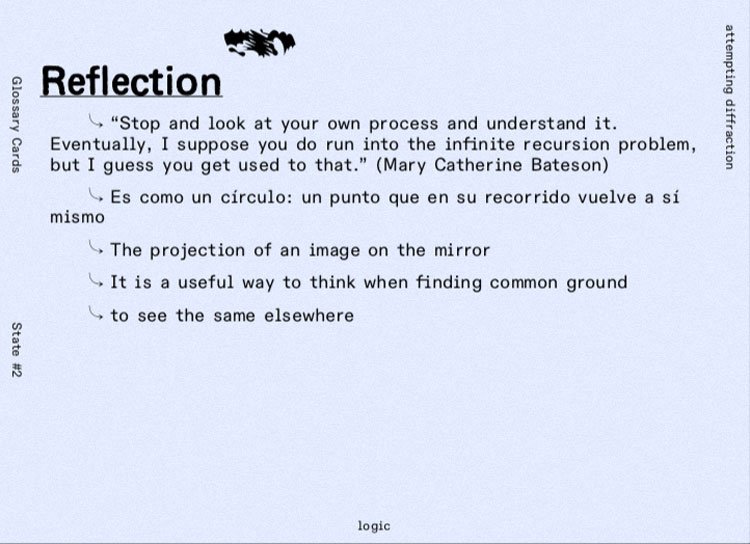
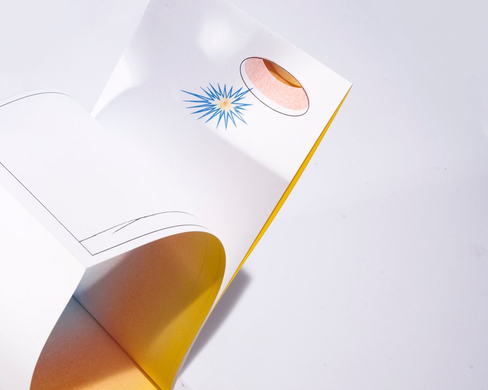
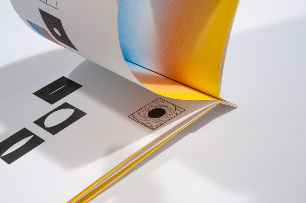
What are the differences between reflection and diffraction?

This experimental zine explores both thought processes using book drawings, conversational writing and hole punching on the pages.

Details:

  • 16 pages
  • 50 copies
  • RISO printed
  • INKS: Gold, gray and fluorescent orange inks

Images:

  • Book
  • Diagram
  • Book
  • Book
  • Book
  • Book
  • Book
  • Book
  • Book

Digesting Care

Printing , Binding , Coding , Illustration

Description

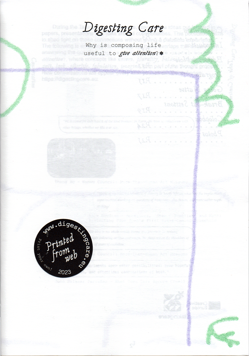
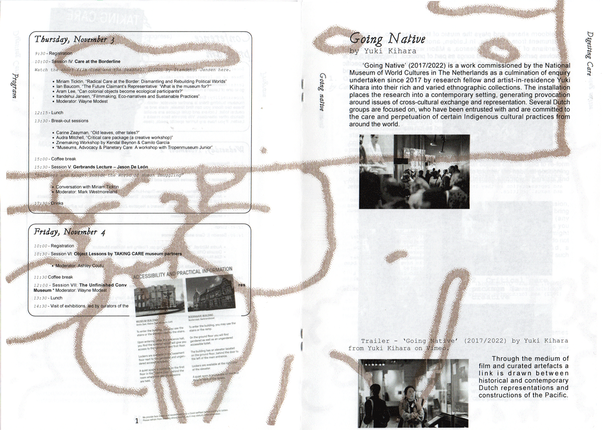
Digesting Care is an experimental publication developed with Kendal Beynon for TAKING CARE, a European research project exploring care and kinship within ethnographic and world cultures museums.

How can a publication make connections across a conference without reducing its complex and sometimes unresolved conversations into a single narrative?

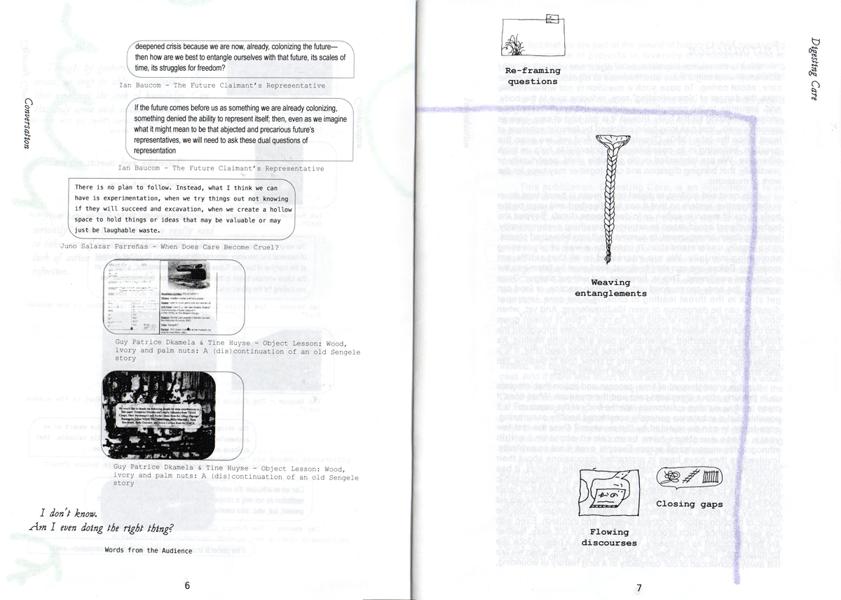
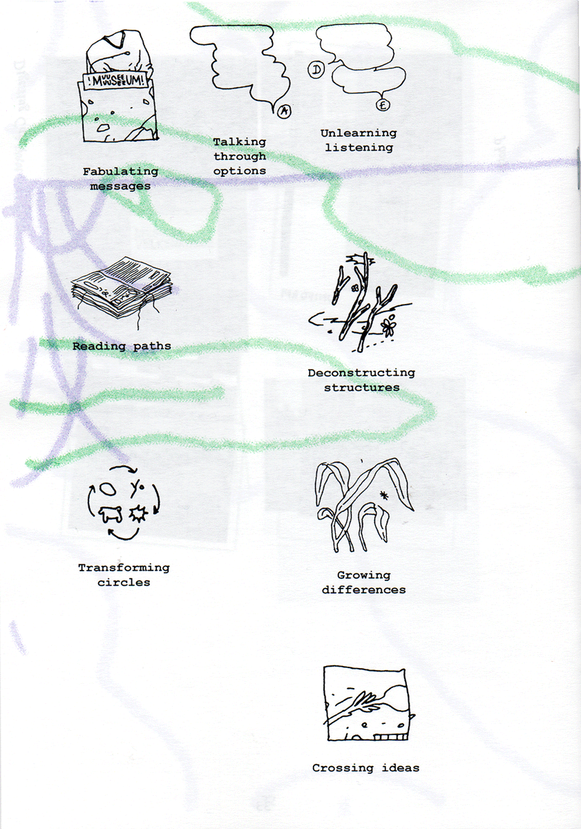
We attended the conference as listeners and participants, using drawing as a form of note-taking to capture ideas, conversations and relationships beyond written documentation. Recurring concepts such as contradiction, plurality, fabulation, entanglement and the unknown became a tagging system through which papers, presentations, photographs and workshop materials could be connected.

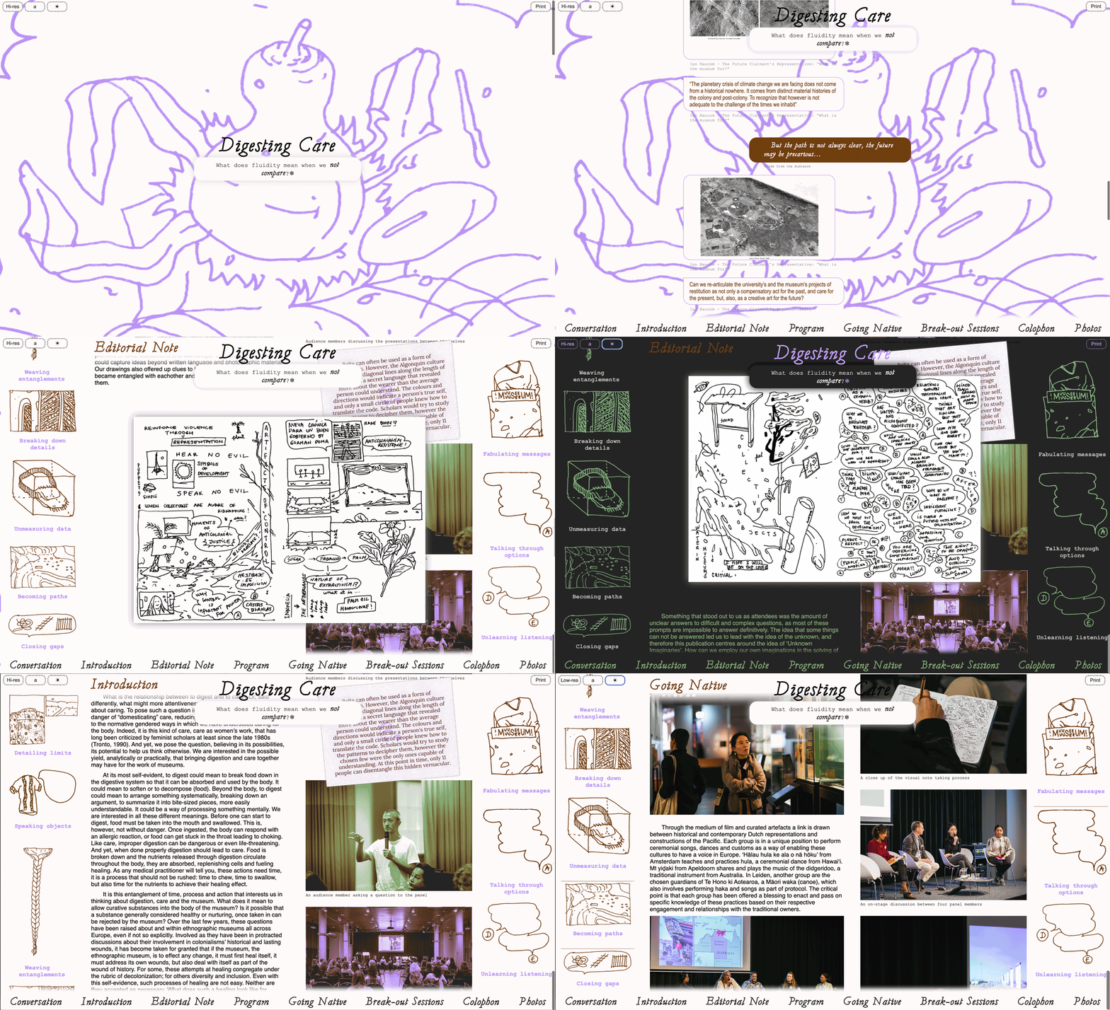
Rather than separating editorial work, design and development, we built a publishing infrastructure in which these processes could inform each other. Collaborative text files and tags were transformed through Python into a lightweight website, while the same content and visual system extended into a physical publication. The digital version uses semantic HTML and dithered images, with high-resolution media available on demand, considering accessibility, resilience and energy use as part of the publishing process.

The website also became the blue print for the physical edition. Fifty different states of the website were printed, producing 50 unique versions of the publication. Rather than reproducing a single definitive arrangement, each copy preserves one possible reading of the material.

The result is a hybrid publication that treats publishing not as the documentation of a finished conversation, but as a way of revealing relationships between ideas and allowing different readings to emerge across digital and physical forms.

My role:

  • Illustration
  • Publication design
  • Web design & development

Editorial collaboration:

  • Kendal Beynon

Images:

  • Digesting Care publication cover
  • Digesting Care publication pages with notes and images
  • Digesting Care publication spread with drawings and text
  • Digesting Care illustrated publication back cover
  • Digesting Care interactive publication website

Living Glossary

Research , Coding , Printing , Design

Description

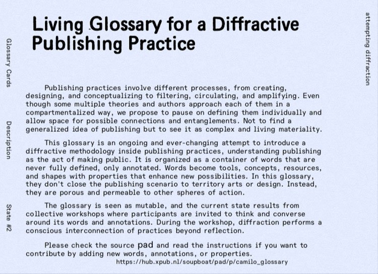
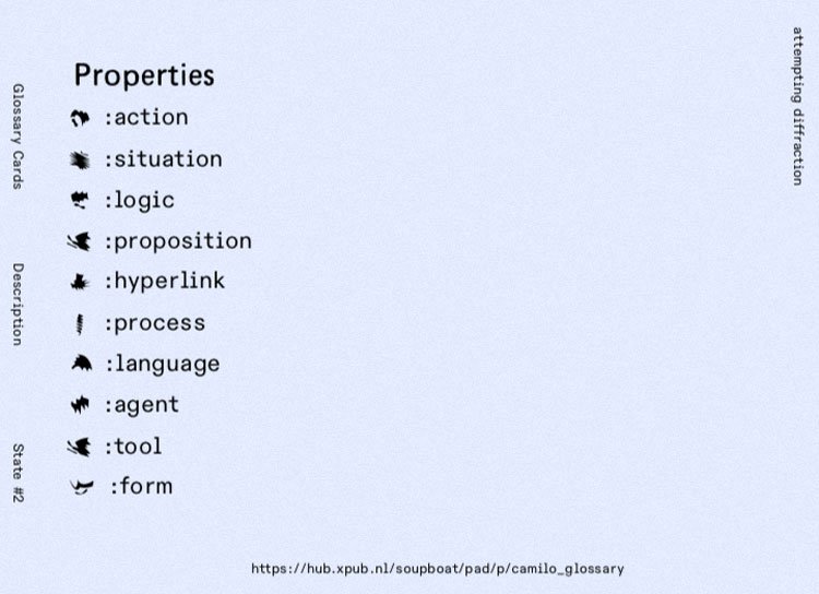
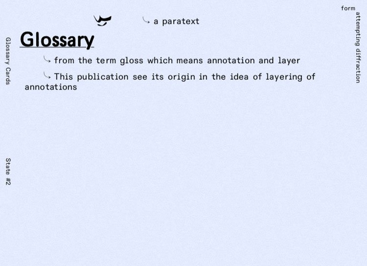
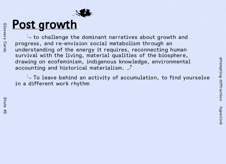
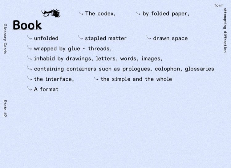
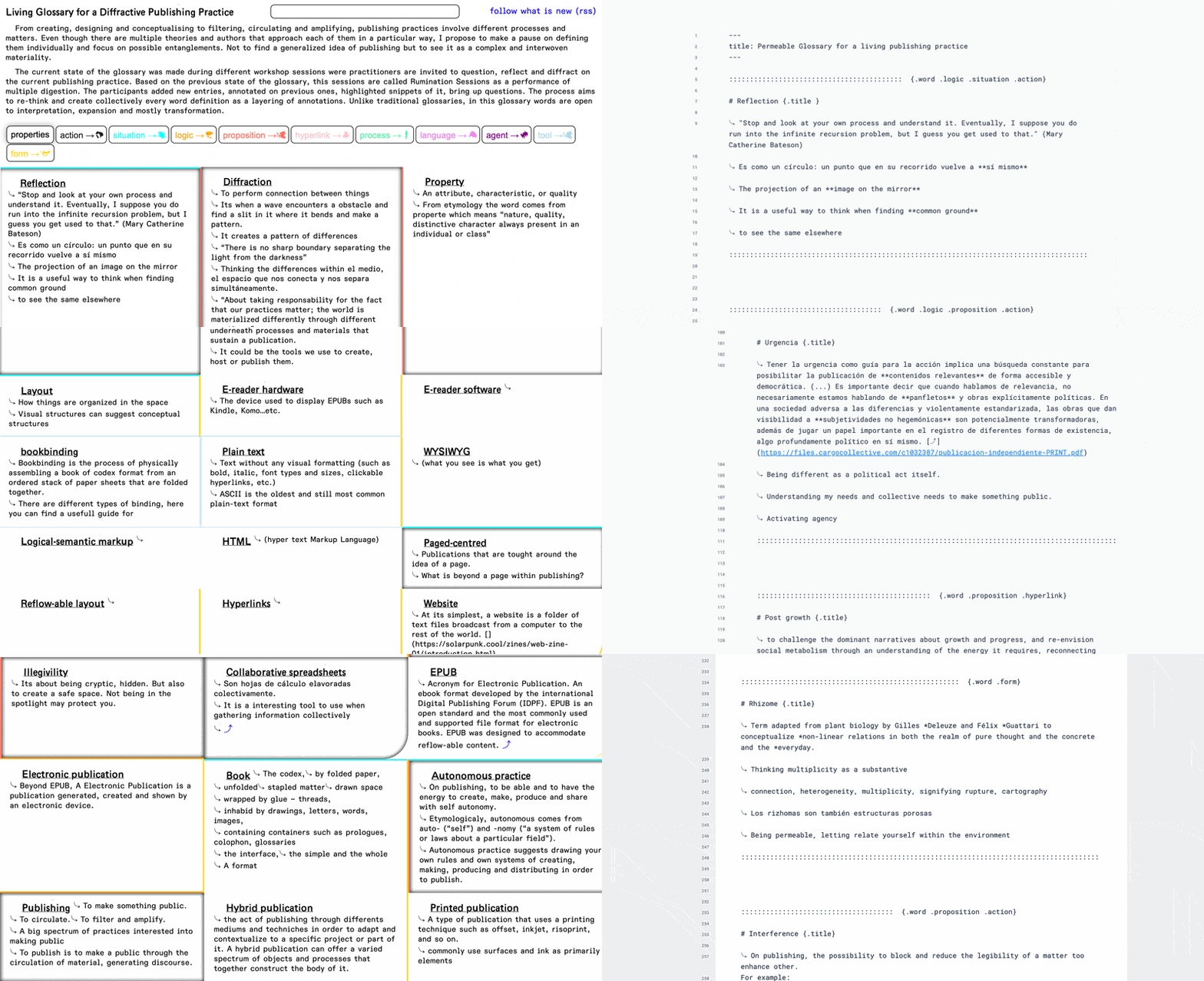
Living glossary for a diffractive publishing practice is an ongoing and ever-changing attempt to introduce a diffractive methodology inside publishing practices, understanding publishing as the mere act of making public. It is organized as a container of words that are never fully defined, only annotated. Words become tools, concepts, resources, and shapes with properties that enhance new possibilities. In this glossary, they don’t close the publishing scenario to territory arts or design. Instead, they are porous and permeable to other spheres of action.

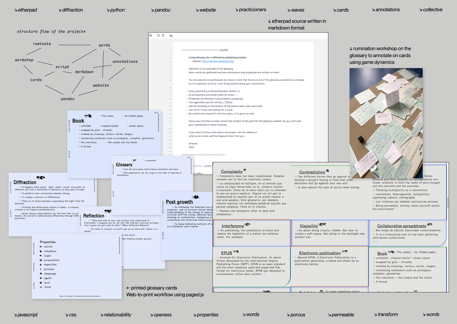
The glossary is seen as mutable, and the current state results from collective workshops where participants are invited to think and converse around its words and annotations. During the workshop, diffraction performs a conscious interconnection of practices beyond reflection.

From the technical side there is source pad were all annotations take place in a markdown format which is processed by a Python script that writes it as a website using Pandoc and then Js.

Images:

  • Cards

  • Cards

  • Cards

  • Cards

  • Cards

  • Cards

  • Cards

  • Website

  • Slide

Permeable Territories

Coding , Printing , Design , Layout , Writing , Illustration

Description

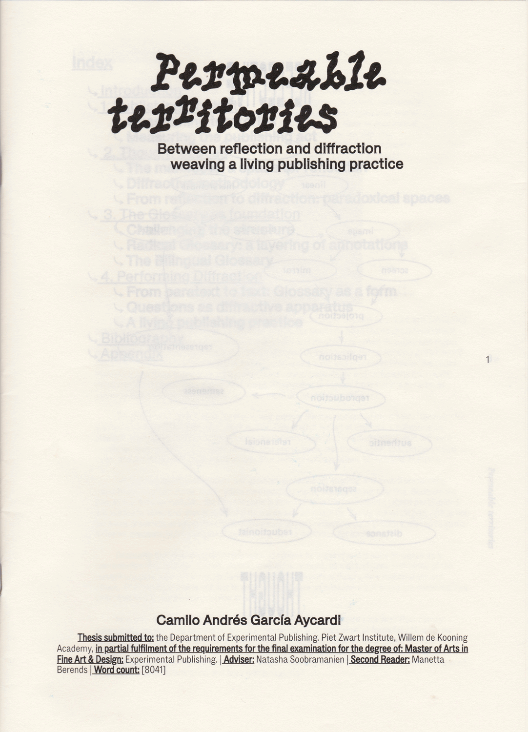
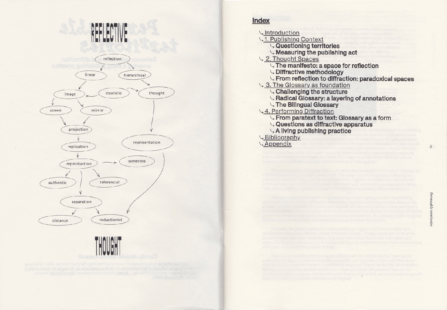
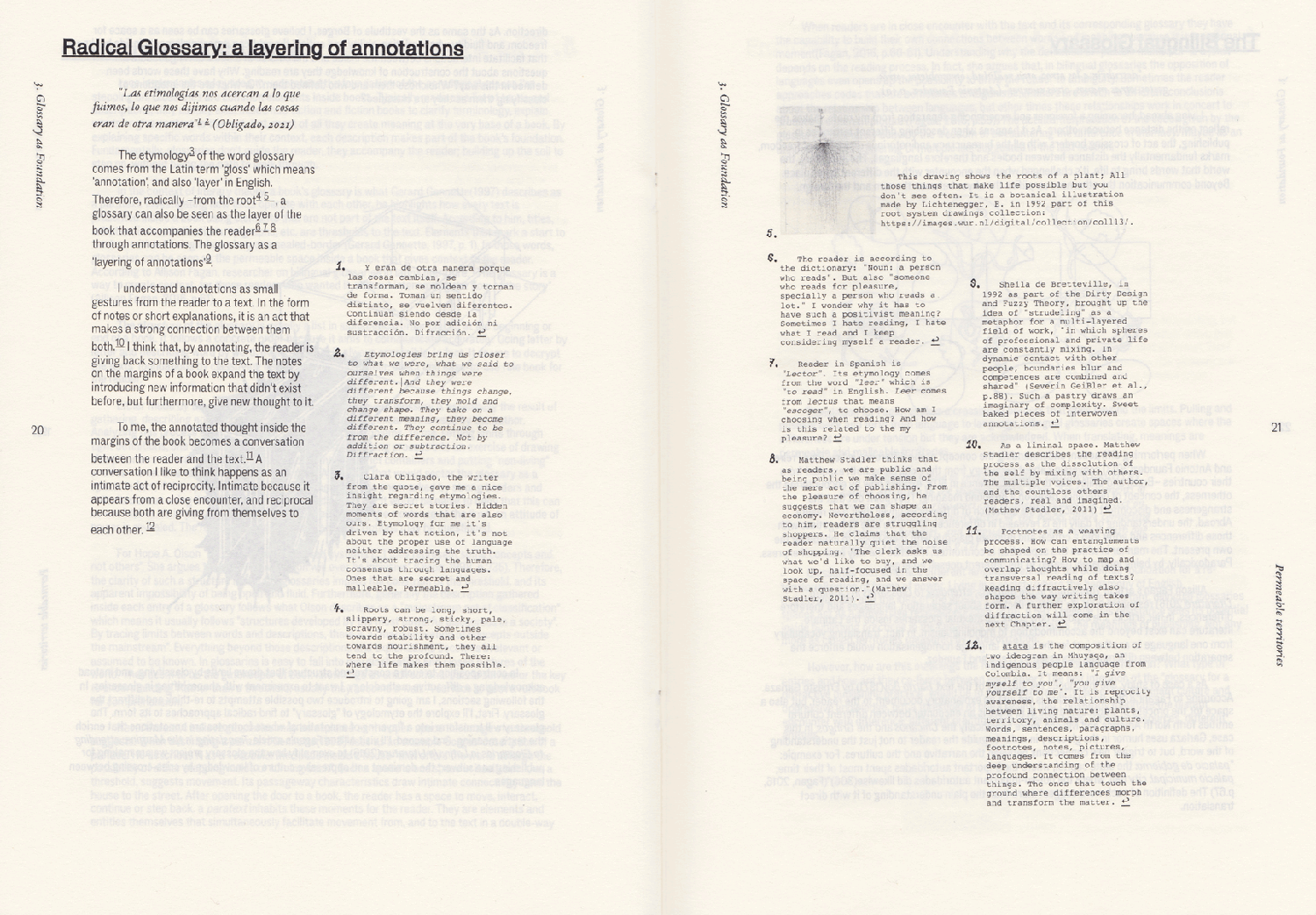
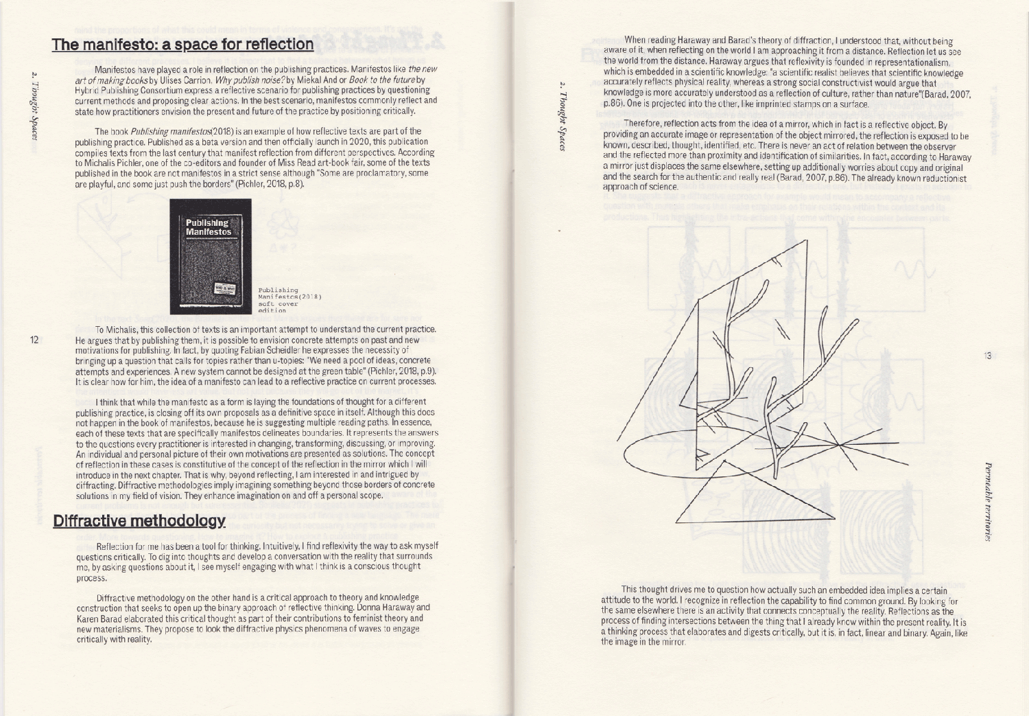
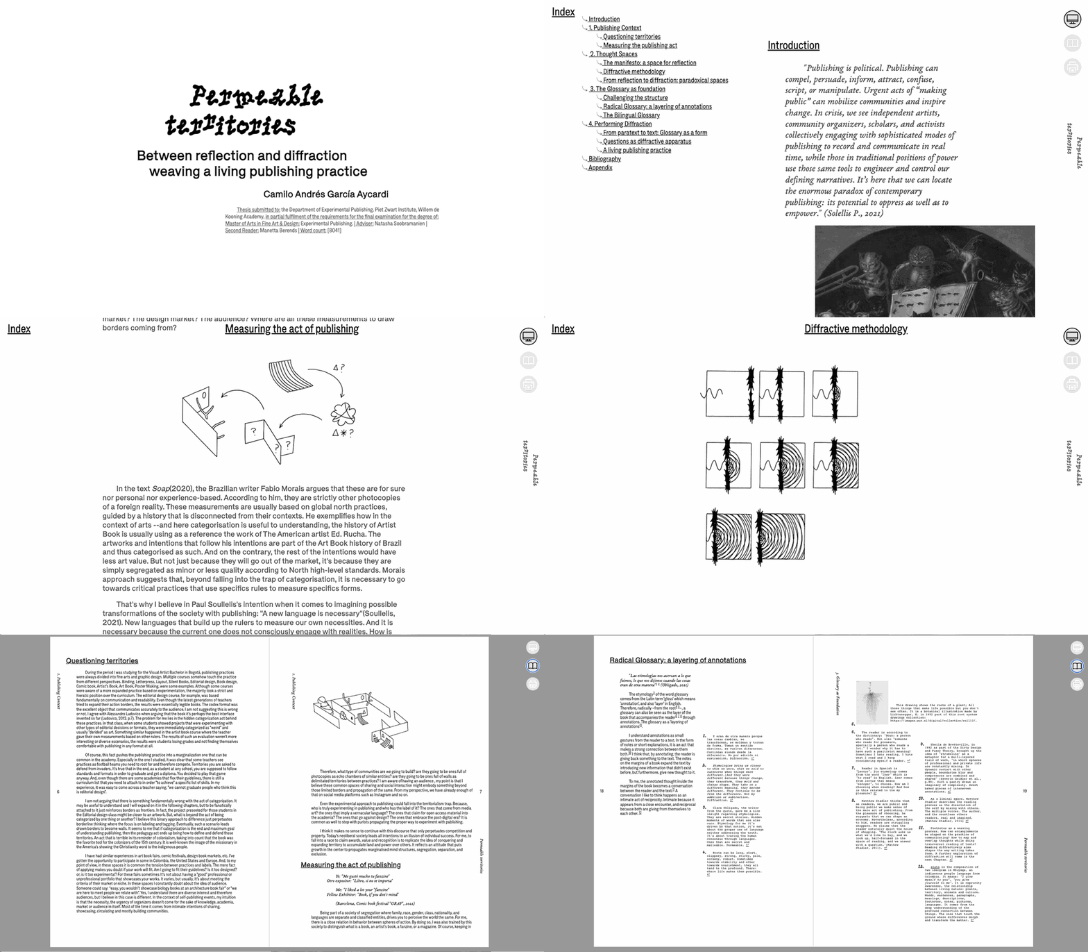
Thesis for the Master’s degree Experimental Publishing.

Details:

Images:

  • Book

  • Book

  • Book

  • Book

  • Illustration

  • Illustration

  • Illustration

  • Illustration

  • Illustration

  • Illustration

  • Illustration

  • Illustration

  • Illustration

  • Illustration

  • Illustration

  • Illustration

  • Illustration

  • Illustration

  • Illustration

  • Website

Walkie Talkie Pub

Coding , Printing , Design , Binding

Description

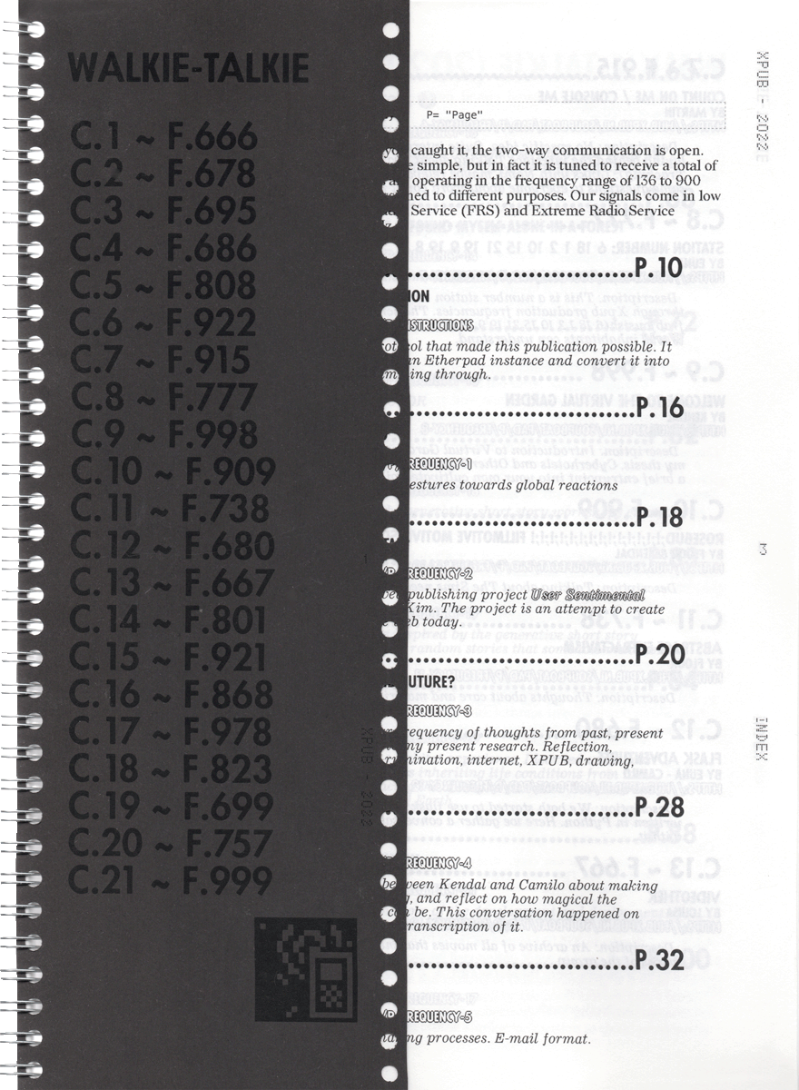
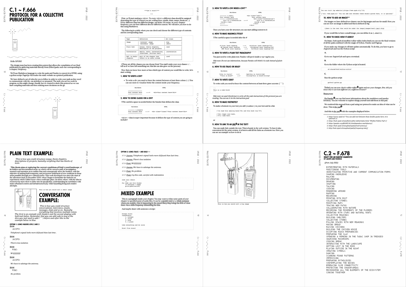
walkie talkie is a collective publication launched last July in Rotterdam for the grad show of experimental publishing. We, as the graphic design team, design a protocol/system to gather all the submissions from participants. We designed, printed and gave a small booklet that explains carefully the rules they needed to follow in order to write their text and easily adjust them in the overall design made by us.

🌱 Self-hosted (at xpub hub)

Images:

  • Book
  • Layout

Plantas

Drawing , Printing , Illustration

Description

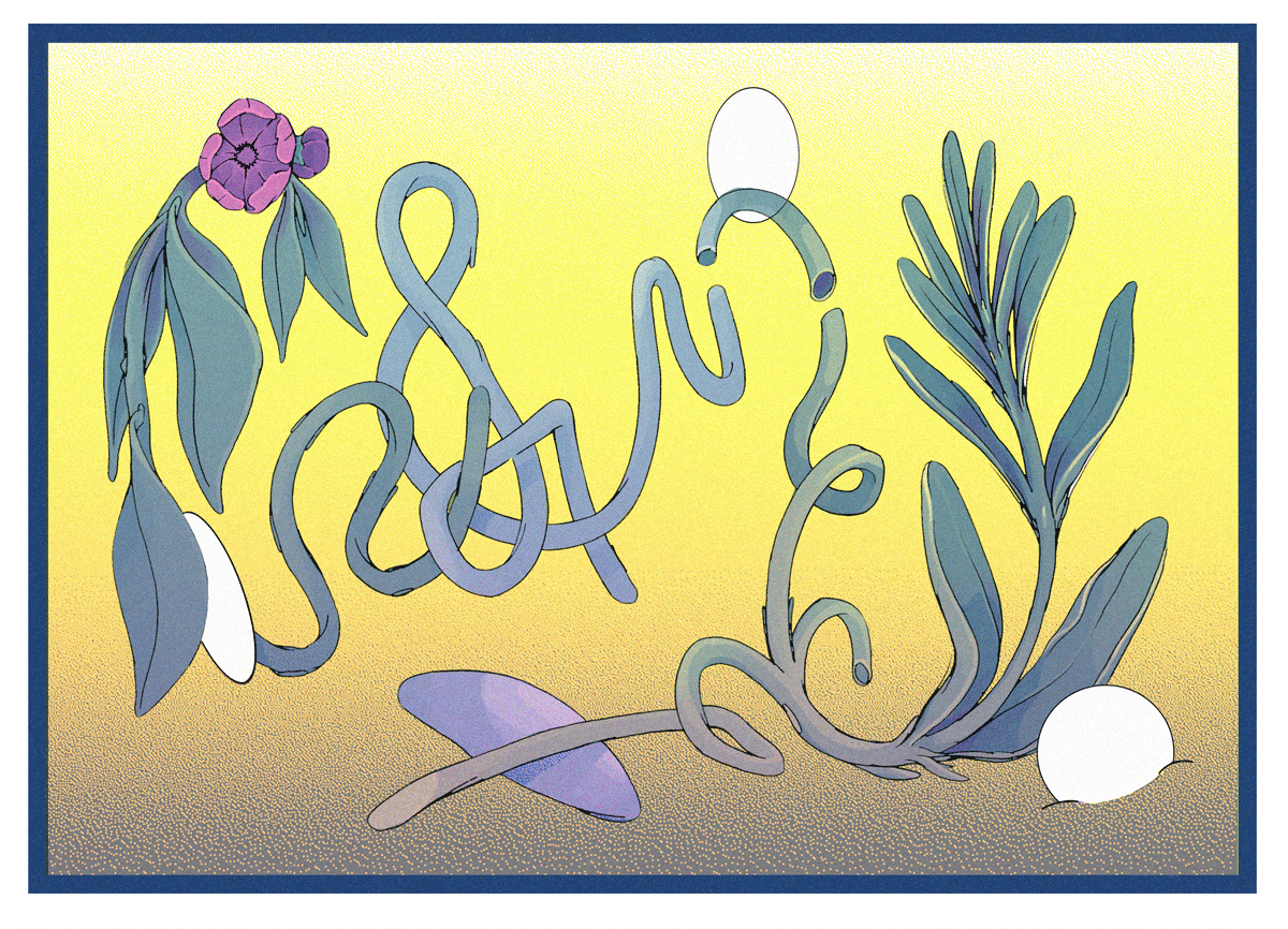
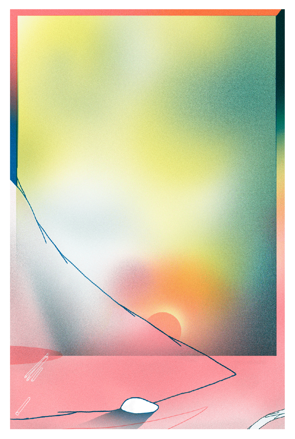
A print made thinking about the possibility that the plants have to bend, connect, trespass and become other.

Details

  • RISO printed
  • INKS: Yellow, pink fluo, blue.
  • Printed by me at RISO Lab, NY.

Images

  • Postcard

El Libro, la forma

Design , Drawing , Printing , Binding , Illustration

Description

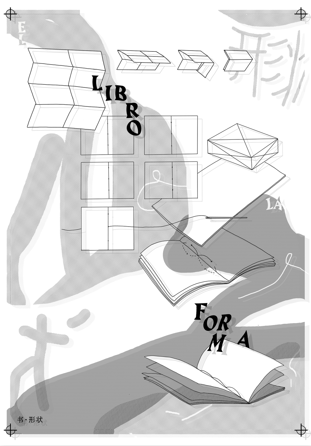
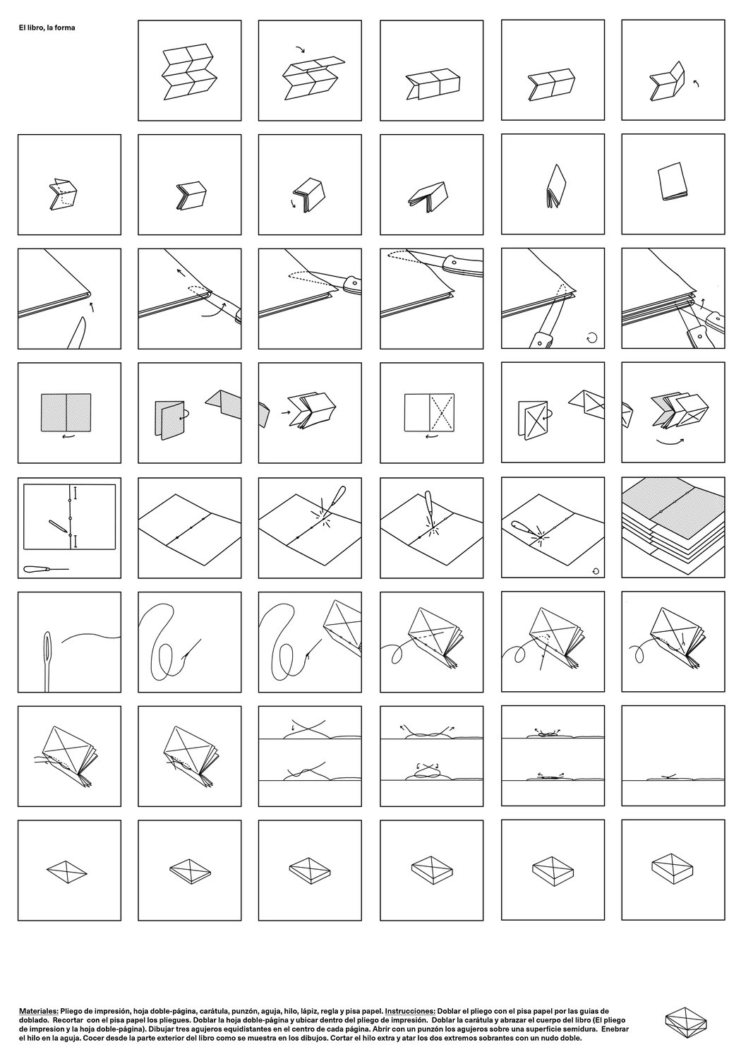
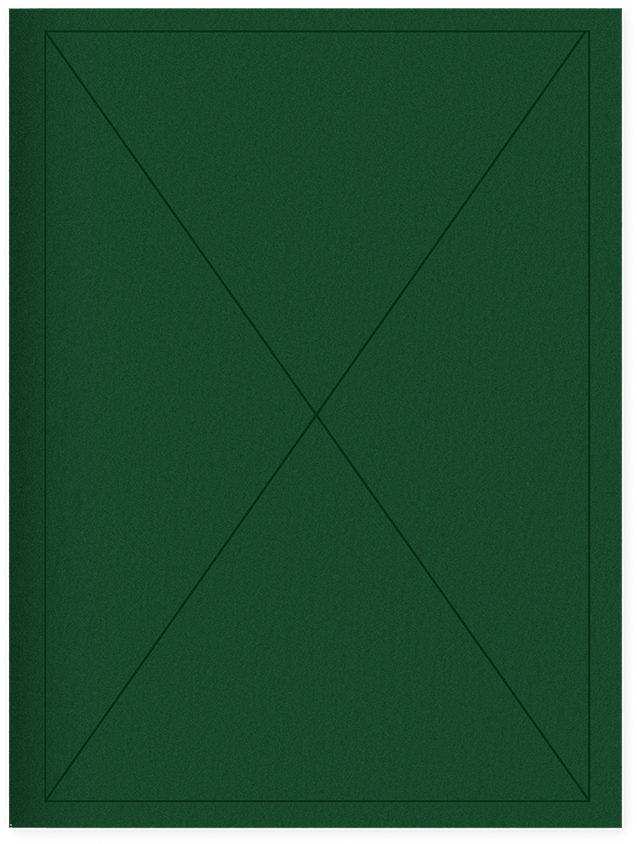
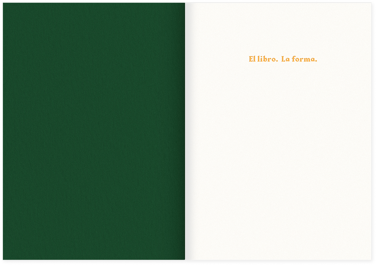
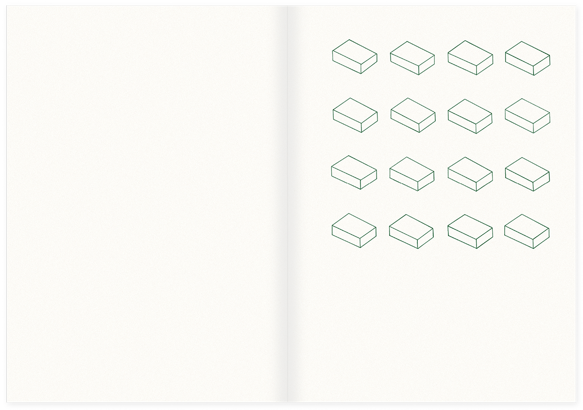
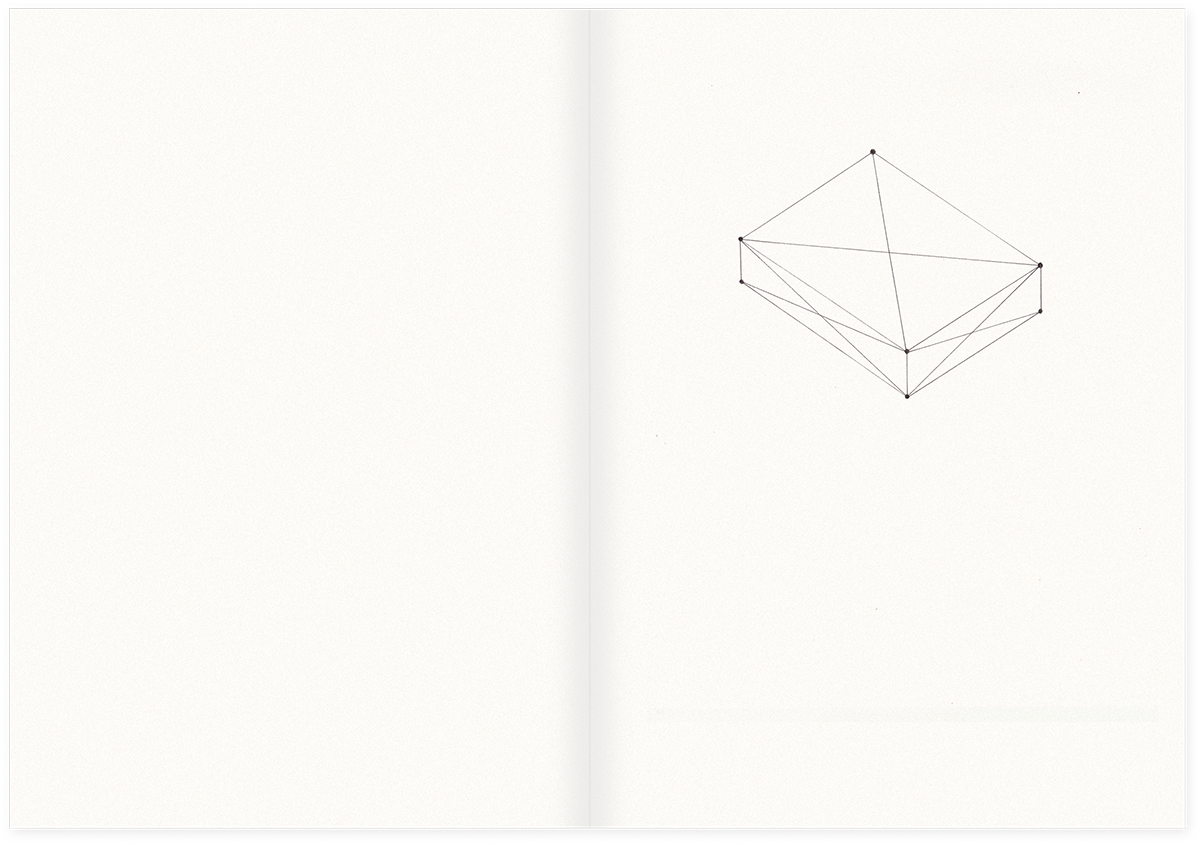
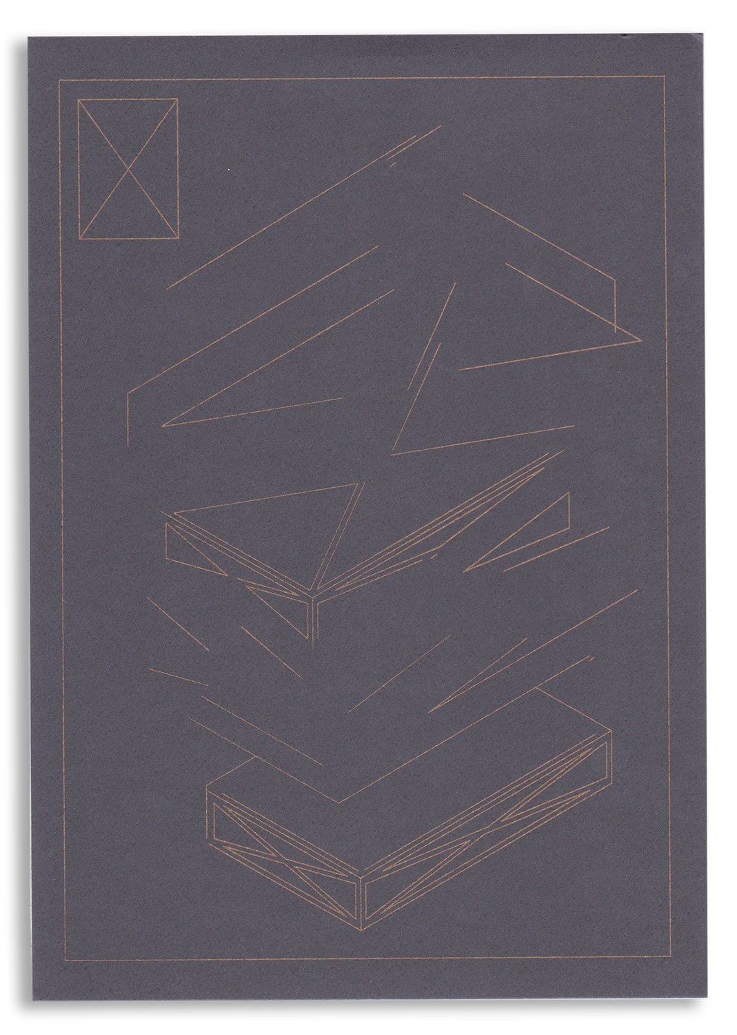
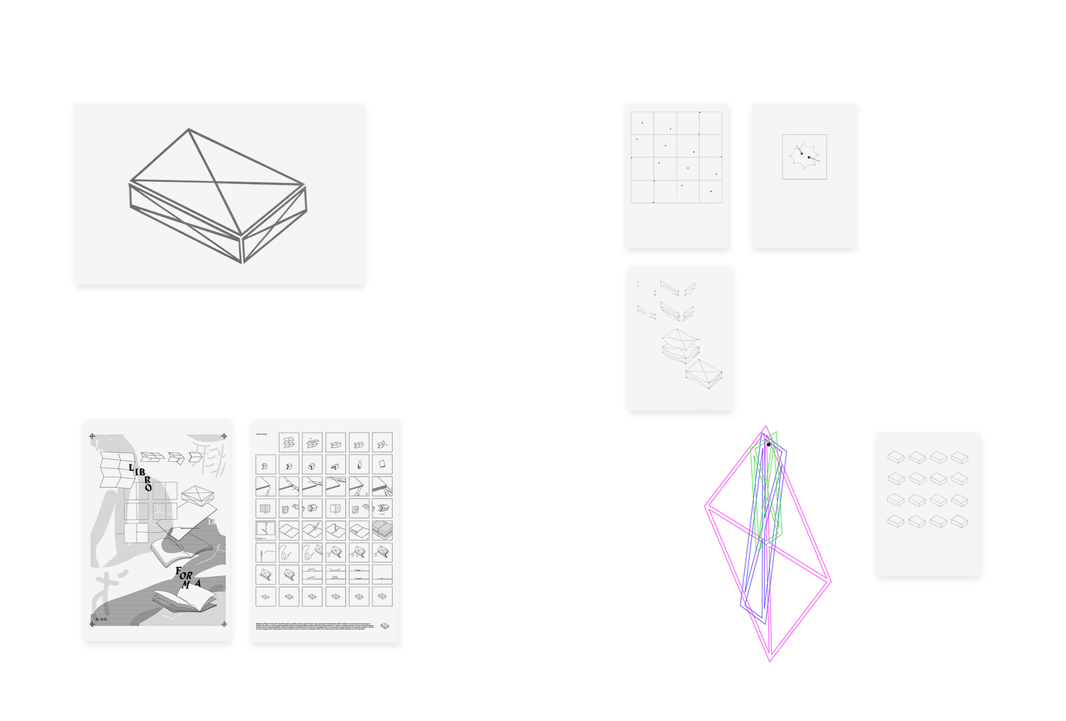
“The Book. The Form” reflects on a fragment of the book Relational art of Nicolás Bourriaud where it is described the birth of form as Epicuro and Lucrecio did it.  The project proposes, as a book, the construction of the book itself and its existence as a primary conceptual and material process.

The final result is an artist’s book that takes shape during his own process of making. In a preliminary stage the project included a book binding workshop in which it would be born as a physical object, and it would spread to others by a sharing knowlege experience, but it couldn’t happen as I planned, so the edition of the book exists but I made it by my own. This project was exhibited at La Caja Galeria in Taller Trez, as a part of the exhibition Trez con Z during Artbo Weekend in Bogotá, Colombia.

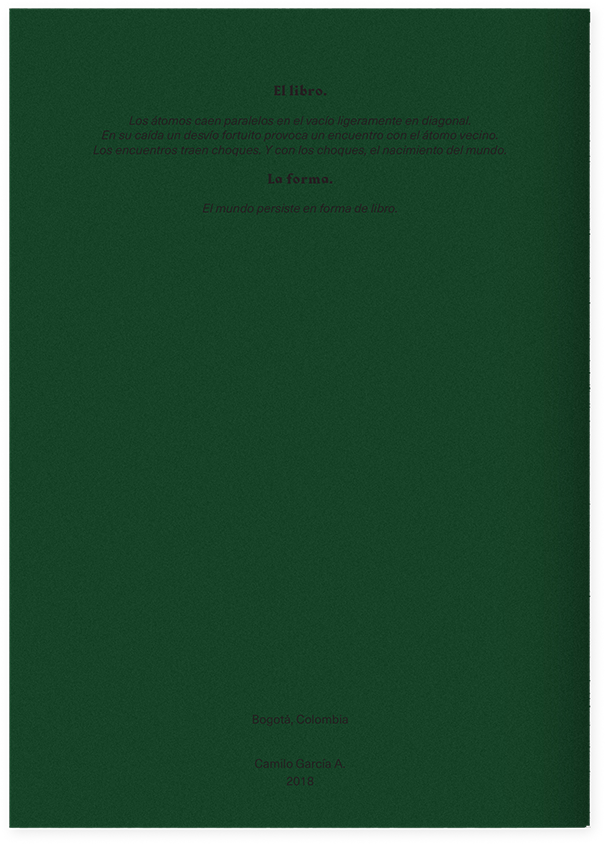
The Book:

Atoms fall parallel in the vacuum slightly diagonal,

Falling, a fortuitous detour causes an encounter with the neighbor atom.

Encounters bring clash. And with clashes,

the birth of the world.

The Form:

The world persists in form of book.

Materials:

  • 12 p. 
  • 25 copies
  • Paper “Rosaspina” - Fabriano 240g
  • Screen Print and Letter press

Images:

  • Poster

  • Poster

  • Book

  • Book

  • Book

  • Book

  • Book

  • Book

  • Book

  • Book

  • Installation

Encuentro

Storytelling , Printing , Binding , Illustration

Description

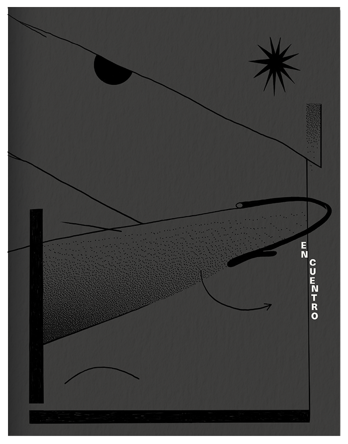
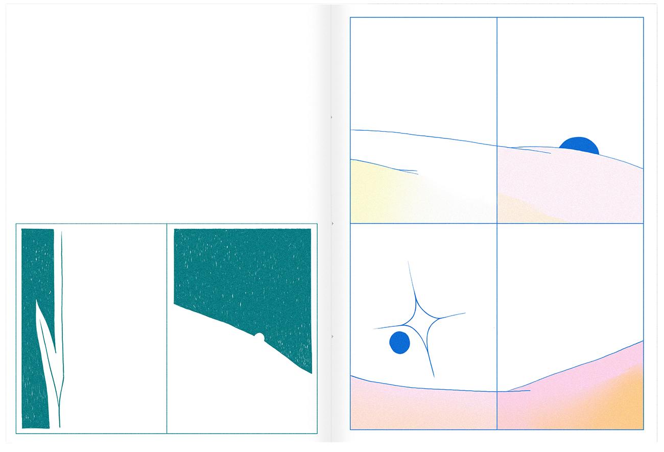
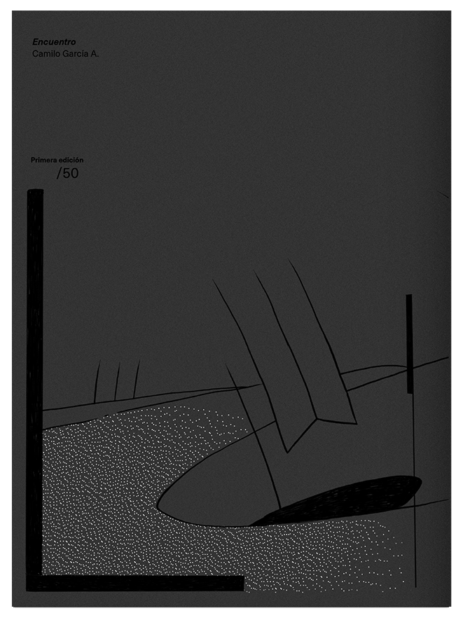
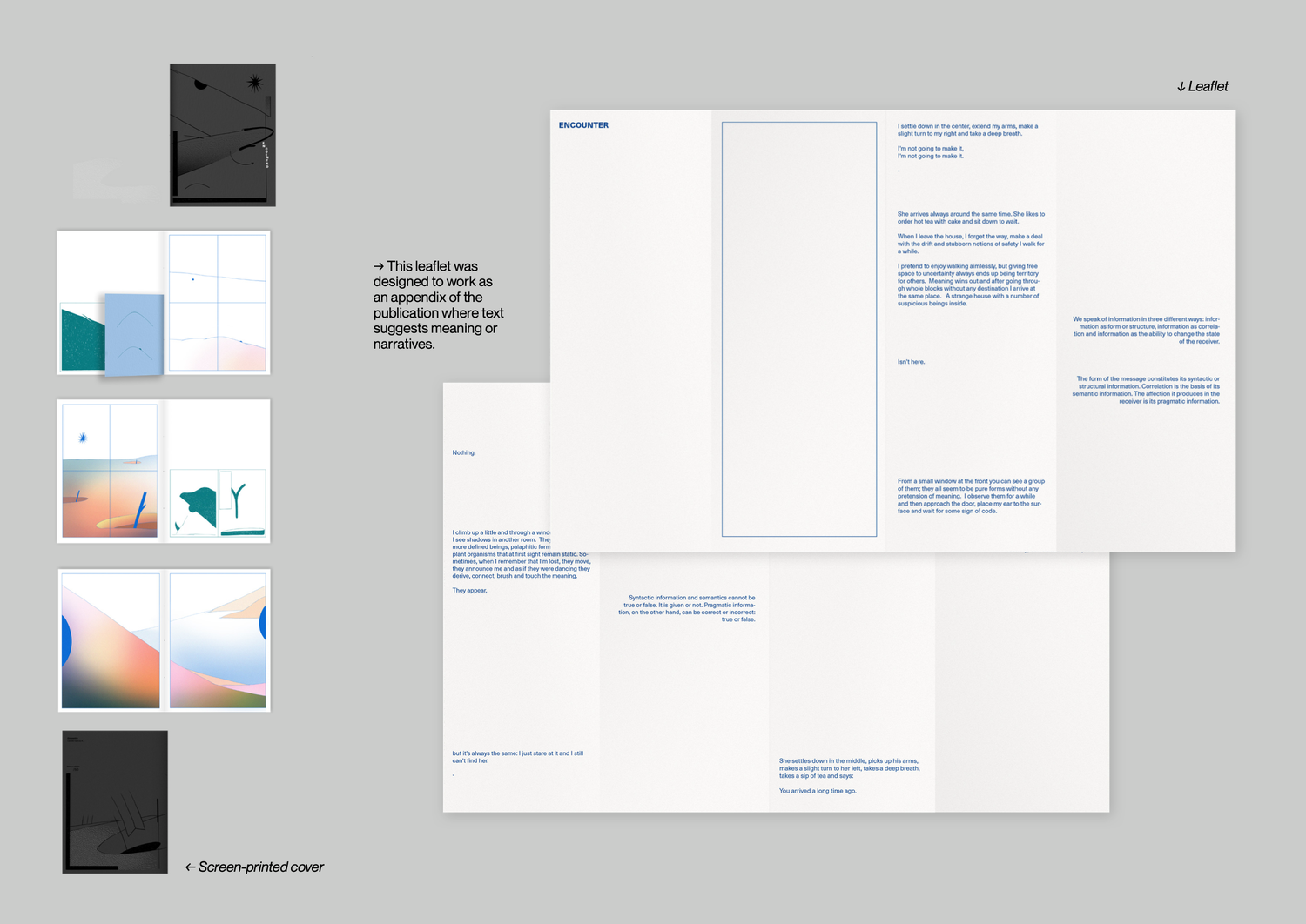
Rather than communicate an objective relate or a story, Encounter seeks to propose several readings about the graphic information printed on paper speculating about three “levels” of communication: Syntactic, Semantic and Pragmatic. The book use as resources: organic forms that are related; different dimensions of language; paper inserts, and a text that suggests poetic and conceptual connections between all the elements of the book.

Details:

  • 32 p. 
  • 50 copies.
  • Abstract Comic/Book
  • Cover: Screenprint by Diantres, 2 inks
  • Body: RISO, 4 inks.
  • Paper: cougar 120g.
  • New York and Bogotá.

Images:

  • Book

  • Book

  • Book

  • Book

  • Book

  • Book

  • Book

  • Book

  • Book

  • Book

  • Book

  • Book

  • Slide

Pregúntese

Drawing , Printing

Description

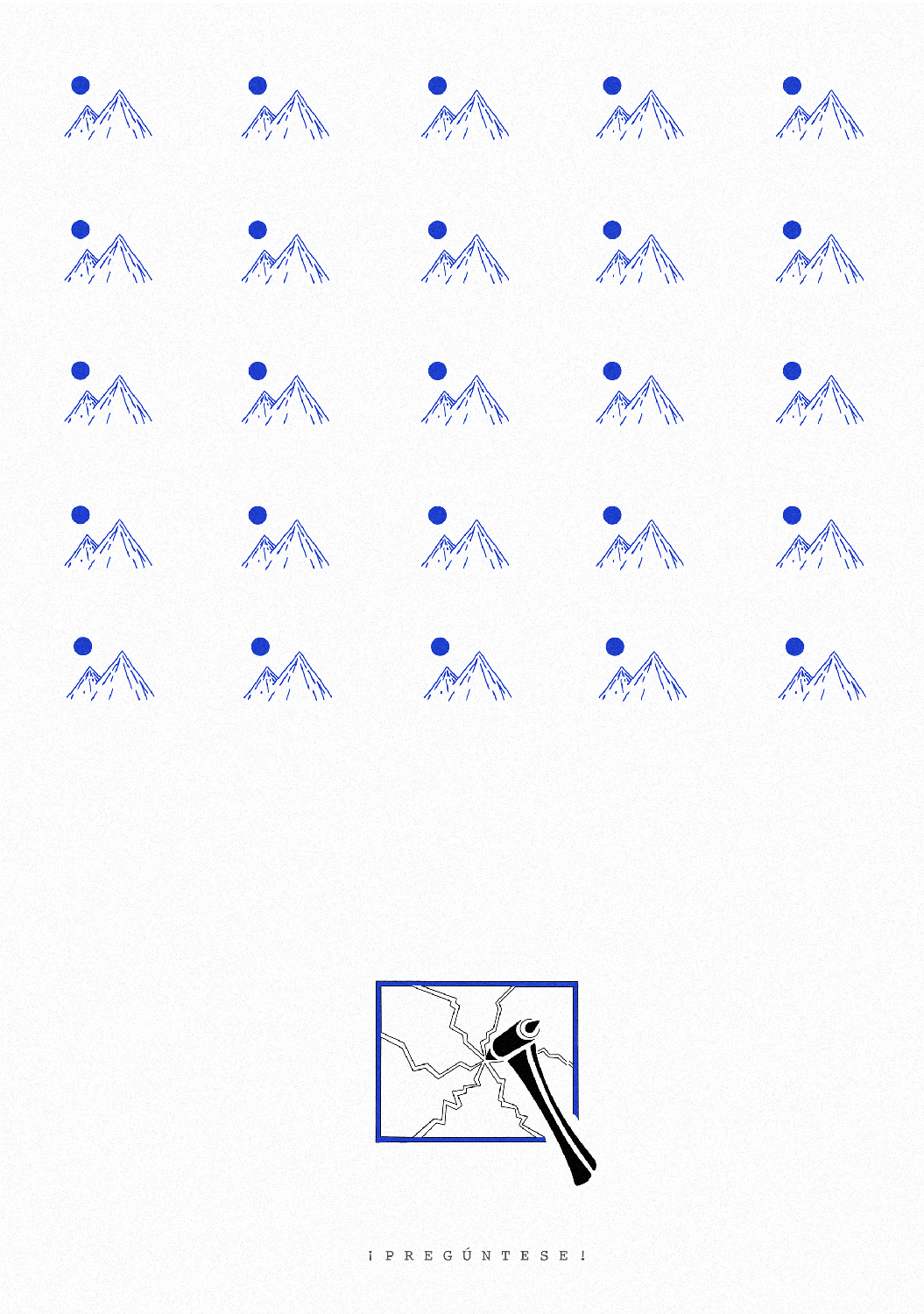
Reflection on repetition, emergency exits, and our ability to question what we see.

The framed version has the mountain from the poster painted on the frame.

Details

  • Papel Mohawk 320g
  • Impreso y exhibido en Taller Trez during Artbo Fin de semana, Bogota.

Images

  • Poster

From Dawn to Dusk

Drawing , Printing , Binding

Description

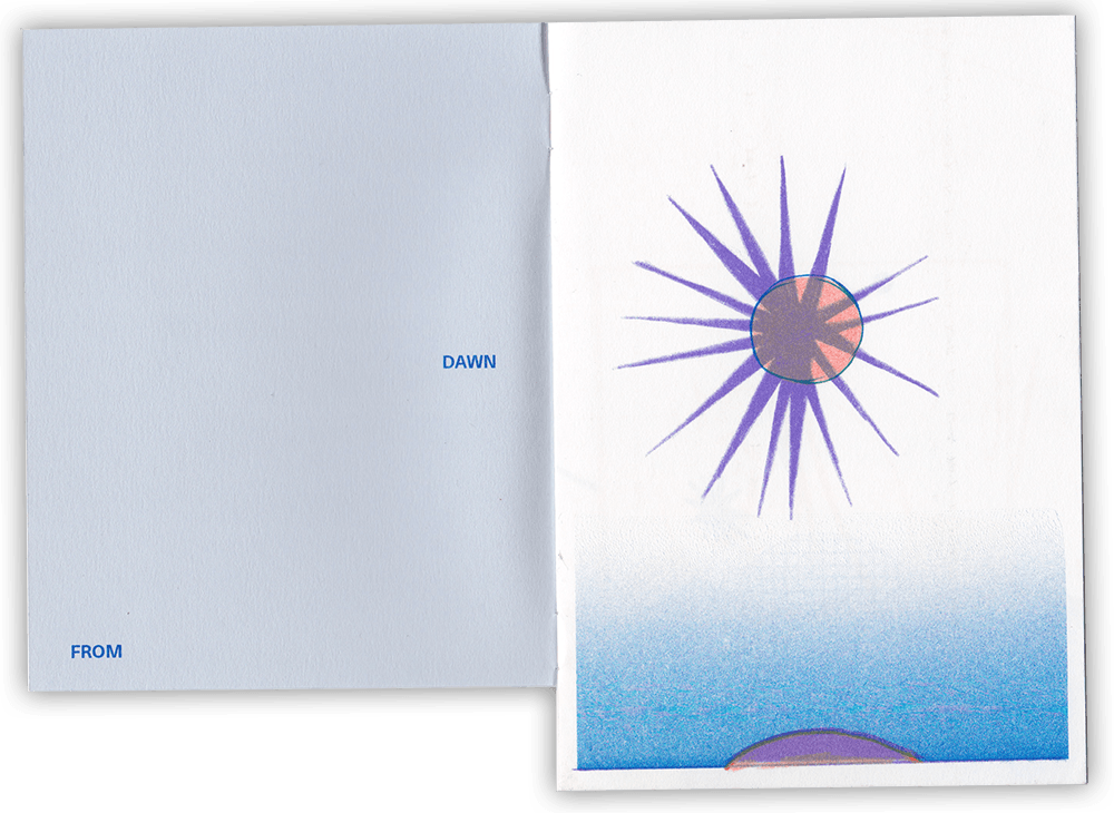
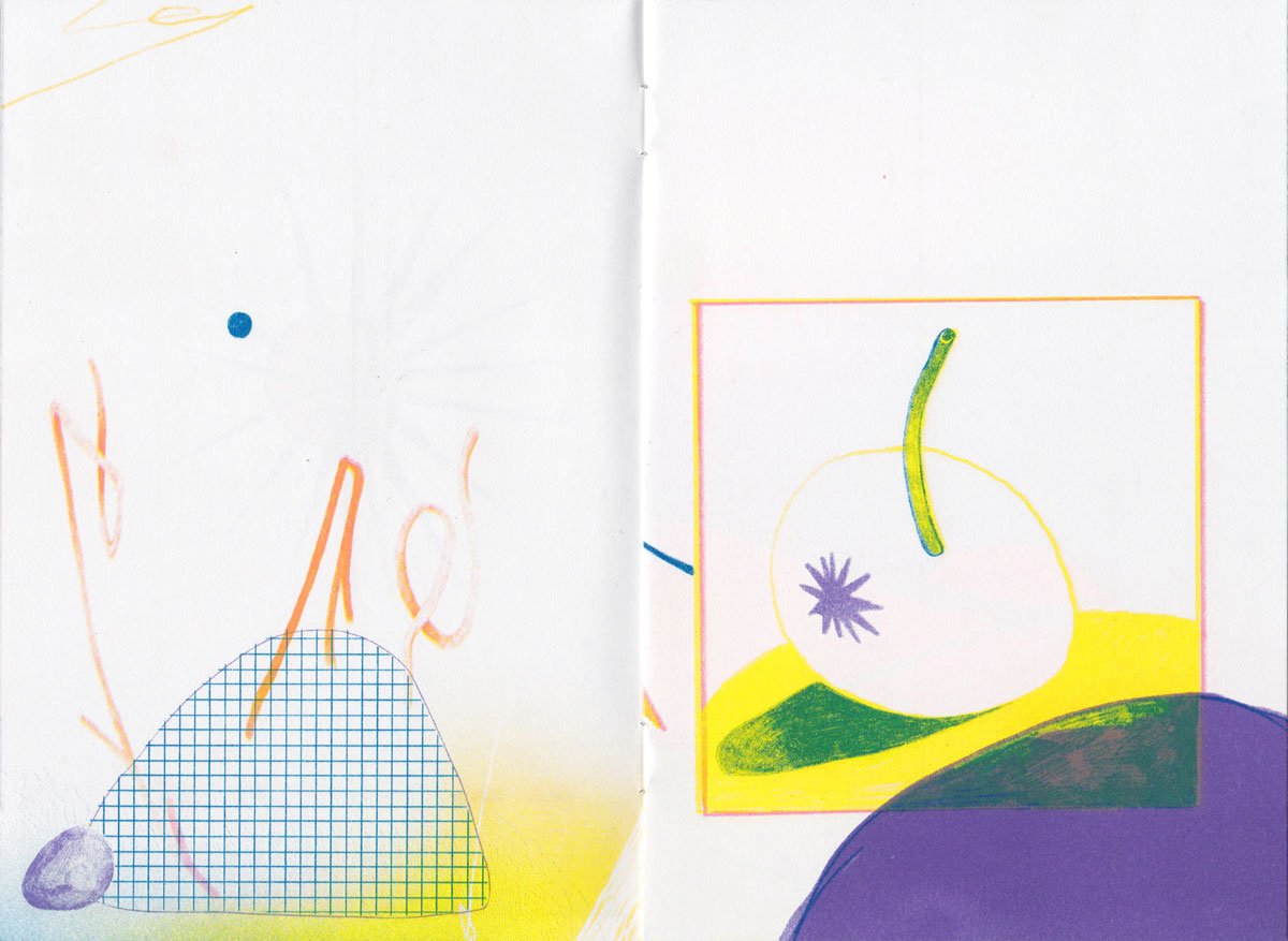
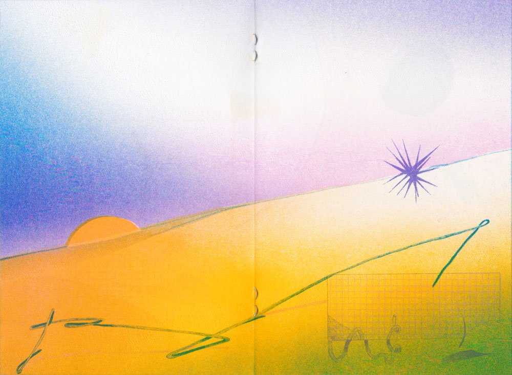
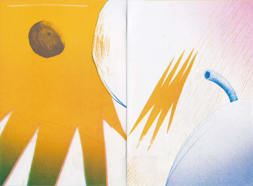
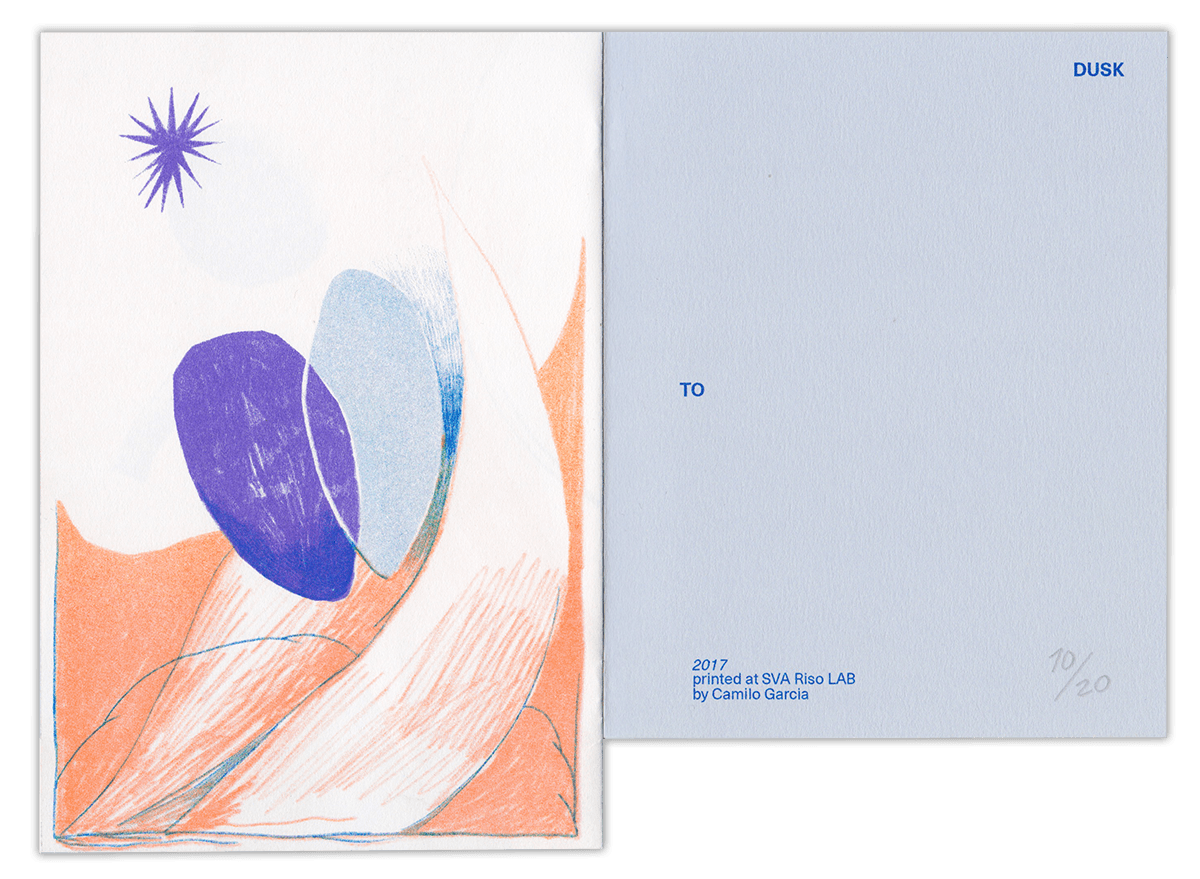
Cansado, sentado en un tren, miraba el sol e intentaba pensar en inglés.

I will be with the dawn wherever she is, daughter of the moon and a silent sun,

I will be there, watching on you, your intentions, your dreams.

Smile to the journey, the change and the rhythm of this river that pretends to be.

Details:

  • 8p.
  • 25u.
  • Paper: Mowhak 120g.
  • Staples.
  • Riso printed 4 inks.

Images:

  • Libro
  • Libro
  • Libro
  • Libro
  • Libro
  • Libro
  • Libro

Landscape

Drawing , Printing , Illustration

Description

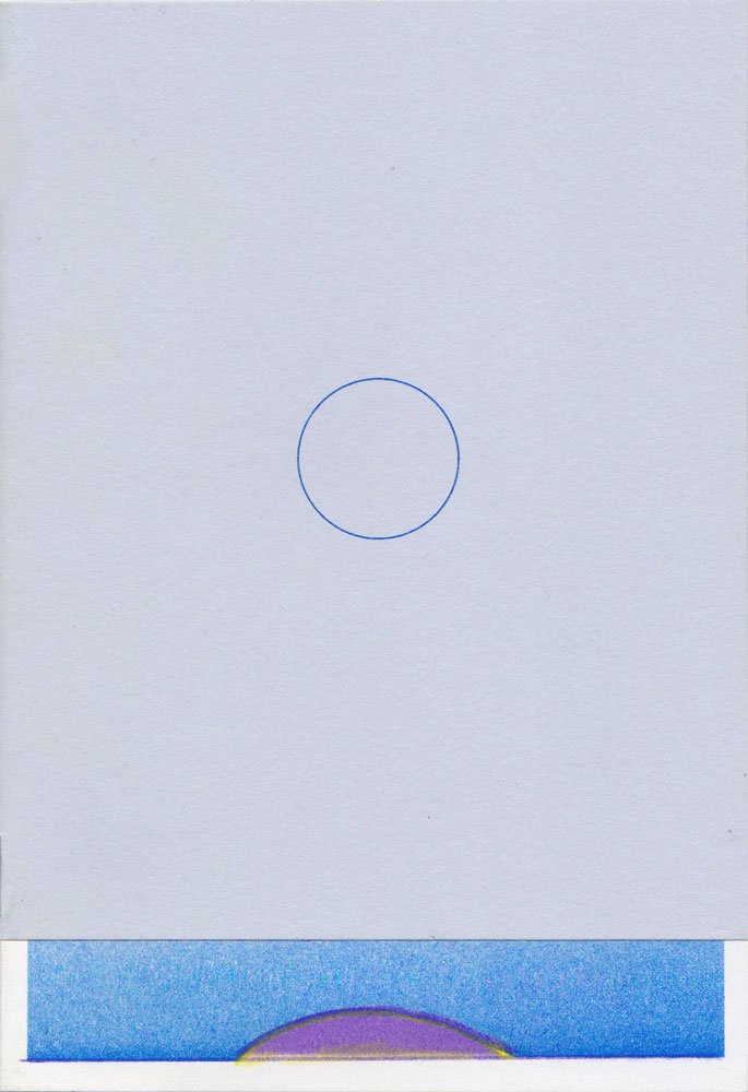
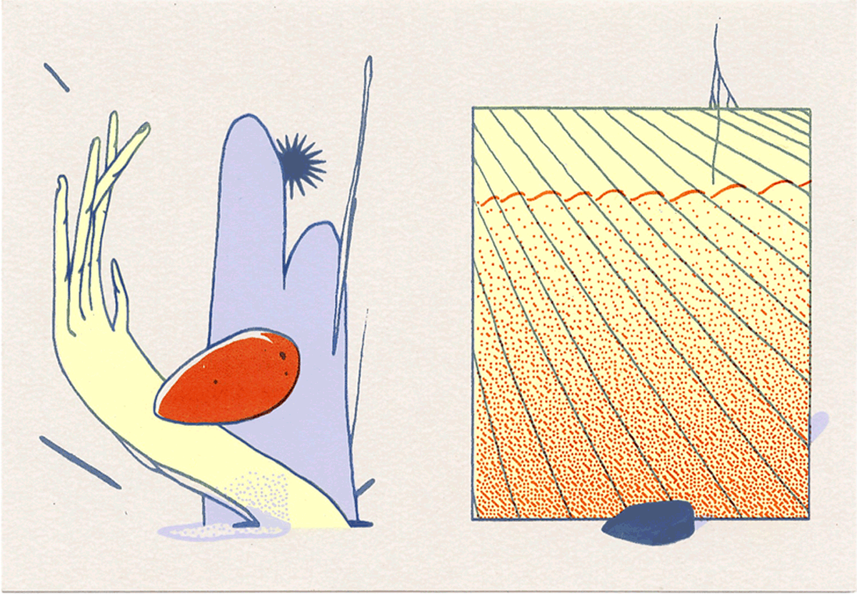
One of my first RISO prints.

Un paisaje, el horizonte y las piedras que siempre aparecen.

Details:

  • Printed in RISO Lab in New York
  • RISO 4 Inks: Blue, red, yellow, Teal.
Images:

  • Poster

Rino Colmillo

Drawing , Illustration , Printing

Description

First RISO print ever, printed at a workshop with RISO Colmillo in Bogotá.

Images:

  • Print

Staring at the Sun

Drawing , Printing , Binding , Illustration

Description

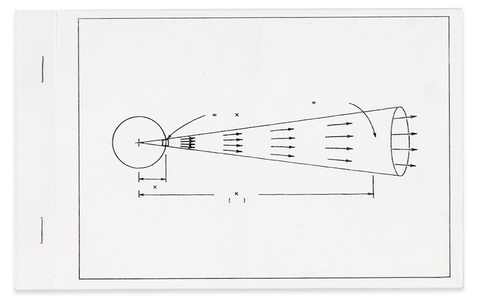
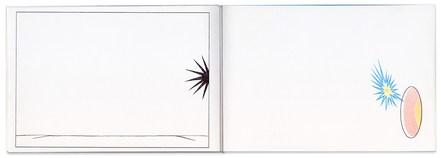
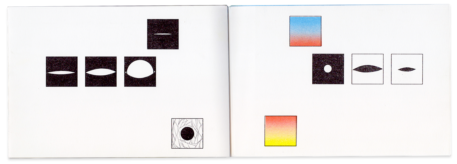
Staring at the sun is a book project about gaze, sun, power and contemplation.

(*)

Staring at the sun,

give up to the light,

find the center,

the being

Details:

  • 8 pages
  • 20 copies
  • Cover: Acetate, Body: Mohawk 140g.
  • RISO: Blue, Yellow, orange and black

Images:

  • Book
  • Book
  • Book
  • Book
  • Page
  • Page

Terreno

Printing , Illustration

Description

Screen printed cards to distribute on fairs.

Details

  • 4 Inks printed by me with the help of Diantres

Images

  • Card

Description:

A listening calendar that propose a time effort to listen more to others. Every day a sentence with a new question.

I was commissioned to make the creative direction, graphic design and print production.

Details:

  • 105p.
  • 100 copies.
  • RISO printed using 4 inks
  • Arena rough 120g

Images:

  • Cover
  • Spread
  • Spread
  • Spread
  • Spread
  • Spread
A Calendar for Listening

Design , Printing , Binding

Description

Floating Words is a collection of works, part of an ongoing process to explore asemic writing. Words exist as a graphic intention. There is no clarity. Doesn’t my activate upon reading them? Do they just exist to my eyes?

All the stamped designs on the garments were hand cut and pressed by me using leftover material from Diantres, a screen printing and design studio from Bogota, Colombia. I’m grateful for your generosity and love.

The text “They Dream” was written by Nicolás Castro.

  • All the drawings are part of an ongoing practice to communicate beyond meaning and sense.

  • All of the garments are single pieces and the ones marked with a ↺ were found in second-hand shops.

🌱 Self-hosted

Images:

  • Book

  • Book

  • Book

  • Book

  • Book

  • Book

  • Book

  • Book

  • Book

  • Garment

  • Garment

  • Garment

  • Garment

  • Garment

  • Garment

  • Garment

  • Drawing

  • Drawing

  • Drawing

  • Drawing

  • Website

Glyphs, Dreams and Garments

Coding , Design , Drawing , Printing , Binding

Description

We De Try is a publication developed with Esther Aminata Kamara and Creative Media for Social Change, exploring storytelling and story-listening as research practices within higher education. The research follows a process of questioning how stories are listened to, interpreted and shared, and what care and responsibility mean within these encounters.

How can a publication give form to a personal and non-linear research journey while inviting the reader to listen along the way?

Working with Esther, I first explored different forms the research could take, including an interactive website, a podcast series and an illustrated book. Together we chose to develop the book, and I translated her writing and research journey into a visual and material form.

I designed and illustrated the publication as a continuous reading experience, using drawings, diagrams, shifts in composition and speech-like elements to accompany the movement between personal stories, research reflections and theoretical ideas. The visual language moves alongside the writing and helps give rhythm and form to the changes in voice and perspective.

The final publication was printed and binded by me in 4 color RISO printing, carrying the project from early publishing exploration through design, illustration and final production.

My role:

  • Publishing concept
  • Format exploration
  • Illustration
  • Publication design
  • RISO printing & production

Research & writing:

  • Esther Aminata Kamara

Editorial collaboration:

  • Tamara Witschge

Details:

  • 32p
  • 50 copies.
  • Paper: Natural Arena 120g & 240g
  • RISO print 4 inks

Images:

  • We De Try illustrated book cover
  • We De Try illustrated book opening spread
  • We De Try illustrated book text and drawing spread
  • We De Try illustrated book research spread
  • We De Try illustrated book diagram and text spread
  • We De Try illustrated book contents spread
  • We De Try illustrated book interior page
  • We De Try illustrated book cover
How Could We Listen?

Concept , Illustration , Printing , Binding , Design

Description

Looking to expand the possibilities of “connecting” as part of the Living glossary for a diffractive publishing practice, I created a role-like game that would reflect and expand the glossary itself by proposing different approaches to it.

The different characters would perform for different perspectives on the connections among:

The liminal, the weaver, the summoner, the otherness, the inner space.

Images:

  • Card
  • Card
  • Card
  • Card
  • Card
  • Card
  • Card
  • Card
  • Card
  • Card
  • Card
Encounter of Differences

Printing , Design

Description

What are the differences between reflection and diffraction?

This experimental zine explores both thought processes using book drawings, conversational writing and hole punching on the pages.

Details:

  • 16 pages
  • 50 copies
  • RISO printed
  • INKS: Gold, gray and fluorescent orange inks

Images:

  • Book
  • Diagram
  • Book
  • Book
  • Book
  • Book
  • Book
  • Book
  • Book
Between Reflection and Diffraction

Drawing , Printing , Binding

Description

Digesting Care is an experimental publication developed with Kendal Beynon for TAKING CARE, a European research project exploring care and kinship within ethnographic and world cultures museums.

How can a publication make connections across a conference without reducing its complex and sometimes unresolved conversations into a single narrative?

We attended the conference as listeners and participants, using drawing as a form of note-taking to capture ideas, conversations and relationships beyond written documentation. Recurring concepts such as contradiction, plurality, fabulation, entanglement and the unknown became a tagging system through which papers, presentations, photographs and workshop materials could be connected.

Rather than separating editorial work, design and development, we built a publishing infrastructure in which these processes could inform each other. Collaborative text files and tags were transformed through Python into a lightweight website, while the same content and visual system extended into a physical publication. The digital version uses semantic HTML and dithered images, with high-resolution media available on demand, considering accessibility, resilience and energy use as part of the publishing process.

The website also became the blue print for the physical edition. Fifty different states of the website were printed, producing 50 unique versions of the publication. Rather than reproducing a single definitive arrangement, each copy preserves one possible reading of the material.

The result is a hybrid publication that treats publishing not as the documentation of a finished conversation, but as a way of revealing relationships between ideas and allowing different readings to emerge across digital and physical forms.

My role:

  • Illustration
  • Publication design
  • Web design & development

Editorial collaboration:

  • Kendal Beynon

Images:

  • Digesting Care publication cover
  • Digesting Care publication pages with notes and images
  • Digesting Care publication spread with drawings and text
  • Digesting Care illustrated publication back cover
  • Digesting Care interactive publication website
Digesting Care Publication

Printing , Binding , Coding , Illustration

Description

Living glossary for a diffractive publishing practice is an ongoing and ever-changing attempt to introduce a diffractive methodology inside publishing practices, understanding publishing as the mere act of making public. It is organized as a container of words that are never fully defined, only annotated. Words become tools, concepts, resources, and shapes with properties that enhance new possibilities. In this glossary, they don’t close the publishing scenario to territory arts or design. Instead, they are porous and permeable to other spheres of action.

The glossary is seen as mutable, and the current state results from collective workshops where participants are invited to think and converse around its words and annotations. During the workshop, diffraction performs a conscious interconnection of practices beyond reflection.

From the technical side there is source pad were all annotations take place in a markdown format which is processed by a Python script that writes it as a website using Pandoc and then Js.

Images:

  • Cards

  • Cards

  • Cards

  • Cards

  • Cards

  • Cards

  • Cards

  • Website

  • Slide

How can a Publishing Practice Diffract?

Research , Coding , Printing , Design

Description

Thesis for the Master’s degree Experimental Publishing.

Details:

Images:

  • Book

  • Book

  • Book

  • Book

  • Illustration

  • Illustration

  • Illustration

  • Illustration

  • Illustration

  • Illustration

  • Illustration

  • Illustration

  • Illustration

  • Illustration

  • Illustration

  • Illustration

  • Illustration

  • Illustration

  • Illustration

  • Website

About Publishing and Knowledge Territories

Coding , Printing , Design , Layout , Writing , Illustration

Description

walkie talkie is a collective publication launched last July in Rotterdam for the grad show of experimental publishing. We, as the graphic design team, design a protocol/system to gather all the submissions from participants. We designed, printed and gave a small booklet that explains carefully the rules they needed to follow in order to write their text and easily adjust them in the overall design made by us.

🌱 Self-hosted (at xpub hub)

Images:

  • Book
  • Layout
A Protocol for a Collective Publication

Coding , Printing , Design , Binding

Description

A print made thinking about the possibility that the plants have to bend, connect, trespass and become other.

Details

  • RISO printed
  • INKS: Yellow, pink fluo, blue.
  • Printed by me at RISO Lab, NY.

Images

  • Postcard
Entanglement Practice

Drawing , Printing , Illustration

Description

“The Book. The Form” reflects on a fragment of the book Relational art of Nicolás Bourriaud where it is described the birth of form as Epicuro and Lucrecio did it.  The project proposes, as a book, the construction of the book itself and its existence as a primary conceptual and material process.

The final result is an artist’s book that takes shape during his own process of making. In a preliminary stage the project included a book binding workshop in which it would be born as a physical object, and it would spread to others by a sharing knowlege experience, but it couldn’t happen as I planned, so the edition of the book exists but I made it by my own. This project was exhibited at La Caja Galeria in Taller Trez, as a part of the exhibition Trez con Z during Artbo Weekend in Bogotá, Colombia.

The Book:

Atoms fall parallel in the vacuum slightly diagonal,

Falling, a fortuitous detour causes an encounter with the neighbor atom.

Encounters bring clash. And with clashes,

the birth of the world.

The Form:

The world persists in form of book.

Materials:

  • 12 p. 
  • 25 copies
  • Paper “Rosaspina” - Fabriano 240g
  • Screen Print and Letter press

Images:

  • Poster

  • Poster

  • Book

  • Book

  • Book

  • Book

  • Book

  • Book

  • Book

  • Book

  • Installation

Atoms, Forms and Books

Design , Drawing , Printing , Binding , Illustration

Description

Rather than communicate an objective relate or a story, Encounter seeks to propose several readings about the graphic information printed on paper speculating about three “levels” of communication: Syntactic, Semantic and Pragmatic. The book use as resources: organic forms that are related; different dimensions of language; paper inserts, and a text that suggests poetic and conceptual connections between all the elements of the book.

Details:

  • 32 p. 
  • 50 copies.
  • Abstract Comic/Book
  • Cover: Screenprint by Diantres, 2 inks
  • Body: RISO, 4 inks.
  • Paper: cougar 120g.
  • New York and Bogotá.

Images:

  • Book

  • Book

  • Book

  • Book

  • Book

  • Book

  • Book

  • Book

  • Book

  • Book

  • Book

  • Book

  • Slide

A Proposal to Relate

Storytelling , Printing , Binding , Illustration

Description

Reflection on repetition, emergency exits, and our ability to question what we see.

The framed version has the mountain from the poster painted on the frame.

Details

  • Papel Mohawk 320g
  • Impreso y exhibido en Taller Trez during Artbo Fin de semana, Bogota.

Images

  • Poster
Repetition, Questioning and Emergency Exits

Drawing , Printing

Description

Cansado, sentado en un tren, miraba el sol e intentaba pensar en inglés.

I will be with the dawn wherever she is, daughter of the moon and a silent sun,

I will be there, watching on you, your intentions, your dreams.

Smile to the journey, the change and the rhythm of this river that pretends to be.

Details:

  • 8p.
  • 25u.
  • Paper: Mowhak 120g.
  • Staples.
  • Riso printed 4 inks.

Images:

  • Libro
  • Libro
  • Libro
  • Libro
  • Libro
  • Libro
  • Libro
From Dawn to Dusk

Drawing , Printing , Binding

Description

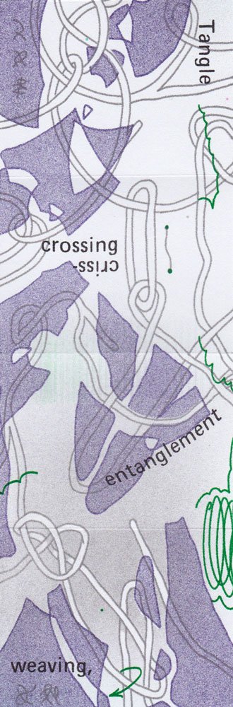
One of my first RISO prints.

Un paisaje, el horizonte y las piedras que siempre aparecen.

Details:

  • Printed in RISO Lab in New York
  • RISO 4 Inks: Blue, red, yellow, Teal.

Images:
  • Poster
Landscape to the Sun

Drawing , Printing , Illustration

Description

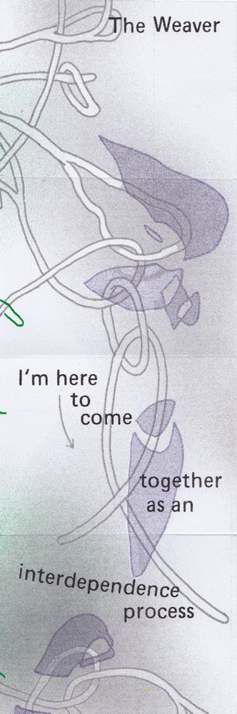
First RISO print ever, printed at a workshop with RISO Colmillo in Bogotá.

Images:
  • Print
Curves, Topography and Color

Drawing , Illustration , Printing

Description

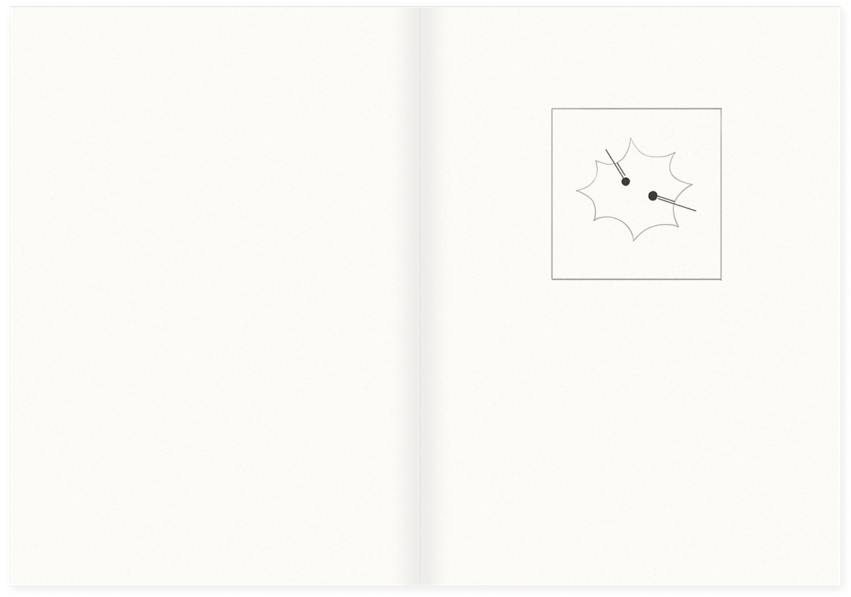
Staring at the sun is a book project about gaze, sun, power and contemplation.

(*)

Staring at the sun,

give up to the light,

find the center,

the being

Details:
  • 8 pages
  • 20 copies
  • Cover: Acetate, Body: Mohawk 140g.
  • RISO: Blue, Yellow, orange and black

Images:

  • Book
  • Book
  • Book
  • Book
  • Page
  • Page
Staring at the Sun

Drawing , Printing , Binding , Illustration

Description

Screen printed cards to distribute on fairs.

Details

  • 4 Inks printed by me with the help of Diantres

Images

  • Card
Screen Printed Cards

Printing , Illustration